Leica Bellevue Is Project of the Week in Seattle Daily Journal of Commerce

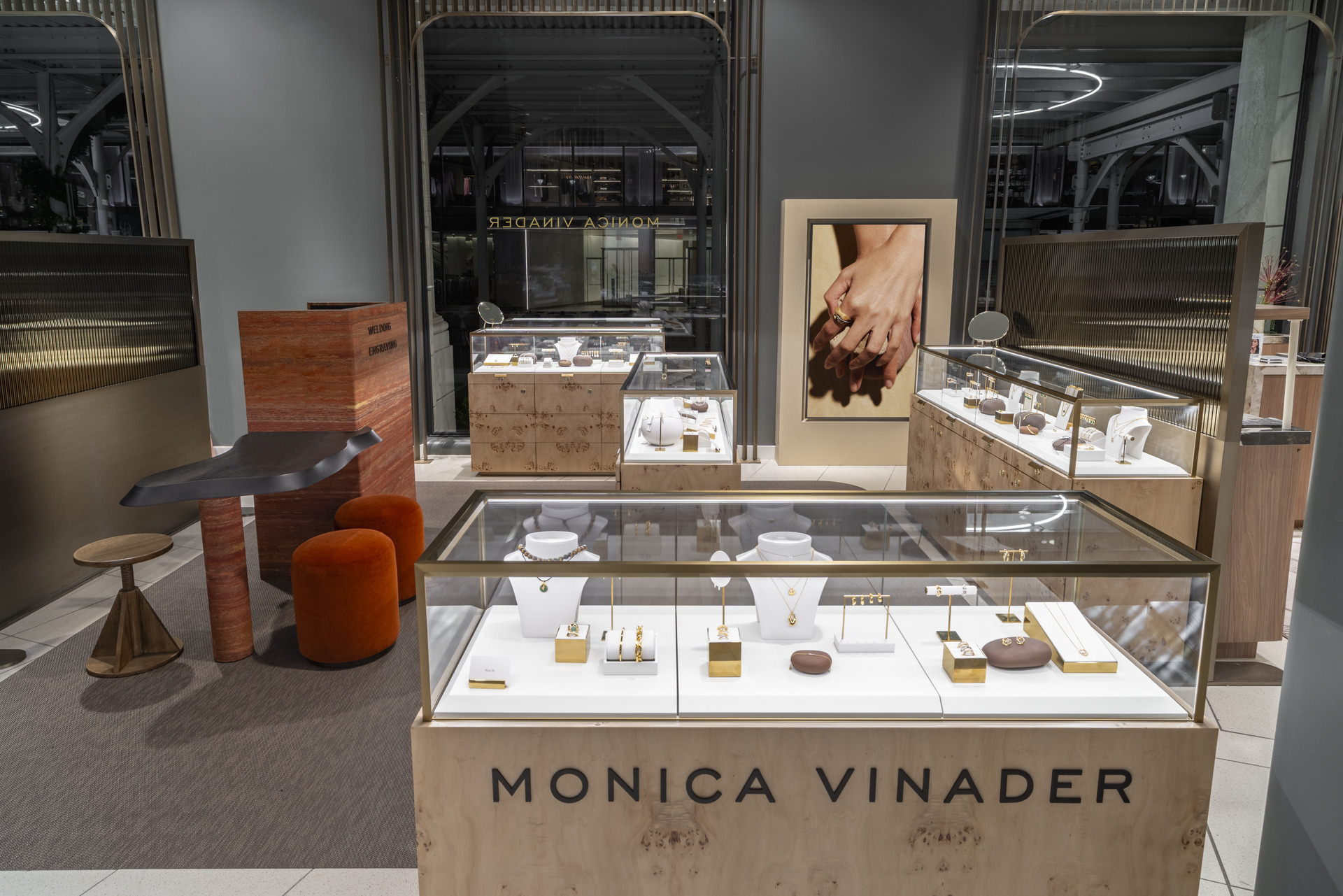
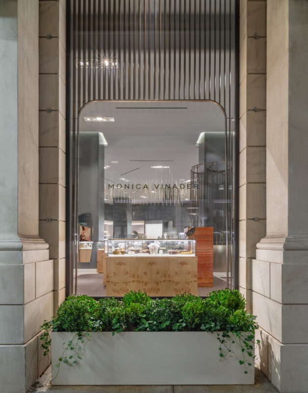
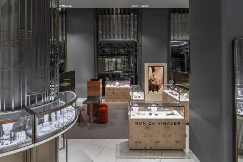
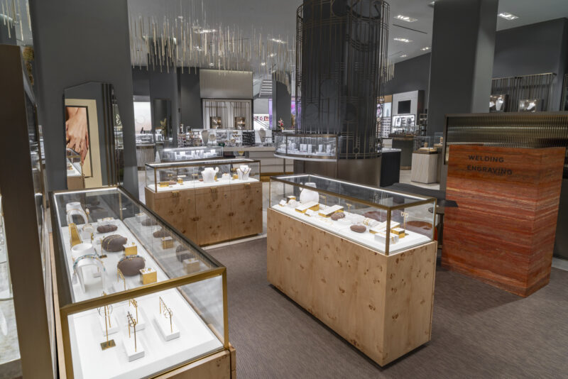
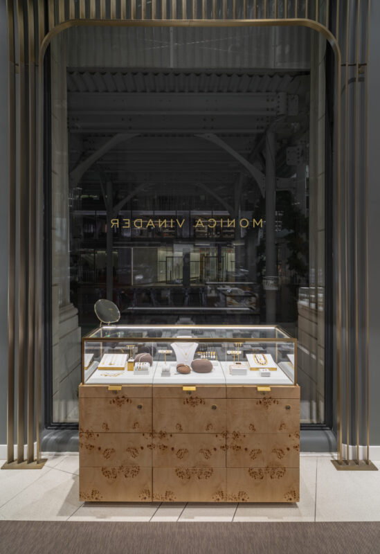
Leica’s luxury storefront in Bellevue was the Seattle Daily Journal of Commerce’s Project of the Week.

“The 2,415-square-foot store is Leica’s first location in the U.S. to receive the company’s new Leica Global Concept design that modernizes space using natural surfaces made of sustainable wood in warm tones to convey a calm atmosphere for guests.”

消费者体验

Kizik Specialty Stores

In collaboration with Kizik, MG2 has been charged with introducing the “hands-free, step-in” footwear brand into physical stores. After its New York City pop-up, Kizik opened stores across the U.S. including Mall of America (Minneapolis), King of Prussia (Philadelphia), and Newbury Street (Boston). These new locations are not only a physical manifestation of the brand but also bring to life a high-sensory fit experience and showcase the brand’s new “motion is magic” design. 
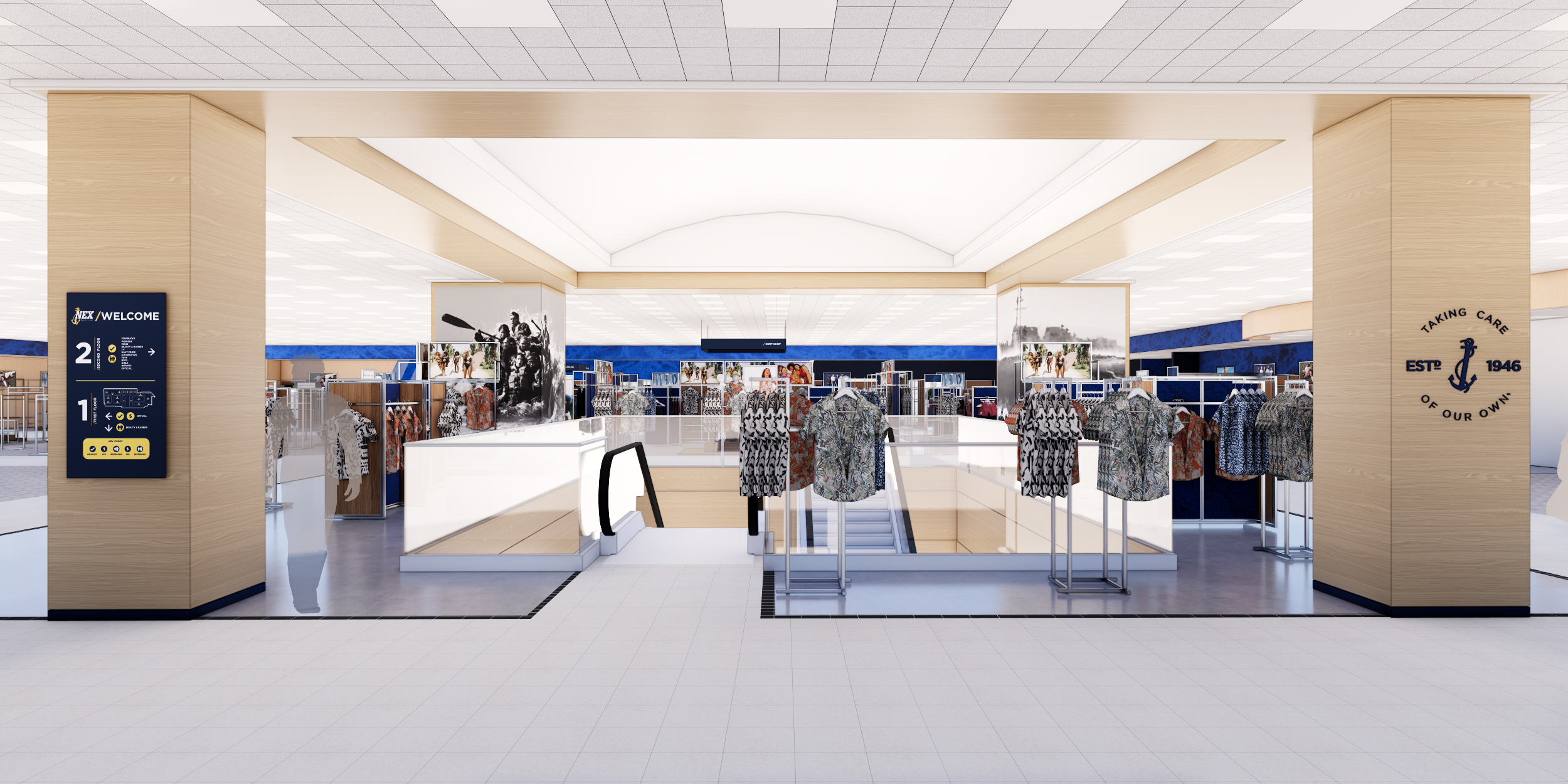
Kizik blue is prominent, both on the exterior and interior of the store. A blue portal entry encompasses both a blue archway and pathway that leads to the store’s primary display to create a threshold moment. The key design principle of the Kizik brick-and-mortar experience is fitting the customer in a pair of shoes as early in the journey as possible. It’s an AHA moment that captures and celebrates the magic of the brand.

Floor-to-ceiling vitrines flank the portal to create Kizik’s signature “fishbowl” storefront, which allows passers-by to see into the space and take part in the store experience. Motion is an important part of the Kizik brand, and digital screens are placed prominently throughout. The “motion is magic” tagline is abstractly reinforced through circular pendants, half-circle benches and fixtures, gradient wall treatments, and mirrored graphics that reflect consumers as they move about the space. 

These stores were designed to be modular and flexible. Elevated, versatile displays capture a sense of motion to create an environment that empowers visitors to discover and explore. Modular systems allow Kizik to morph and change as it continues to grow and expand. Shelving can be moved up, down or removed entirely. Central displays can be reconfigured to form a variety of patterns. Standout design elements include the store’s materiality—a juxtaposition of surfaces including perforated metals, concrete, and textured paints with LED neon and vibrant blue. 

The result is inviting and visually engaging spaces that captivate and draw in the eye, enhancing the overall aesthetic and reinforcing the brand identity.


The Health & Wellness Wave

“As the idea of holistic health has taken root in society, marketers are exploring new ways of communicating with customers to promote wellness. ‘There’s a variety of promises that brands can make from a lifestyle point of view,’ says Melissa Gonzalez, principal at MG2. ‘It can be everything from new product offerings to sections of beauty departments that explain benefits in a wellness context to awareness of environmental issues.’

“A January 2024 report on holistic health from the MG2 Advisory group explores how marketers can capitalize on what it sees as the next wellness frontier: the retail store. ‘By evaluating traditional store design elements through the lens of wellness,’ the report states, ‘brands have the opportunity to create environments that are more holistic, rather than simply physical, and inclusive of cognitive, emotional and spiritual health attributes.'”

Unlocking the Value of Fit Tech: Personalization and Recommendations

MG2 Advisory research found that in-store fit tech is […] a big draw for footwear shoppers. Up to 68% of consumers reaffirmed the importance of a ‘customized fit,’ and 40% said fit scan technology would benefit their in-store experiences.”

“I think the industry is benefiting from not just the acceptance of this technology but the overall fluidity that consumers are experiencing with technology,” said Melissa Gonzalez, Principal at MG2, to Retail Touchpoint’s Alicia Esposito.

消费者体验

Leica

Leica Camera is an international, premium manufacturer of cameras and sports optics. The legendary reputation of the Leica brand is based on a long tradition of excellent quality, German craftsmanship and German industrial design, combined with innovative technologies. 

Leica has identified North America as a key growth region for the brand and, as a result, is embarking on growing its store presence over the next few years. By partnering with MG2, the brand is launching this initiative with the opening of new stores in Bellevue, WA and a New York City flagship. MG2 is engaged as the full service architect, helping the client translate the design intent to adapt to the unique attributes of each site location while sourcing regionally. The project delivery scope includes design development, FF&E sourcing and procurement, construction documents, permitting, and construction project management.


Uniquely New York: Snapshot of Leica NYC

Leica’s flagship location in New York City was featured in CBS News Uniquely New York with Rachel Holt.

“An immersive space where New Yorkers can experience the brand responsible for some of the most famous photographs in the world,” said Holt. Her interview with the President of Leica Camera North America, Mike Giannattasio, walks through all the spaces the Meatpacking District location offers.

MG2 Listed in Building Design+Construction’s Top 200 Architecture Firms for 2024

MG2 ranked among the top 20 in Building Design+Construction Media’s recently released Top 200 Architecture Firms for 2024.

Leica Bellevue named ENR Northwest 2024 Best Projects Winners

MG2’s Leica project in Bellevue, WA has been named an ENR 2024 Regional Best Project.

The luxury retail store features a gallery space for professional photography exhibits, a retail space featuring Leica’s renowned products, a Leica Akademie area to conduct workshops and events, and VIP spaces.

/

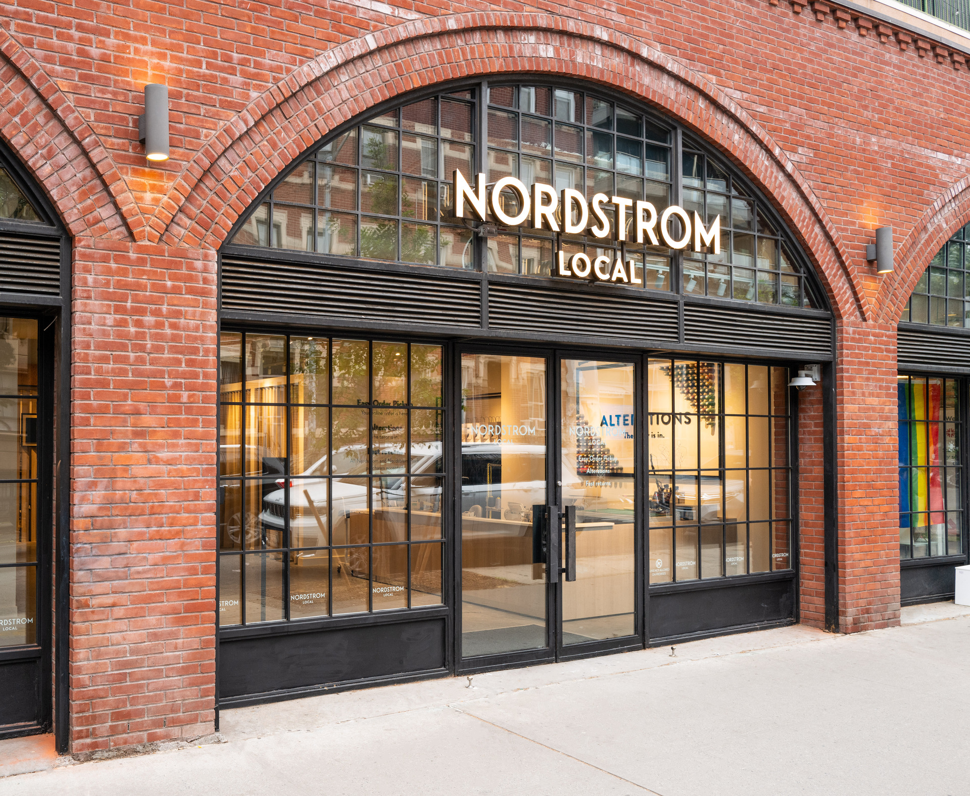
Nordstrom Bellevue

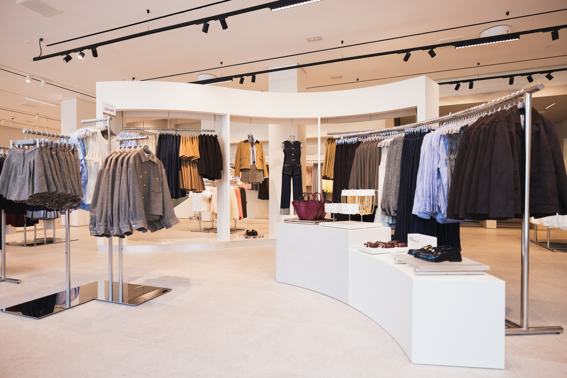
Nordstrom partnered with MG2 to design and remodel an existing store in Bellevue, spanning multiple buildings with the intent to develop a new fleet-wide strategy. This new dynamic for the Nordstrom customer will set the stage for future retail success.

The goal is to establish a seamless, discovery-driven customer experience showcasing the most sought-after brands in the world. All areas of the store will be updated to create a designer-level experience—clear, light, warm, and flexible. The design and implementation of the new Fleet-Wide Strategy will focus on the following: customer experience, brand attraction, innovation, flexibility, budget, and operational efficiency.


Australian fashion brands are opening more U.S. stores & distribution centers

Modern Retail’s Julia Waldow spoke with Melissa Gonzalez about Australian brands such as Bared Footwear, Princess Polly, Camilla and Outcast Clothing expanding into the U.S. Women’s brand Outcast Clothing, for example, does not yet have a physical store in the U.S., but sells its merchandise online and has been experimenting with pop-up stores. “Pop-ups like Outcast Clothing’s can be a great way for brands to dip their toes into new markets like the U.S.”
消费者体验

Glam Seamless

Glam Seamless opens its first store in Los Angeles.
Goal

Glam Seamless is a prominent hair extension brand with a strong online presence and a New York salon and flagship store. Looking to expand their reach, the brand came to MG2 with plans to open a second location in West Hollywood. Our goal was to build a salon and retail space that remains true to the Glam Seamless aesthetic, allows them to offer in-person services to their LA clientele, and supports content creation for their social media channels and e-commerce platforms.
MG2

Glam Seamless hired MG2 to collaborate on concept development, store design & project management of build out for its second salon location. Deliverables included creative ideation and design direction as well as all production sourcing and build-out management including but not limited to: signage, custom fabrication, and sourced FF&E and decor. MG2 worked closely with the Glam Seamless team to understand the merchandising and operational needs to be considered in all custom designs.

Outcome

The MG2 team’s design delivered a luxurious and intimate 2,000-square-foot West Hollywood salon-cum-retail location with key zones, including a retail and reception room, a four-station salon and beauty bar, and a private salon. These spaces have been designed to facilitate a wide spectrum of interactions, including self-guided shopping, hair extension consultations and treatments – all with an Instagrammable backdrop for live streams. Glam Seamless’ founder, Alexandra Cristin, aims for the space to provide guests with a full beauty care solution all in one location by offering a culmination of beauty services, products, and partnering with other women-owned beauty brands.

The Los Angeles salon (as featured in Beauty Independent) was designed with unique qualities to the space while keeping a level of cohesion aligning with the New York space. A locally-inspired color palette of soft pinks and warm peaches provides a light and luxurious consistency throughout the space, while an arch motif was carried over from the original salon and serves as a brand identifier. These light and mellow elements felt true to Los Angeles while maintaining an authentic brand aesthetic.


  • Project Details

  • 地点 West Hollywood, CA
  • 客户 Glam Seamless
  • 市场分类
  • 规模 2,000 SF
  • 设计服务
消费者体验

Ever/Body

Refreshing and Expanding Ever/Body’s Retail Offering

With the mission of demystifying cosmetic dermatology, Ever/Body is a beauty services provider that offers customized, high-performance treatments to its clientele. Keeping up with the growing demand for the company’s value proposition, Ever/Body sought to expand its service area throughout New York’s Tri-State region.

To make that goal a reality, they partnered with MG2/The Lionesque Group to redesign a refreshed concept that would align with the brand’s repositioning and bring its vision of growth to the next level.

Designers created spaces that were not just stores, but destinations and experiences worth visiting.

Tasked with creating a destination that grows lifetime value, builds awareness, and attracts new clients, MG2/The Lionesque Group strategized, designed, and developed Ever/Body’s new retail concept to align effectively with the brand’s repositioning.

Full-Service Retail Space Design & Development

To bring the new retail spaces to life, the team executed a holistic set of services for Ever/Body, including strategic planning and program development, real estate consultation, concept design, 2D test fits and 3D design, design development and construction documentation, and construction administration. Careful and meticulous design details were matched with methodical value engineering to ensure cost-effectiveness while still delivering a chic, cozy, and modern environment.

Solidifying the Legacy of a Branded Retail Experience

The partnership resulted in the opening of three new locations that align with the ethos and value proposition of the brand. The elevated, spa-like experiences incorporate natural elements infused with warm earthy colors and modern, sophisticated decor.

With a welcoming ambiance that embodies the brand’s goal of demystifying cosmetic dermatology, Ever/Body’s refreshed retail concept has proven to effectively grow lifetime value, build brand awareness, and attract new clients.


消费者体验

Hush Puppies

Scalable on-brand retail solutions for a global icon

Footwear towers to flagship stores: Unifying a brand across 3,000 retail spaces

Iconic since its inception, Hush Puppies has spent decades redefining the meaning of comfort, inspiring the embrace of color, and establishing itself as one of the world’s most recognizable footwear brands.

Having adopted an optimistic new visual identity and innovative approach toward technology, Hush Puppies partnered with MG2 to translate its new ideals into a modular retail format and global design guidelines.

With a standardized toolkit of modular design options, Hush Puppies retail partners have the flexibility to curate and scale store spaces while always remaining on-brand.

Artfully blending facilitation and collaboration with rapid productivity

Retail experts at MG2 facilitated collaborative explorations with stakeholders on both sides to examine challenges and find solutions to strike a balance between the needs of individual stores and the needs of the business. From there, they worked together to quickly and simultaneously design a flexible merchandising kit-of-parts as well as develop documented brand benchmarks to ensure that every Hush Puppies experience, from standalone footwear towers to global destination experiences, have the same identity and personality.

Countless scalable combinations, one iconic brand

With a toolkit of on-brand modular design options and standards, Hush Puppies retail partners around the world have the flexibility to choose from a carefully curated, scalable combination of fixtures, flooring, shelving, furniture, lighting, ceiling baffles, environmental graphic designs (EGD), monitor display graphics, and more, all adaptable to specific locations and budgets.

In addition to concurrently designing three unique full-scale store formats, five shop-in-shop formats, and developing tiered standards for fixtures and furnishings, MG2 leveraged talents from its branding team to bring to life unique EGD, wayfinding, and signage, including a hand-illustrated wall covering featuring Jason: Hush Puppies’ iconic basset hound mascot.

These playful, vibrant elements can be found throughout Hush Puppies’ latest concept store in Jakarta, Indonesia: the brand’s first implementation of its new global retail design guidelines. The experience also includes a variety of technology-driven retail touch points, ranging from augmented reality games to Instagram Live shopping events, that help the company connect with a new generation of customers.


观点

Immersive Experiences, Enduring Strategies: Retail Design Lessons From Milan Design Week

6 月 2022 / By MJ Munsell, Jessica Thaemert

What makes a retail experience truly exceptional?

Is it the total, almost tactile immersion in the world according to that brand? The way being in that space makes you feel? The possibilities it allows you to envision? The senses it stimulates? All of the above? Or something else entirely? This year, we attended Salone de Mobile and Fuorisalone In Milan to uncover fresh answers to these questions.

Inspired by all that we encountered, our team rounded up our top experiences, chronicling what made them stand out, and what we can learn and apply to designing some of the world’s best retail experiences.

Alcova

An otherworldly excursion into an abandoned military hospital, Alcova showcased over eighty exhibitors who brought common objects into an uncommon environment, creating focus, enabling storytelling, and developing memories that we now associate with that object and brand.

The journey inside was as impactful as the event itself: the approach, the uncertainty, the unveiling of a vignette — it all added to the allure of the brands, and the influence of the experience.

Alessi

The personalized showcase from Alessi told a brand story through the lens of their history in a multi-scaled environment. It presented small, curated vignettes that featured iconic moments from the brand’s past, narratives from the family who spoke about the factory and company’s timeline in the first person, and offered a sincere, insightful immersion into its legacy through a branded exhibit.

This multi-faceted design firm brought to life an experiential gallery of objects, music, place, and setting. The installation showcased their talent in creating emotional spaces, the curation of beautiful objects, and effortlessly bringing like-minded people together into an unforgettable experience.

Hermes

A showstopper from one of the world’s biggest luxury design houses featured their latest collection of furniture, accessories, and lighting. Inspired by brutalist water towers, large glowing wooden structures covered in translucent paper, enveloped various objects in an ethereal, yet focused setting.

A cavernous, dimly lit space housed these four glowing structures, each devoted to a different product type. The immersive, almost theatrical experience captured the imagination and inspired a deep, emotional connection with an otherwise often inaccessible brand.

Lee Broom

The latest collection from lighting designer Lee Broom was shown in an exhibit titled Divine Inspiration.  The setting placed the collection in a context that richened both its design and the story. Showcasing a stunning series of new, ethereal lighting inspired by historic places of worship. It was truly a multi-sensory experience combining journey, sound, scent, lighting, and place to reinforce the origins of this new collection.

Golden Goose

Golden Goose was successful in evolving their brand experience to be energetic, young, eventful, and even artistic through the in-store experience.  

The journey began at the storefront were visitors were driven by curiosity to peek into the action of the store from the outside. Once inside, a combination of both hands-on artistry with life-sized digital screens, created a complimentary experience.  Watching a delighted customer unpack their customized sneakers, unveiling artwork that was created specifically for them, and the energy that surrounded it was a brand defining moment.

An unexpected detail was the acknowledgment on the history of the space: Golden Goose honored the previous tenant—Alexander McQueen—through iconic elements and a narration of the legacy and significance they played.

Rossana Orlandi

Described as a “meandering wonderland of craft, collectible design, and mind-bending furniture that enticed visitors to explore down hallways, up stairwells, and around corners”, Rossana Orlandi’s gallery had us finding inspiration in every nook and cranny.

RO offered three curated experiences, which included immersive settings, collectible furniture, and spaces for eating and drinking. Some highlights were the “Sexy Seventies” collection by Se, the indoor/outdoor rustic spaces that showcased both practical and artistic sustainability concepts, and The Danish House exhibition that effortlessly showcased its curated Scandinavian designs.

What made all of these showcases so great?

  • Fully immersive experiences
  • Intuitive storytelling
  • Entirely integrated messaging
  • Bold, yet simple
  • A clear point of view
  • Disciplined design
  • Instantly iconic
  • A story told using all senses

This year at Milan Design Week, we were reminded of the importance of three pivotal, yet enduring design strategies:  “do not stray”, “keep it simple”, and “leave something to the imagination”.

With every experience we encountered, it was the fusion of sound, scent, lighting, design elements, visual merchandising, and people that made them memorable. And it’s this blending of science and art that creates exceptional retail experiences.

观点

The Future of Digital & Physical Retail: Top Five Trends for 2022

1 月 2022 / By Melissa Gonzalez

This post was originally written for & published by The Lionesque Group.

__________

In late January, our team had the pleasure of attending NRF’s annual Big Show conference in New York, where I had the honor of leading a captivating panel discussion about the future of the industry. With so much changing in retail over the past two years it was a welcome opportunity to connect with brands and experts in person and hear about their innovative approaches toward keeping up with consumer expectations and demands. 

Here are our top five takeaways from what’s important for retailers, brands, and designers to keep at the forefront as they bring future generations of digital and physical consumer experiences to life:

1. Agility in evolving the cross-platform experience is critical. 

As consumers continue to evolve how they shop, blurring the point-of-sale lines across digital and physical spaces, brands need the ability to continually and fluidly advance their offering. Any instance of friction during the payment process can kill the purchase. Unearthing and implementing streamlined methods of putting payment in the hands of consumers and/or in-store associates is essential. 


When it comes to in-store layouts, art meets science. We have more access to data and insights today than ever before, highlighting customer patterns, capturing interactions with store associates, and illuminating friction points. This data is vital to informing agile design strategies, which need to morph alongside the customer. Industry partnerships, like the one announced between The Lionesque Group and Pathr.AI, will be key to defining and strengthening the future of consumer/brand relationships.

2. Efficiency is the most desirable currency that technology offers.

To truly be successful, store associates require information to be at their fingertips, both for back-of-house and consumer-facing interactions. Instant visibility as to what’s on the floor, what’s in the back, and what’s available at another store’s location isn’t just an expectation of today’s customer, it’s necessary to embolden the prospects of a sale and fortify brand loyalty.


Consistent with The Lionesque Group’s recent industry survey findings, every moment a store associate has real-time visibility into the full scope of their inventory adds up to millions of dollars saved by the retailer. Using technology to empower associates with this knowledge bolsters store efficiency, optimizes productivity, and streamlines delivery performance.

Melissa Gonzalez, Principal at MG2, NRF Big Show 2022

3. Omnichannel means being omnipresent for the consumer. 

Whether they’re standing in a store, browsing online, interacting with social media, or playing in the metaverse, consumers want and expect a congruent, simplified “click-to-buy” experience that’s seamless across every presence of a brand.

They’re seeking an “all-of-the-above” optionality that is as fluid as they need it to be in the moment, and this agility is critical as we think about designing the store of tomorrow. Digital integration will need to empower both store associates and the consumer to be able to move interchangeably when visiting different brick and mortar locations so they have the options, access, and efficiency they desire.

4. True sustainability starts with the supply chain. 

Consumers speak with their wallets, and more and more their love language is shifting toward an expectation in transparency, sincerity, and sustainable practices from the brands they support. This further includes retailers being net-positive to the environment, as well as striving for social and community equities.

The real onus, however, is on the full ecosystem coming together to truly make a difference consumers can see and resonate with. Brands and retailers need to own and optimize their supply chain, making it more accessible from a cost and candor standpoint for consumers.

One of the lessons shared by Saskia van Gendt of Rothy’s was a profound sense of understanding of the brand’s own role in the process. “If you own the supply chain,” he notes, “you can truly impact things. For example, you can set up for on-demand manufacturing so as not to leave waste.”

5. We’re amidst an era of phygital convergence.

The metaverse—the industry’s newest buzzword—holds the promise of and capacity to meld physical retail with mixed reality experiences. However, we’re already years into this convergence of digital and brick-and-mortar, with offerings like virtual endless aisles that consumers can browse for hours, just as they might window shop in-store. 

Innovative technology has, and continues to fuel the future of retail data collection and analysis, powering responsive IoT connectivity via RFID, sensors, digital displays, and products that ignite an overlay of immersive media. The digital/physical overlap will only continue to grow.

__________

Reach out to our team to learn more about how we’re helping define the future of brick-and-mortar retail for brands.

Research & Insights

Designing Store Experiences for Today’s Consumer

1 月 2022 / By Melissa Gonzalez, Nick Caputo

In our constant curiosity and investigation of consumer behaviors and expectations, we utilize data insights to help uncover and validate where we can deliver true points of gratification within the customer journey. Here is a snapshot of key takeaways from our latest consumer survey. Our full deck with all our insights is available for download at the bottom of this preview.

How can we adapt “The role of the store” to reflect today’s consumer?

As consumers adjust to their hybrid worlds and the merging of digital and physical deepens, we take a look how consumer behaviors, needs, and expectations impact “the role of the store.” In this survey, we investigate the utility technology plays, the inherit value it brings us and how that can inform opportunities for physical retail environments.

Download – Advisory – 20220111 Store Experiences Report

消费者体验

Kathy Kuo Home

Curating immersive inspiration

Kathy Kuo Home is a boutique home furnishings brand that offers modern and classic home decor for all interior design needs. With a robust and loyal online following, Kathy Kuo Home sought to create its first permanent flagship location with the assistance of MG2 / The Lionesque Group. In addition to curating in an inviting, laid-back, dog-friendly space where customers can immerse themselves in possibilities, Kathy Kuo and her team also wanted to bring their online design center, full digital catalog, and tailored consultation offering to their clients in the heart of Southampton, New York.

The resulting experience is one that perfectly embodies the brand’s high-end offerings, seamlessly weaving together the delight of in-person discovery with the ease of digital retail technology and expert design consultation.

Within just 4,000 SF of retail space, the Kathy Kuo Home flagship uses vignette scenes to feature a hand-selected assortment of the brand’s best-selling products, including indoor and outdoor furniture, décor, and lighting in a range of styles. The store also houses a design resource center for KKH designers to work one-on-one with clients in-person to design their home, and will further serve as a destination for curated events hosted in-store.

Transcending an environment that feels like Kuo’s own Hampton home, it’s an experience that successfully welcomes everyone in the space, encouraging exploration and fueling inspiration.

“Interacting with our customers has always been a top priority for the brand, and there’s no better way to do this than in person.” said Kuo in an interview with Forbes just prior to the store’s grand opening, “We’ve seen continued success through investing in our relationships by providing our high-touch services online and now will have the opportunity for continued growth. Having a physical location will allow us to connect with and serve more customers and clients than ever before, aiding in our brand mission to help as many people as possible love where they live.”

Since opening doors, Kathy Kuo Home’s flagship store has been featured in Architectural Digest, Insider Trends, Modern Luxury, and Business of Home.

It was also awarded the honor of House Beautiful’s 2021 Best Home Stores in America Right Now.


  • Project Details

  • 地点 Southampton, New York, United States
  • 客户 Kathy Kuo Home
  • 市场分类
  • 规模 4,000 SF
  • 设计服务
观点

Above & Beyond: A Data-Driven Commitment to Sustainable Design

11 月 2021 / By Above & Beyond: A Data-Driven Commitment to Sustainable Design, Russ Hazzard

Architect and AIA 2030 Founder Edward Mazria once said, “We tend to rush toward the complex when trying to solve a daunting problem, but in this case, simplicity wins. Better buildings, responsible energy use, and renewable energy choices are all we need to tackle both energy independence and climate change.”

Straightforward, responsible design has long been at the core of MG2’s strategy and philosophy, with sustainable principles and applications woven into our projects at every opportunity. Our three sustainability values—Environmental Stewardship, Purposeful Efficiency, and Restorative Measures—are a simultaneous embodiment of where our firm was the year they were defined and reflect where we want to be in the years to come. MG2 has worked to raise the bar on our designs over time, evolving to match—and where we can, exceed—sustainable certifications and benchmarks.

“We had always reviewed our specifications for opportunities to suggest sustainable products and methodologies to our clients, which when we started were just better choices from a location and ‘better for the environment’ point of view,” says Russ Hazzard, President of MG2.

“Today, those sustainable vendor and materials recommendations aren’t just convenience, they’re a fundamental part of our DNA and design process. As a result, clients who once might not have been open to alternatives are looking to us as experts and advocates, armed with the right solution to set them on a path toward a more sustainable future.”

Costco Wholesale Headquarters Campus – Issaquah, WA

As architects and designers of built environments, the implications of everything we do, of every project we take on, are unmistakable. AIA’s 2030 Challenge outlines two specific goals that pledge firms must strive toward:

  1. A 90% reduction in built environment operating energy systems by 2025.
  2. A 45% reduction—a percentage imposed by our own team—in built environment embodied carbon by 2025.

“Greenhouse gas emissions reduction is the challenge of the century for the entire industry.” states Johnny Klemke, Building Performance Analyst at MG2, “How do we keep building more and more while producing less and less impact in the natural environment? That’s the question we’re taking on at MG2. By helping teams come up with more efficient, less carbon-intensive solutions for their designs, we’re also showing clients that sustainability doesn’t need to be a cost burden on the project.”

By helping teams come up with more efficient, less carbon-intensive solutions for their designs, we’re showing clients that sustainability doesn’t need to be a cost burden.

Johnny Klemke, Building Performance Analyst

“Our greatest hurdle is bringing the industry along with us,” says Jon Guerechit, a designer at MG2 helping to lead our operating energy initiative, “One benefit is that indisputable data makes it easier to convince clients that a cost-saving measure can also serve the environment. But the numbers aren’t always in our favor. Embracing the mindset of being a steward of the environment is harder because it forces stakeholders to think differently and invest in the distant future. It’s a mentality we’re pushing for across the board.”

Today, as we continue to evaluate and evolve our firm’s sustainability action plan, we’re committed to going above and beyond the goals outlined by AIA’s 2030 challenge by adding two more of our own

  1. A rigorous commitment to working with forward-thinking vendors and using sustainable materials that adhere to the highest standards possible.
  2. A reduction of water consumption—30% to 45% for indoor and 50% for potable outdoor—in all of our projects by 2030
PCC Community Markets – Seattle, WA

Adding materials to the mix.

From improving indoor air quality to reducing construction waste, the materials our architects and designers specify matter. Our choices represent an enormous opportunity to enhance the health of the planet and the people who live on it.

In addition to becoming proud signatories of the AIA Materials Pledge, MG2 has created our own rigorous Materials Evaluation System. Using a stoplight structure, our specialists analyze and rank every vendor, product, and material we use, to ensure that where and whenever possible, we’re adhering to the highest attainable sustainability standards for a better future.

PCC社区超市—the largest grocery co-op in the United States—has partnered with MG2 for years on their journey to better their store’s materials and target LBC Petal Certification. In its Ballard location, the first grocery store in the world to be certified, over 40% of the materials—just shy of $1.4M—were sustainably sourced, with 9.2% of those derived from within 100 miles. Additionally, 100% of the store’s wood is FSC certified, with 10% of the elements reclaimed or reused.

“There is a misconception that we need to pursue green building certification to push for sustainable materials, or that we must only use sustainabile materials to make a difference in the world. Neither of these are true.”

Candon Michelle Murphy, Materials Specialist

With MG2’s data-driven materials system comes a deep reservoir of knowledge and insight, but continuous education to overcome misconceptions and help our clients and partners understand the financial and environmental investment is still critical.

“The largest challenge around the selection of sustainable materials is the misunderstanding of what costs are associated with it.” mentions Candon Michelle Murphy, MG2’s Materials Librarian, “It is true that there are specific material categories on the market that represent a high cost add if the sustainable selection is desired, but there are quite a few categories where there is no or nominal fee add to make a far more environmentally-sound final installation.

“There is also a misconception that we need to pursue a green building certification to push for sustainable and healthy materials, or that we must only put in sustainable materials to make a difference in the world. Neither of these is true, however: any selection that supplies a reduction of embodied carbon, lesser the amount of VOCs put into interior spaces, and provides for reclamation of materials or diversion from landfills still makes a difference.”

Fundamental impact through water reduction.

Water is one of the earth’s most precious resources. While many of us take fresh, clean water for granted in our day-to-day lives, architects who create built environments in areas where this resource is not so abundant continually have its preservation, reduction, and recyclability top-of-mind.

MG2’s water conservation goal—our fourth and possibly most ambitious sustainability initiative—is to reduce indoor water use in appliances such as toilets and faucets by 30% to 45% and to reduce potable outdoor water consumption in landscaping and irrigation by 50% in every single one of our projects by the end of 2030.

“Among dozens of reasons, a reduction of water in our projects is important because it can lower water withdrawals from local water sources,” states Maribel Barba, designer and co-lead of MG2’s water conservation goals, “allowing us to better harmonize with the local environment, increase water availability for all, and improve community relations.”

Costco Santa Fe – Mexico

While our water conservation goals may be new to many of MG2’s clients, some have been pioneering innovative technologies and water reduction tactics in their build environments for years. For example, longtime partner Costco has been working with MG2 on implementing water solutions programming into its warehouses throughout Mexico and the Southwest US for years, an initiative that awards them a 20% annual water savings.

The wholesaler giant recently took an even more significant leap into the future of water conservation with its Costco Santa Fe store. Complete with a one-of-a-kind green roof that acts as a natural extension of Parque La Mexicana, the Santa Fe location was designed with numerous water-saving technologies,  including toilets and landscape irrigation that utilize recycled water and a stormwater collection system in the Parque lake. Restroom fixtures were also installed with 50% less water demand, according to baseline.

“Even when water conservation processes have been implemented for several years, I think it is still being a challenge for firms to sell this idea to some partners.” says Christian Razo, designer and co-lead of MG2’s water conservation goals, “Many do not realize how much water you can save, or even the consequences of not saving water. We do our best to educate every one of our clients on the rewards of implementing these processes, including the satisfaction of knowing that what you’re doing is helping future generations.”

Costco Santa Fe – Mexico

We’ve come a long way in our sustainable design practices and are immensely proud of the benchmarks many of our projects and partnerships have achieved. But the reality is, MG2 is just getting started. 

“When we set out to create MG2’s formal framework for sustainability, we knew it needed to resonate with all staff and be embedded in the culture of the firm.” says Mark Taylor, MG2’s Sustainability Lead, “Our data-driven approach speaks directly to the results-oriented nature of the firm and will be the backbone of our success as we continue on our journey.”

MG2’s Sustainability Action Plan

Learn more about our above-and-beyond commitment to the future of our planet in our AIA 2030 Commitment Sustainability Action Plan, or by reaching out to our sustainability team.

消费者体验

灿烂的地球

jewelry-show-room-brilliant-earth-mg2-design

Approachable luxury

Since 2005, Brilliant Earth has offered the world ethically sourced, award-winning fine jewelry through its elevated web-based platform and personalized appointment-only showrooms. When the digitally-native company sought to expand its brick-and-mortar portfolio with open retail spaces, they partnered with MG2 to seamlessly translate the spirit of their digital brand and unique offerings into a real-world experience.

Like its jewelry, the retail design and rollout program for Brilliant Earth’s new showrooms was curated with thoughtful craftsmanship in every production phase. Previously, all the brand’s in-person experiences were appointment-only, with most of their spaces hidden away from window-shopping consumers on the upper floors of retail centers.

Utilizing a light, luminous, bright, and warm palette that reflected its online presence, MG2 designers brought an approachable luxury to Brilliant Earth’s new showroom experience. This new iteration of the store—the first of its kind for Brilliant Earth—brings an inviting, interactive, and educational retail experience into the brand’s program, diversifying its real estate potential with more premium, ground-level spaces, increasing awareness and engagement.

Brilliant Earth_Brooklyn

From planning to fixture design, the team boldly broke many industry barriers often seen in jewelry, such as the traditional horseshoe-shaped counters that often act as barriers.

Instead, in a direct reflection of the brand’s unique educational approach to the diamond shopping experience, MG2 designed a fixture package program that flexes and scales with each new space; a customizable kit-of-parts that can fit any format.

An entry kiosk once used to check customers in for their appointments evolved into a multi-functional digital tool. Now used to assist shoppers in industry and diamond education, the sizing of rings, and the check-out process, it’s a feature that further underlines the seamless integration of Brilliant Earth’s digital and physical offerings.

Caseline throughout the store is designed like furniture; display cases float lightly in the space, while round consultation tables equalize the service experience. This highly customized design and rollout program was achieved without raising the cost of construction for Brilliant Earth.

Brilliant Earth_Brooklyn

The Brooklyn location of Brilliant Earth represents a step forward for the brand while still adhering to the same kit of parts utilized in their other showrooms. Its unique building in Williamsburg features a vaulted ceiling and exposed brick, giving the space a larger and more roomy feel. This has granted merchandising room to grow, expanding the brand’s retail offering with six cases, an additional appointment station, and a more retail-focused reception area. With an emphasis on showcasing its fine jewelry products, this evolution in Brilliant Earth’s showroom design successfully balances its minimalist roots with an elevated, flexible retail agenda.

Similarly distinctive in its design hurdles and opportunities, Brilliant Earth’s King of Prussia showroom location—situated within a mall with limited egress and no natural light—presented unique challenges for the team to overcome. To bring the space to life, designers reprioritized the showroom’s configuration, eliminating the need for glazing, and added greater visual impact by utilizing large format graphics, wall casework, and incorporating merchandising above the cases. The warm and inviting retail story is solidified through the incorporation of recessed lighting, plush sofa seating, and education-centric pedestals at the front of the space.

The showroom’s private appointment stations were strategically relocated to the back of the space, providing guests with greater privacy while maximizing the overall flexibility of the design. By utilizing the same kit of parts as its other showrooms while adding new elements that reflect the brand, designers ensured that Brilliant Earth’s iconic bright and light personality prevailed within the confines of the darkened shopping center.

With each showroom brought to life across the country, this global leader in ethically sourced fine jewelry continues to seamlessly preserve its online identity while defining new retail experiences for its consumers, each with its own unique flair.


消费者体验

Vans 洛杉矶市区新店开业

Scalable on-brand retail solutions for a global icon

滑板和冲浪运动经典品牌Vans在过去的54年里都将美国南加州视为自己的大本营,今年终于在加州洛杉矶市区开设了首家社区零售和活动门店。MG2加州尔湾办公室与Vans团队合作已久,此次共同打造了Vans最新也是最大的旗舰店,创造了超越预期的升级混合体验环境,成为Vans迈进新时代的标志。

House of Vans旗舰店占据了历史悠久的Singer Building大楼三层楼面,精心的设计优化了竖向动线与重叠路径,带来无缝衔接的的消费体验。同时还设置了诸如厨房和移动酒吧等别具一格、超乎预期的功能设施,而这要求门店的空间设计能够解决更为复杂的报批过审和合规性问题。

With a standardized toolkit of modular design options, Hush Puppies retail partners have the flexibility to curate and scale store spaces while always remaining on-brand.

多年的合作让MG2成为了House of Vans项目的首席建筑合作伙伴,该项目是Vans迄今为止设立的最大、最具雄心的旗舰店,面积超过1000平米。对他们品牌的深入了解和稳固的合作关系让双方团队在整个项目期间都可以实现无缝衔接,保持透明度、信任度和协作性。

Vans美洲区营销副总裁Carly Gomez

多年的合作让MG2成为了House of Vans项目的首席建筑设计合作伙伴,该项目是Vans迄今为止设立的最大、最具雄心的旗舰店,面积超过1000平米。对他们品牌的深入了解和稳固的合作关系让双方团队在整个项目期间都可以实现无缝衔接,保持透明度、信任度和协作性

在空间设计过程中,MG2团队在结构功能、材料、成本和品牌推广方面发挥了决策咨询和推动宣传的作用。MG2项目团队还具有本地优势,熟悉本地相关审批流程,具备处理较为复杂的项目问题的能力。

为了展现Vans对可持续性的执着坚持和品牌价值,我们在整个空间中尽可能多地采用了原始材料、原有历史建筑元素和可持续性能源装置。

新的空间环境采用了胶合板、混凝土、链条、当地艺术和Van的招牌黑白棋盘图案作为装饰,从整体上呈现了Vans所具有的南加州式的文化风格和调性,同时还为品牌提供了拓展除开滑板和冲浪爱好者之外的客户群的空间,吸引了新世代的消费者。

在整个项目过程中,项目团队亲眼目睹了当地政府和消费者对Vans开设新门店的兴奋与热情,Vans新店的选址原为废弃空间,经过设计改造将让艺术、音乐和文化重新融入到这一历史悠久的社区。

洛杉矶市区House of Vans是该品牌目前全球最大的Vans之家,也是该社区第二大的实验性零售空间。新店于2020年春季向公众开放,展出了本地艺术家的最新作品,设置了专门的社区体验工作室,当然了,还上新了各种Vans独家鞋品、服装和配饰。


消费者体验

Vans

跨境翻译标志性品牌

Vans品牌崇尚个性和户外运动的文化,例如滑冰,冲浪,单板滑雪和BMX自行车。为了在墨西哥和其他市场拓展业务,VF Corporation需要将Vans商店的概念转变为新的商店设计,以增强文化敏感性地标志性品牌。

MG2与Vans合作,为北美30多家门店实施一致的建筑设计和规划程序。

在每个位置,通过MG2的文化趋势知识和本地发展流程的细微差别,可以有效地量身定制和有效实施设计概念。


消费者体验

蒙克勒

超越奢侈图标的高标准

蒙克勒(Moncler)为豪华户外运动服设定了标准,其客户期望最好的东西。 Moncler的店铺遍布世界各地,一直在寻找合作伙伴,以便在华盛顿州Bellevue的Bravern的Shops和拉斯维加斯的Caesars的Forum Shops的新专卖店中将法式生活方式品牌融入生活。

MG2在专业和奢侈品零售以及零售中心设计方面的专业知识为Moncler和零售中心开发商之间的有效桥梁,以实现每个参与者的目标。

该过程涉及与Moncler的安装团队进行现场合作,以确保有效地整合独特的材料,例如意大利的石材和法国软木镶板。由于MG2的工作,拉斯维加斯和贝尔维尤的精品店成功地秉承了Moncler的品牌标准和Moncler客户的高期望。


消费者体验

优衣库

量身定制的表达独特品牌的方法

优衣库是全球第四大服装零售商,拥有超过1,400家商店,其销售网络不断扩大,提供优质,休闲的服装。随着优衣库的不断扩展,他们致力于将每个市场的文化特征整合到零售店中,同时忠于品牌的核心设计。

进入新市场时,优衣库通过利用弹出式或临时商店位置来战略性地提高品牌知名度。 MG2与UNIQLO的美国和日本团队合作,进行了一系列此类弹出式窗口以及在线购物中心和旗舰店。一个特别独特的弹出窗口位于波士顿历史悠久的法纳伊大厅市场中,其后是附近的一家旗舰店,体现了优衣库的现代美学与将近200年历史的昆西市场建筑的传统融合。

在每个商店位置,MG2都诠释了UNIQLO的主要品牌和设计价值,以适应市场的独特特征。优衣库的标志性设计元素-从精确的对称处理到着重于进入时的强烈视觉冲击-确保每家商店都忠于UNIQLO品牌,同时吸引了一批新的忠实顾客。


  • Project Details

  • 地点 美国,多家门店
  • 客户 迅销有限公司
  • 市场分类
  • 规模 2,500-15,000平方英尺
  • 设计服务
观点

美的未来

6 月 2020 / By Melissa Gonzalez

就在几个月前,美丽还依赖于高接触感官环境。随着人们对高接触环境意识的增强,美容行业必须吸引负责任地解决与产品测试相关的“触摸和感觉”交互的客户。 店!协会 问我们的团队,商店如何在负责任地平衡数字化和人类互动的同时创造诱人和真实的体验?

Melissa Gonzalez,Min Jae Kwon和Lauren D'Archangelis探索设计解决方案,其中 美的未来 可以通过创新的吊船,平行游戏和氛围照明,互动式商店墙和新的结账方法来应对这一挑战。清洁和卫生将是品牌和消费者的首要任务,但是发现的情感体验仍然会闪耀。