Perspectives
Immersive Experiences, Enduring Strategies: Retail Design Lessons From Milan Design Week
June 2022 / By Immersive Experiences, Enduring Strategies: Retail Design Lessons From Milan Design Week, Jessica Thaemert

What makes a retail experience truly exceptional?
Is it the total, almost tactile immersion in the world according to that brand? The way being in that space makes you feel? The possibilities it allows you to envision? The senses it stimulates? All of the above? Or something else entirely? This year, we attended Salone de Mobile and Fuorisalone In Milan to uncover fresh answers to these questions.
Inspired by all that we encountered, our team rounded up our top experiences, chronicling what made them stand out, and what we can learn and apply to designing some of the world’s best retail experiences.
Alcova
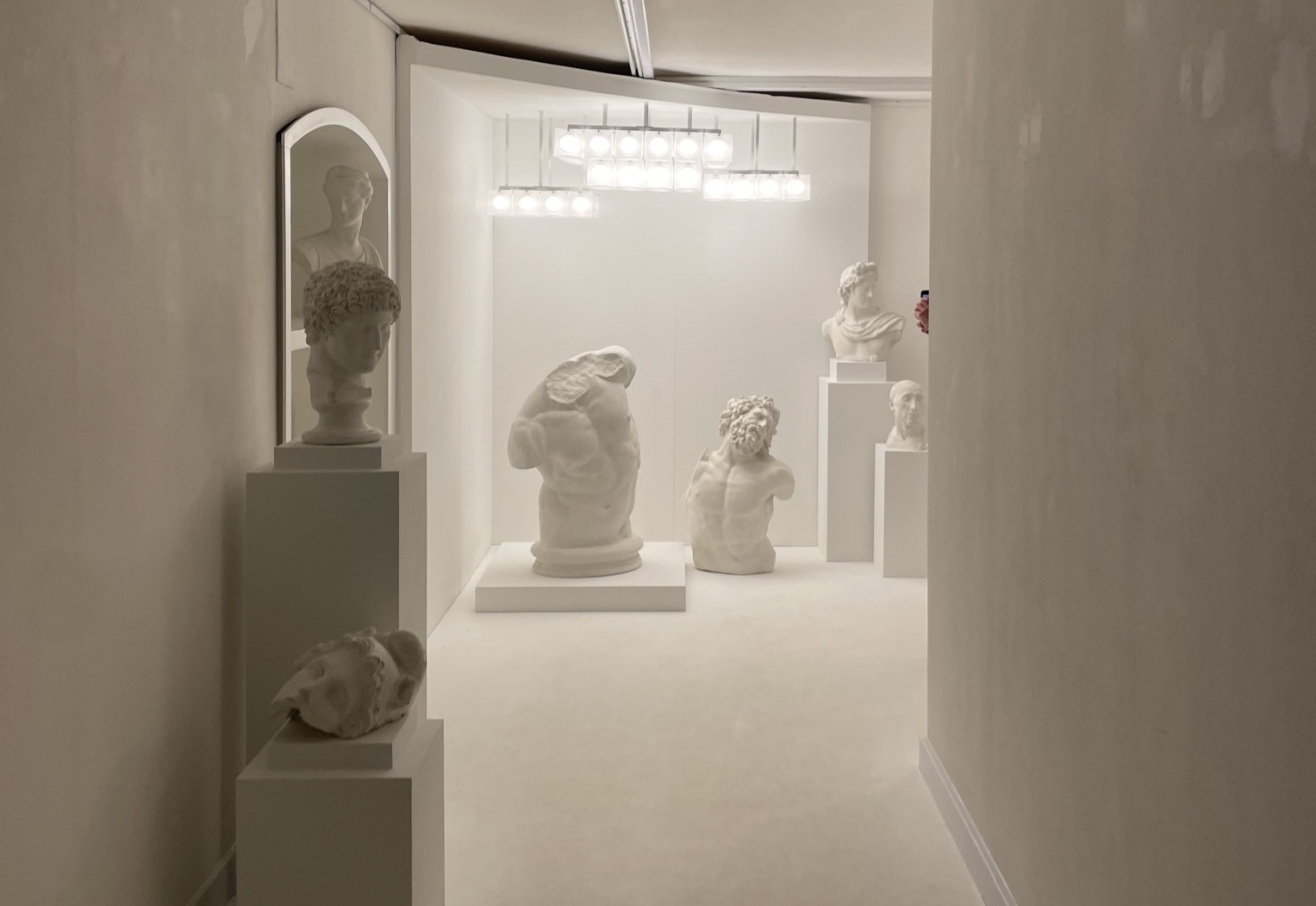
An otherworldly excursion into an abandoned military hospital, Alcova showcased over eighty exhibitors who brought common objects into an uncommon environment, creating focus, enabling storytelling, and developing memories that we now associate with that object and brand.
The journey inside was as impactful as the event itself: the approach, the uncertainty, the unveiling of a vignette — it all added to the allure of the brands, and the influence of the experience.
Alessi
The personalized showcase from Alessi told a brand story through the lens of their history in a multi-scaled environment. It presented small, curated vignettes that featured iconic moments from the brand’s past, narratives from the family who spoke about the factory and company’s timeline in the first person, and offered a sincere, insightful immersion into its legacy through a branded exhibit.
Dimore Gallery
This multi-faceted design firm brought to life an experiential gallery of objects, music, place, and setting. The installation showcased their talent in creating emotional spaces, the curation of beautiful objects, and effortlessly bringing like-minded people together into an unforgettable experience.
Hermes
A showstopper from one of the world’s biggest luxury design houses featured their latest collection of furniture, accessories, and lighting. Inspired by brutalist water towers, large glowing wooden structures covered in translucent paper, enveloped various objects in an ethereal, yet focused setting.
A cavernous, dimly lit space housed these four glowing structures, each devoted to a different product type. The immersive, almost theatrical experience captured the imagination and inspired a deep, emotional connection with an otherwise often inaccessible brand.
Lee Broom
The latest collection from lighting designer Lee Broom was shown in an exhibit titled Divine Inspiration. The setting placed the collection in a context that richened both its design and the story. Showcasing a stunning series of new, ethereal lighting inspired by historic places of worship. It was truly a multi-sensory experience combining journey, sound, scent, lighting, and place to reinforce the origins of this new collection.
Golden Goose
Golden Goose was successful in evolving their brand experience to be energetic, young, eventful, and even artistic through the in-store experience.
The journey began at the storefront were visitors were driven by curiosity to peek into the action of the store from the outside. Once inside, a combination of both hands-on artistry with life-sized digital screens, created a complimentary experience. Watching a delighted customer unpack their customized sneakers, unveiling artwork that was created specifically for them, and the energy that surrounded it was a brand defining moment.
An unexpected detail was the acknowledgment on the history of the space: Golden Goose honored the previous tenant—Alexander McQueen—through iconic elements and a narration of the legacy and significance they played.
Rossana Orlandi
Described as a “meandering wonderland of craft, collectible design, and mind-bending furniture that enticed visitors to explore down hallways, up stairwells, and around corners”, Rossana Orlandi’s gallery had us finding inspiration in every nook and cranny.
RO offered three curated experiences, which included immersive settings, collectible furniture, and spaces for eating and drinking. Some highlights were the “Sexy Seventies” collection by Se, the indoor/outdoor rustic spaces that showcased both practical and artistic sustainability concepts, and The Danish House exhibition that effortlessly showcased its curated Scandinavian designs.
What made all of these showcases so great?
- Fully immersive experiences
- Intuitive storytelling
- Entirely integrated messaging
- Bold, yet simple
- A clear point of view
- Disciplined design
- Instantly iconic
- A story told using all senses
This year at Milan Design Week, we were reminded of the importance of three pivotal, yet enduring design strategies: “do not stray”, “keep it simple”, and “leave something to the imagination”.
With every experience we encountered, it was the fusion of sound, scent, lighting, design elements, visual merchandising, and people that made them memorable. And it’s this blending of science and art that creates exceptional retail experiences.