- Toronto, Canada
- Specialty retail
Consumer Experiences
The Shoe Company

Designing a customer-centric experience of convenience
When The Shoe Company, a footwear and accessories brand well-known for its convenience, sought to revamp its store design to offer a fresh perspective, it partnered with retail experts at MG2 to make its shopping experience even faster, better, and easier.
A customized retail design strategy centered on shopper convenience.
Crafting an Environment for Busy Moms
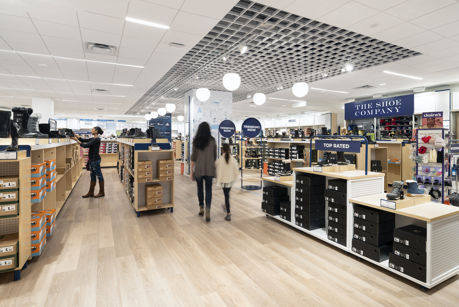
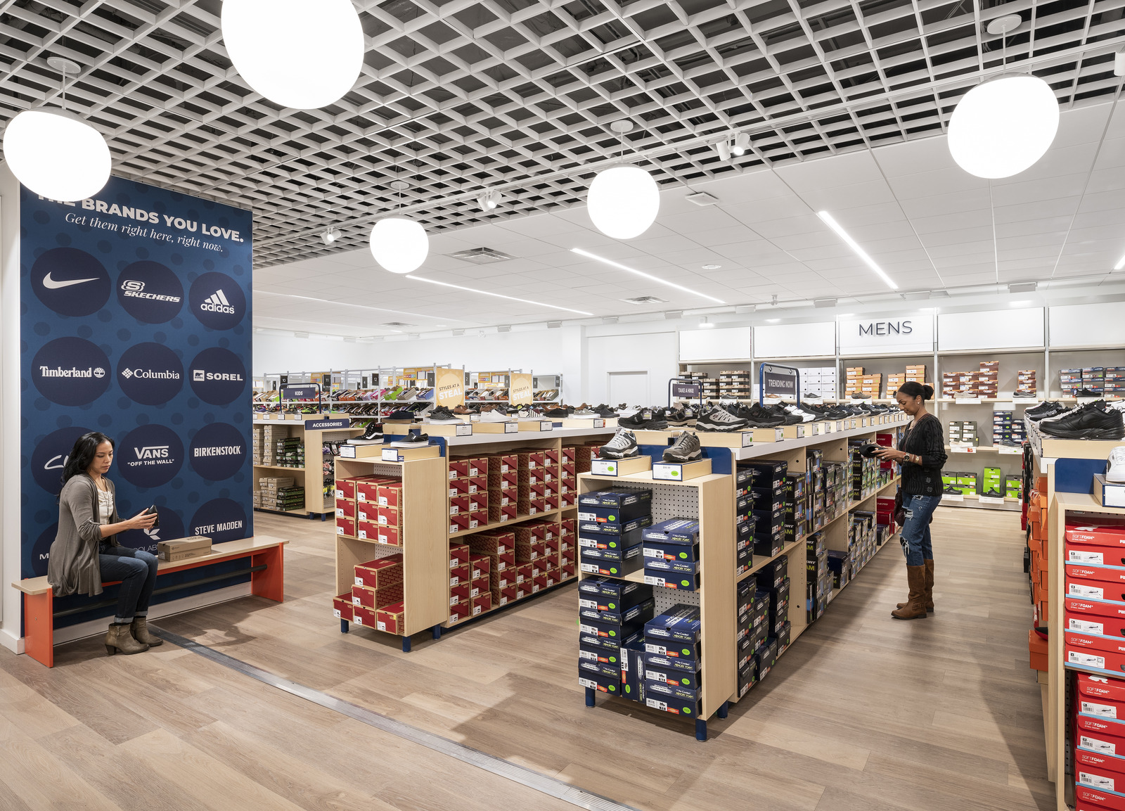
Designers began by identifying what could make The Shoe Company stand out in a crowded marketplace and defining a detailed persona for the brand’s target consumer: A busy, on-the-go mother who valued quick and hassle-free shopping with her children in a self-serve environment curated for convenience.
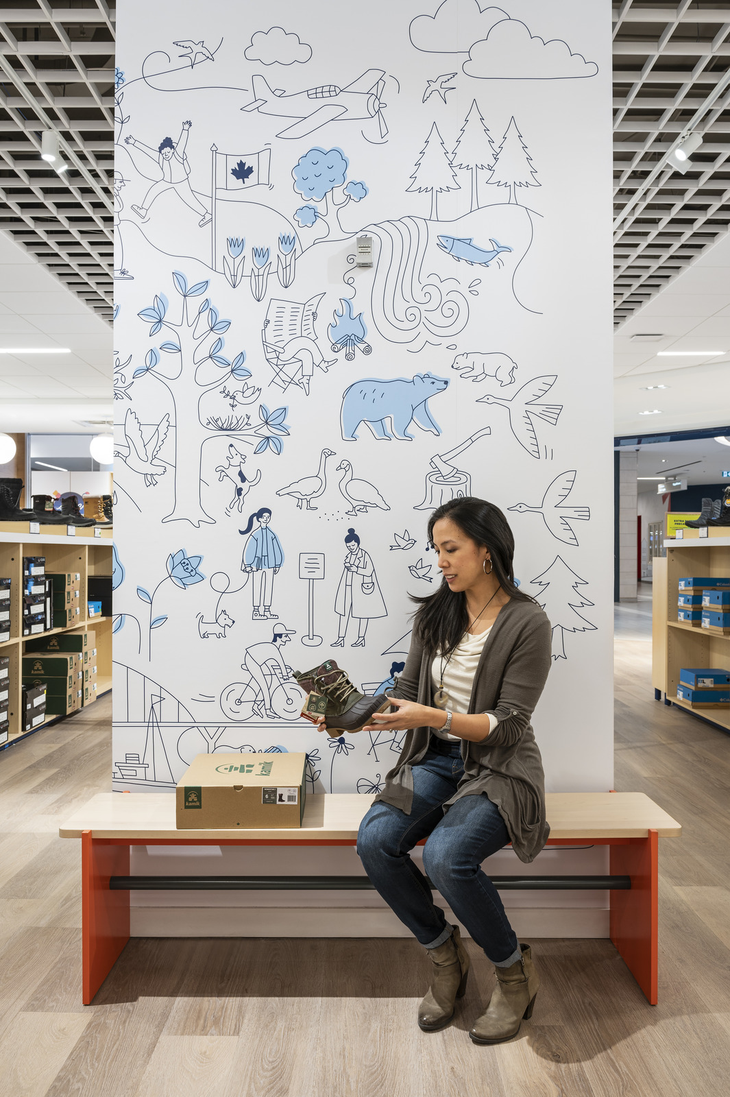
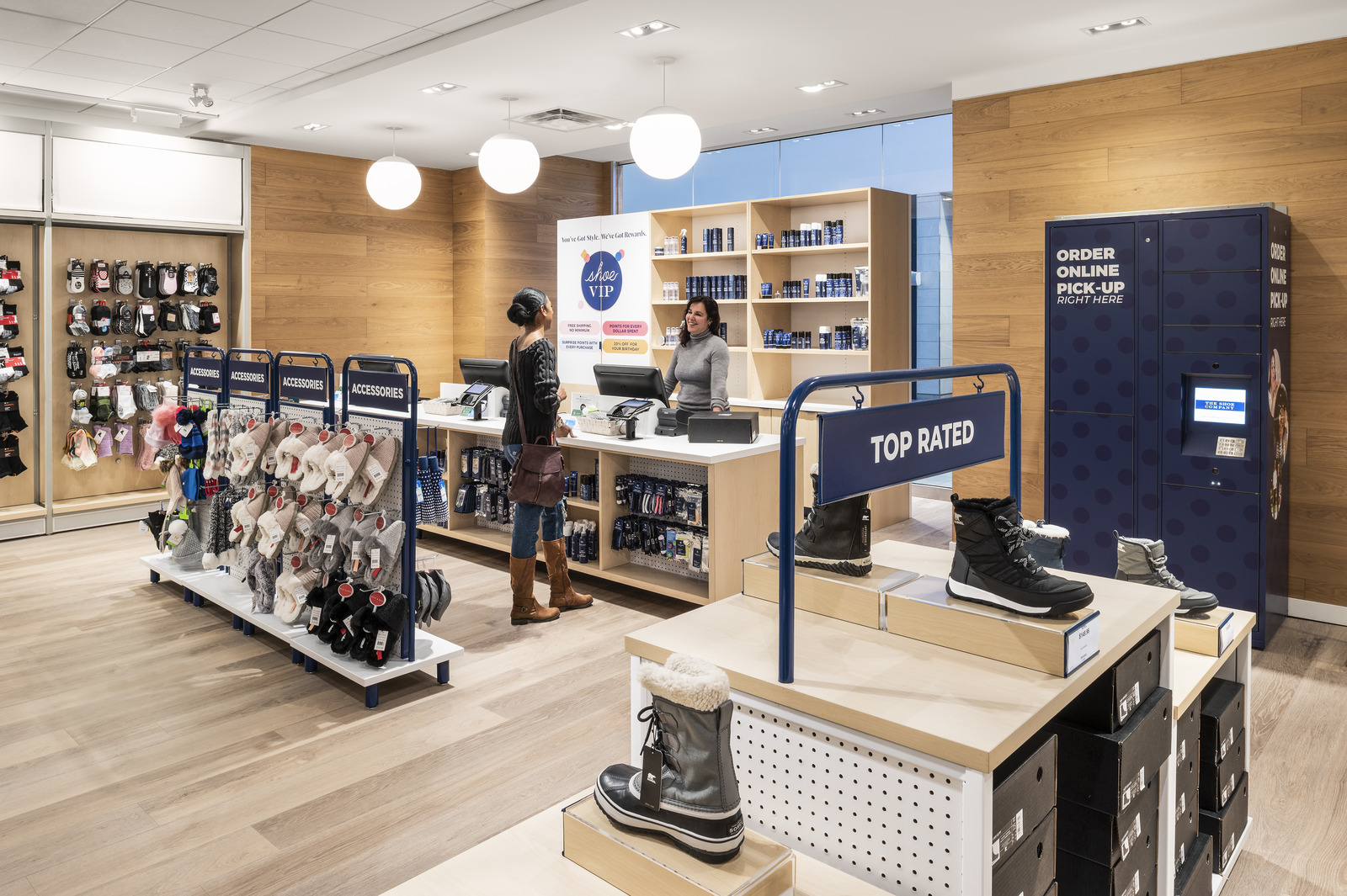
With this deep understanding in place, the team holistically reimagined the store’s environment, focusing on decluttering and cleaning up the space to make it more welcoming, kid-friendly, easily navigable, and visually appealing.


A Focus on Products and Flexibility
Previously, the space’s composition mixed multiple colors with the brand’s iconic navy motif, making it difficult to see how the fixtures were arranged. In order to address this, designers reduced the colors in use while leveraging a flexible format, updating the old fixtures and materials to create a clear and organized store layout that placed the focus on products.
A flexible merchandise area was developed as a focal point upon entry, featuring multiple types of fixtures and three primary merchandise towers that merged online inventories with in-store ones. This approach allowed the brand to easily update the products featured to align with various shopping seasons throughout the year and created the possibility for future technology integrations that would provide a deeper connection to e-commerce.
Revamping Inventory Display and Navigation
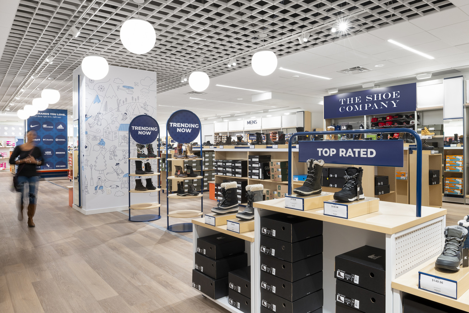
Restructuring the upper inventory areas along the walls, which once shelved backstock products, the team integrated bold and easily visible wayfinding, easily movable throughout the store. Able to efficiently navigate to the area they’re interested in, shoppers are then greeted with additional signage, visually separating individual categories within each section.
Throughout the area, end-caps were functionally reimagined to enable cross-merchandising, while specially curated display ends in the kids’ section detailed aisle and fixture numbers corresponding with the shoes exhibited there, making it even easier for young shoppers to navigate merchandise.


Streamlining the Shopping Journey
The team, recognizing that clearance was a crucial destination for The Shoe Company’s target consumers, dedicated ample time to studying how customers navigated this area in the past. Leveraging this user journey analysis, they implemented a redesign that clearly and graphically highlighted the section. The result was a more intuitive layout that made it easier for customers to find what they were looking for.
As a final touch of convenience, buy-online-pickup-in-store (BOPIS) lockers were added near the cash wrap at the front of the store. This allowed customers to quickly pick up their online orders, taking their shopping experience to the next level.
Retail Navigation, Optimized
Leveraging MG2’s comprehensive retail strategy approach, which encompassed project design, documentation, construction administration, fixtures, branding exportation, signage, visual merchandising, and wayfinding, The Shoe Company successfully launched a fully redeveloped store that was not only cleaner and more organized but also customer-focused, engaging, and efficient.