From Retail to Residential: The Transformation of a Chicago Sears Store

MG2 Principal and design lead of 6 Corners Lofts Jooyeol Oh spoke with Multi-Housing News Associate Editor Madalina Pojoga about the adaptive-reuse process at the Sears building and the impact 6 Corners Lofts will have on the city’s Portage Park area.

“The Six Corners Shopping District has a long history as a popular and successful neighborhood shopping and entertainment destination serving the community. Preserving the character of one of its most beloved landmarks was a crucial consideration for us.

“There were three main design elements we wanted to highlight: the vernacular architecture of the surrounding brick buildings, the juxtaposition of old and new, and a celebration of the Art Deco style.”

The Health & Wellness Wave

“As the idea of holistic health has taken root in society, marketers are exploring new ways of communicating with customers to promote wellness. ‘There’s a variety of promises that brands can make from a lifestyle point of view,’ says Melissa Gonzalez, principal at MG2. ‘It can be everything from new product offerings to sections of beauty departments that explain benefits in a wellness context to awareness of environmental issues.’

“A January 2024 report on holistic health from the MG2 Advisory group explores how marketers can capitalize on what it sees as the next wellness frontier: the retail store. ‘By evaluating traditional store design elements through the lens of wellness,’ the report states, ‘brands have the opportunity to create environments that are more holistic, rather than simply physical, and inclusive of cognitive, emotional and spiritual health attributes.'”

Unlocking the Value of Fit Tech: Personalization and Recommendations

MG2 Advisory research found that in-store fit tech is […] a big draw for footwear shoppers. Up to 68% of consumers reaffirmed the importance of a ‘customized fit,’ and 40% said fit scan technology would benefit their in-store experiences.”

“I think the industry is benefiting from not just the acceptance of this technology but the overall fluidity that consumers are experiencing with technology,” said Melissa Gonzalez, Principal at MG2, to Retail Touchpoint’s Alicia Esposito.

MG2 Listed in Building Design+Construction’s Top 200 Architecture Firms for 2024

MG2 ranked among the top 20 in Building Design+Construction Media’s recently released Top 200 Architecture Firms for 2024.

What It Took to Convert an Old Chicago Sears into Modern Retail and Residential

Lead designer and MG2 principal Jooyeol Oh talked with C+CT contributing editor Joel Groover about 6 Corners Lofts, a transformed historic Chicago Sears building that is now a mixed-use development.

MG2’s Community Environments team carefully preserved the building’s art deco character while introducing contemporary elements like floor-to-ceiling windows and a new top floor with luxury amenities.

“We punched floor-to-ceiling windows and added balconies and terraces. This allowed us to modernize the old Sears retail store and warehouse to a residential use while preserving its art deco character. To expand the number of residential units, we added a whole new 31-unit wing that complements the look and feel of its counterpart.”

Adaptive reuse of a Sears store becomes luxury mixed-use housing

After serving 80 years as a retail space, 6 Corners Lofts is revitalizing the Chicago area as an adaptive reuse, mixed-use development.

社区环境

Flatiron Crossing

Flatiron Crossing is undergoing a transformation into a thriving outdoor park experience with the intent to highlight the Flatiron Mountain namesake. A mix of uses will include residential, F&B, entertainment, and future office all within a 9-acre nature park space. The architecture blends seamlessly with the park to create a truly integrated experience. Macerich’s commitment to sustainability is showcased with the use of mass timber and CLT in one of the signature buildings.


社区环境

Paso Robles

The Landing at Paso Robles is a unique location unifying various activities. From wineries and breweries to warehouse maker spaces, a blurred indoor-outdoor environment leverages the destination’s perfect climate to foster connections in a casual setting.

With elements influenced by the adjacent airport in wine country, Paso Robles is designed to offer a unique motif that fuses modern aesthetics with a rich local legacy. These themes can be found throughout the different building types, from grand sliding barn doors that reveal flattering glass walls to sweeping laminated timber beams that soar overhead.

A closer look at the site reveals the presence of existing oak trees, adding a natural charm and contributing to the spatial qualities with dappled light. To further enhance the story, a farm-to-table grape-growing demonstration garden was included to embrace the agricultural essence of the region.

The Landing at Paso Robles will boast diverse offerings, including resort hotels for a luxurious stay, a vibrant market hall, well-equipped office spaces, and retail establishments. Each detail weaves together seamlessly to create an enticing and memorable destination.


社区环境

United Health Centers

Adaptive reuse medical facilities for the post-COVID era

United Health Centers—or UHC—is driven by its commitment to the lifetime wellness of its communities. They provide accessible, comprehensive, quality health care to everyone with compassion and respect, regardless of ability to pay.

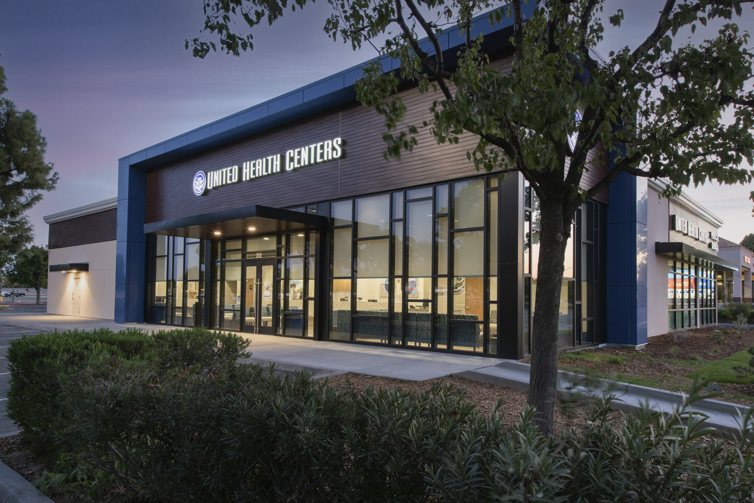
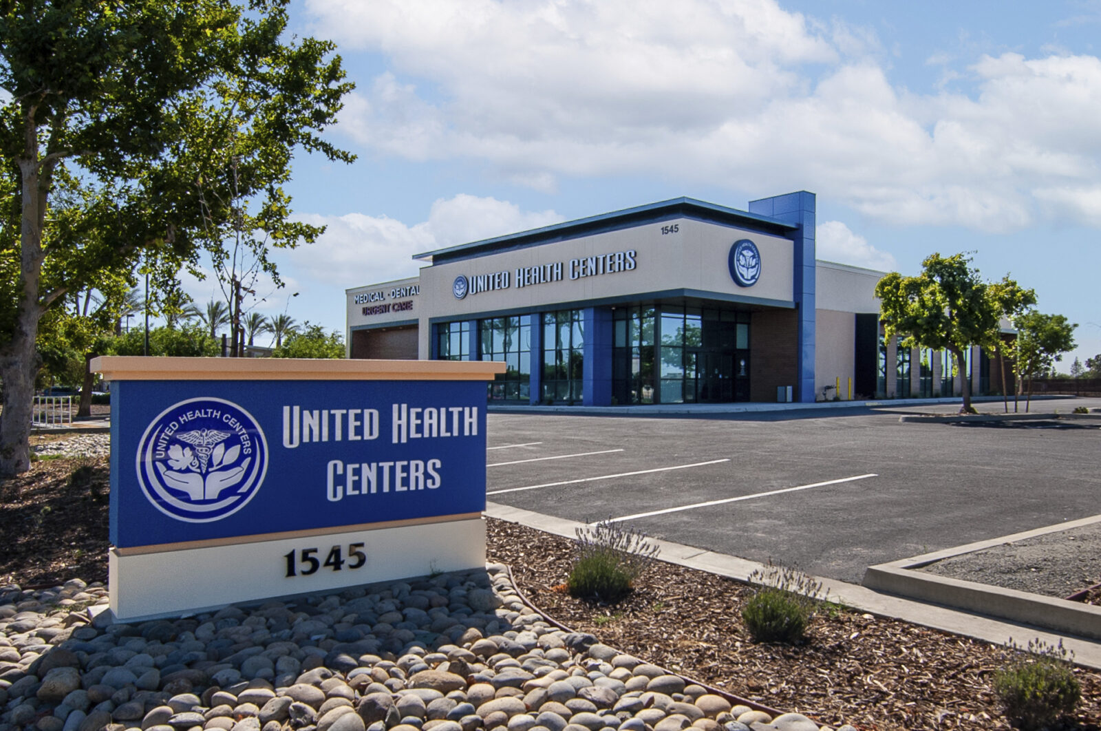
As the organization rapidly expands its services across California’s San Joaquin Valley, they’ve collaborated with designers at MG2 to repurpose and transform existing structures into exceptional medical facilities. The resulting spaces provide an elevated user experience by combining contemporary hospitality, residential comforts, and modern medicine in casual, comfortable, and open environments.

Adaptive reuse for healthcare environments

The adaptive reuse of properties into high-performing medical centers requires more than just basic architectural design. In addition to a deep understanding of structural nuances and how to work with existing components to transform a space, specific sets of expertise are required to adhere to state and national medical office codes and regulations.

The team began with intensive programming sessions—key in the concepting of any medical buildings—to unearth fundamental health and comfort considerations, allowing them to optimize the facilities’ user experiences for both patients and staff.

At the Clovis-Shaw Health Center—formerly housing a furniture store, Hollywood Video, and dojo—designers salvaged the building’s shell, reskinning and structurally retrofitting glass windows with the help of strongbacks to allow natural light to flow. Working closely with the city on the exterior, the team removed dated stucco, repainted, and refinished the facade with sun-resistant faux wood and a modern canopy, creating a welcoming atmosphere that begins when one enters the parking lot.

Previously a Sears automotive store, the Hanford Health Center location necessitated the removal of several oil pumps from the site, refilling and reconditioning the foundation to accommodate extensive structural edits, and shoring up. Auto garage doors were also removed and replaced with expansive glass windows that opened up interiors to natural beauty beyond.

Now a modern dental facility, the healthcare architectural design program was compact and complex, requiring the retrofit of fifteen medical stations and its unique plumbing system inside. MG2’s optimized design enabled the desired number of patient alcoves—complete with panoramic views of greenery to help lower patient stress—and a glass-bound reception area with columns buried into the window structure to carry the weight of the modern wall additions.

Designing a COVID-Era Medical Waiting Room

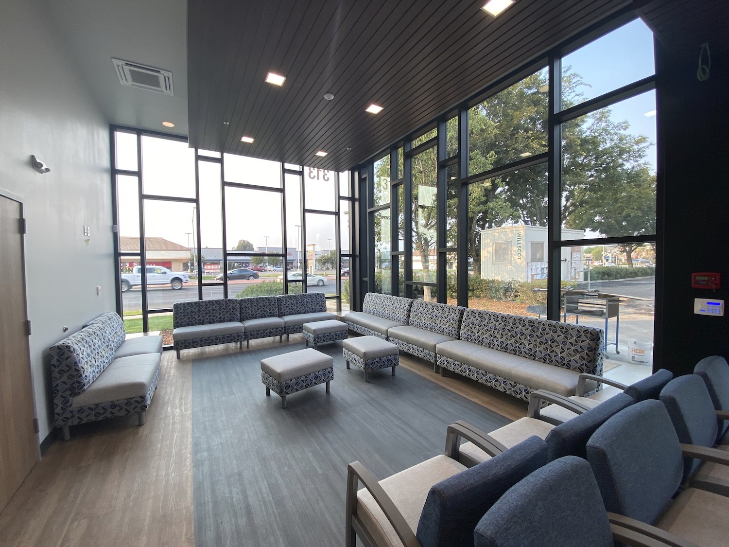
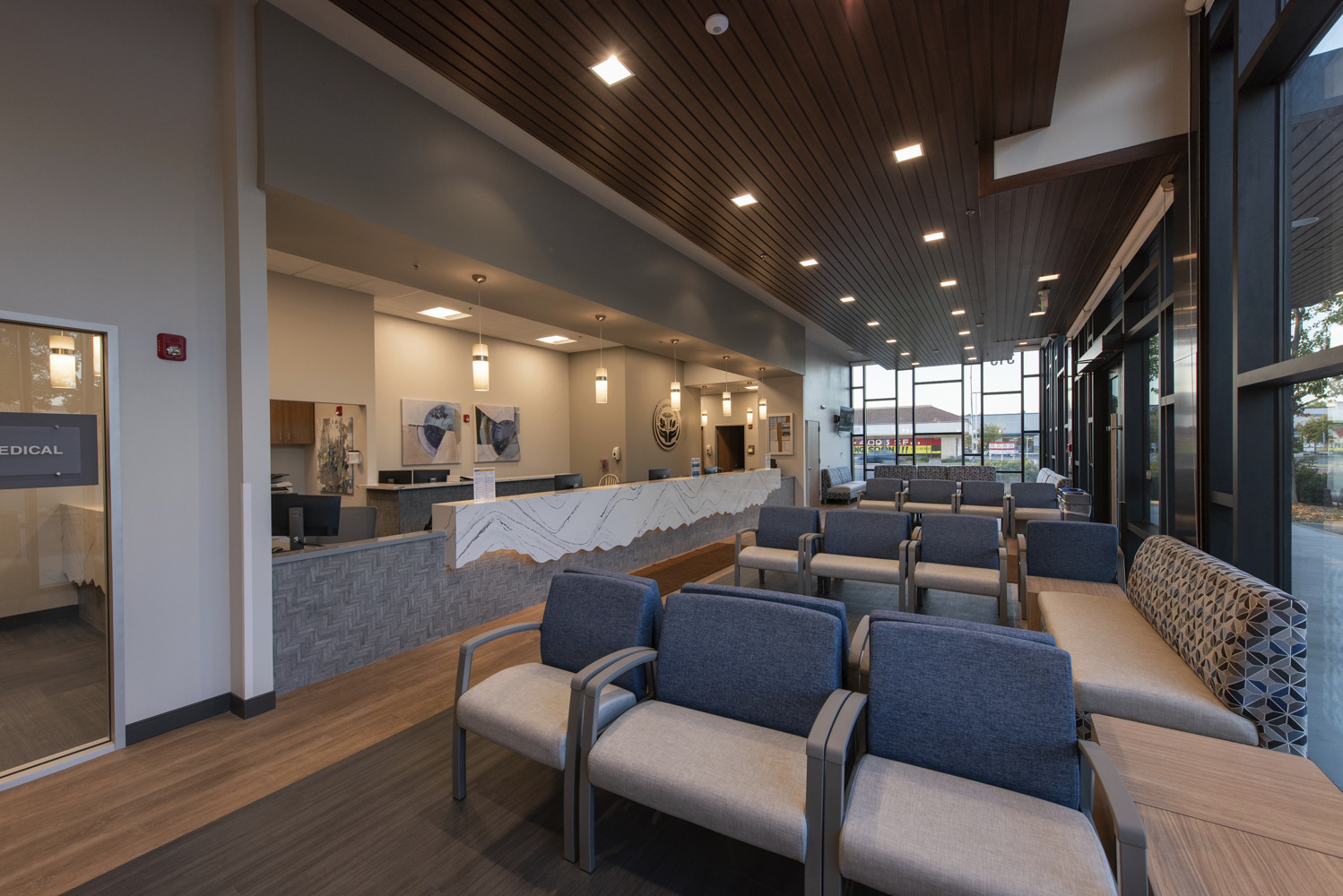
With the goal of elevating a unique end product that steered away from a cookie-cutter feel, designers leveraged focal points of safety, control, and family to produce open, welcoming, and modern environments that embody natural daylight and incorporate hospitality elements throughout.

With COVID still very much a reality, medical facility patients—whether consciously or subconsciously—will gravitate toward spacing themselves out from one another. With this in mind, designers worked to ultimately optimize the waiting room’s layout, configuring the lobby’s flow into unique pockets and pods instead of one large open-format staging area. These zones, designed to take into account individual comfort levels, enable each guest to feel safe while allowing nurses to see everyone seated in the room.

Designing for Medical Employee Health and Wellness

Just as important as patient health, safety, and comfort are that of doctors, nurses, and facilities staff. Employee satisfaction in a time of burnout and record resignations was a primary consideration in these medical office developments. As such, each back-of-house environment is designed and finished with the same high-end materials, finishes, and fixtures as the front-of-house.  

Further, outdoor break spaces at facilities were strategically implemented to give healthcare workers room to breathe, a break from their PPE gear, and access to greenery and fresh air during their shifts.

Weaving Sustainability into Healthcare Environments

Above-and-beyond sustainability standards and biophilic elements have been implemented throughout the design and construction of United Health Center’s adaptive reuse medical centers for today’s patients and future generations alike.

Expertise in designing for California’s OSHPD #3 medical code, as well as CalGreen permitting, enabled MG2’s design team to adopt and abide by these clinical and state-wide standards quickly and efficiently. Energy conservation is furthered through solar panel-ready roofs, a robust, eco-friendly lighting system, and the inherent nature of adaptive reuse in favor of new construction, all of which add up to saving UHC energy and money.


观点

How A Suburban Seattle Strip Mall Is Being Transformed Into A Healthy Community

3 月 2022 / By How A Suburban Seattle Strip Mall Is Being Transformed Into A Healthy Community

This article was produced for and originally published by Bisnow.

__________

There’s a growing movement to change the way American communities are designed that places a greater focus on the well-being of residents. At the heart of these new communities is one thing: accessibility. 

Sometimes called the 15-minute city, the design goal for these neighborhoods is to have all the necessities a person could need — from groceries to medical attention — within a 15-minute walk or bike ride from their home. According to a 2019 report titled Foot Traffic Ahead from Smart Growth America, these types of walkable developments lead to improved social mobility, economic growth, and several other factors in residents’ lives. 

The team at Seattle-based architecture, design, strategy, and branding firm MG2 believes strongly in the potential of walkable developments, which is why they are focused on designing what they call healthy communities

“Our focus goes beyond the traditional ‘live-work-play’ tenets of mixed-use developments,” MG2 principal 本吉斯 said. “We also take into account what we feel are the vital principles of ‘nourish, move and learn.’ We’re combining all of our expertise in designing everything from grocery stores to healthcare clinics to create one cohesive, walkable, healthy community.”

Gist said that for MG2, some of the key components of a healthy community include easy access to grocery stores, daycare centers, office space, healthcare facilities, parks, and mixed-income housing. The firm has spent the last few years focusing on how to take its architects’ varied experience in designing a variety of retail spaces and pivoting that toward transforming underused retail sites — like malls — into dynamic neighborhoods. 

One of its most recent projects is located in Kirkland, Washington, a suburb east of Seattle. Here, MG2 and its partner Madison Development Group have taken the site of a former strip mall and are redesigning it into a 1.35M SF development called 玫瑰山. This new community, located right off the 405, will feature four mixed-use apartment/retail buildings. Each is designed with a different demographic in mind, radiating its own personality inside and out while still speaking the same design language. 

Along with just over 800 apartment units, these buildings will feature retail components including a healthcare facility and a daycare center. There will also be workspaces, an outdoor party deck, and several other amenities open to all residents. 

“We’ve distributed the amenities throughout the project, enticing residents to explore and get to know buildings beyond their own,” Gist said. “We’re trying to encourage a sense of community, curiosity, and movement throughout the site.”

On-premise, residents will find a 40K SF full-service grocery store, as well as a Costco just across from the site. This is especially appropriate since MG2 has designed hundreds of Costcos across the globe. Further setting the stage for the walkable community, Google finalized a purchase agreement for the nearby Lee Johnson car dealership in November, with plans to use the site to expand its Seattle footprint with new physical offices.

Gist said that up until this point, most American communities were designed with vehicles in mind. In contrast, Rose Hill is focused on creating accessible, well-lit, and artfully landscaped pedestrian walkways that make it easy for residents to walk to any building in the development. Even the main parking garage features plants and natural lighting through skylight-esque openings as it leads residents and visitors directly into the grocery store entrance.

Construction on the development is expected to begin this spring. 

玫瑰山 isn’t just for the people who will live within a 15-minute walk from its buildings,” Gist said. MG2 envisions that it will be a hub for the entire Kirkland community, which at this time mostly comprises strip malls, parking lots, low-rise buildings, and single-family neighborhoods. 

He added that the nature of retail is changing, shifting the formula for malls across America. Traditional anchors with smaller shops in between no longer address consumers’ current needs, and have accelerated mall closures across the country. 

“This is why we’re taking a new approach to retail development, starting with asking the question ‘How can retail encompass a community, not just retail opportunities?’” he said. “This effectively shifts us from developing ‘places to shop’ to designing sought-after destinations that feel like home.”

Reach out to Ben Gist to learn more about 玫瑰山 & the team behind the healthy community design.

观点

The Future of Digital & Physical Retail: Top Five Trends for 2022

1 月 2022 / By Melissa Gonzalez

This post was originally written for & published by The Lionesque Group.

__________

In late January, our team had the pleasure of attending NRF’s annual Big Show conference in New York, where I had the honor of leading a captivating panel discussion about the future of the industry. With so much changing in retail over the past two years it was a welcome opportunity to connect with brands and experts in person and hear about their innovative approaches toward keeping up with consumer expectations and demands. 

Here are our top five takeaways from what’s important for retailers, brands, and designers to keep at the forefront as they bring future generations of digital and physical consumer experiences to life:

1. Agility in evolving the cross-platform experience is critical. 

As consumers continue to evolve how they shop, blurring the point-of-sale lines across digital and physical spaces, brands need the ability to continually and fluidly advance their offering. Any instance of friction during the payment process can kill the purchase. Unearthing and implementing streamlined methods of putting payment in the hands of consumers and/or in-store associates is essential. 


When it comes to in-store layouts, art meets science. We have more access to data and insights today than ever before, highlighting customer patterns, capturing interactions with store associates, and illuminating friction points. This data is vital to informing agile design strategies, which need to morph alongside the customer. Industry partnerships, like the one announced between The Lionesque Group and Pathr.AI, will be key to defining and strengthening the future of consumer/brand relationships.

2. Efficiency is the most desirable currency that technology offers.

To truly be successful, store associates require information to be at their fingertips, both for back-of-house and consumer-facing interactions. Instant visibility as to what’s on the floor, what’s in the back, and what’s available at another store’s location isn’t just an expectation of today’s customer, it’s necessary to embolden the prospects of a sale and fortify brand loyalty.


Consistent with The Lionesque Group’s recent industry survey findings, every moment a store associate has real-time visibility into the full scope of their inventory adds up to millions of dollars saved by the retailer. Using technology to empower associates with this knowledge bolsters store efficiency, optimizes productivity, and streamlines delivery performance.

Melissa Gonzalez, Principal at MG2, NRF Big Show 2022

3. Omnichannel means being omnipresent for the consumer. 

Whether they’re standing in a store, browsing online, interacting with social media, or playing in the metaverse, consumers want and expect a congruent, simplified “click-to-buy” experience that’s seamless across every presence of a brand.

They’re seeking an “all-of-the-above” optionality that is as fluid as they need it to be in the moment, and this agility is critical as we think about designing the store of tomorrow. Digital integration will need to empower both store associates and the consumer to be able to move interchangeably when visiting different brick and mortar locations so they have the options, access, and efficiency they desire.

4. True sustainability starts with the supply chain. 

Consumers speak with their wallets, and more and more their love language is shifting toward an expectation in transparency, sincerity, and sustainable practices from the brands they support. This further includes retailers being net-positive to the environment, as well as striving for social and community equities.

The real onus, however, is on the full ecosystem coming together to truly make a difference consumers can see and resonate with. Brands and retailers need to own and optimize their supply chain, making it more accessible from a cost and candor standpoint for consumers.

One of the lessons shared by Saskia van Gendt of Rothy’s was a profound sense of understanding of the brand’s own role in the process. “If you own the supply chain,” he notes, “you can truly impact things. For example, you can set up for on-demand manufacturing so as not to leave waste.”

5. We’re amidst an era of phygital convergence.

The metaverse—the industry’s newest buzzword—holds the promise of and capacity to meld physical retail with mixed reality experiences. However, we’re already years into this convergence of digital and brick-and-mortar, with offerings like virtual endless aisles that consumers can browse for hours, just as they might window shop in-store. 

Innovative technology has, and continues to fuel the future of retail data collection and analysis, powering responsive IoT connectivity via RFID, sensors, digital displays, and products that ignite an overlay of immersive media. The digital/physical overlap will only continue to grow.

__________

Reach out to our team to learn more about how we’re helping define the future of brick-and-mortar retail for brands.

观点

Above & Beyond: A Data-Driven Commitment to Sustainable Design

11 月 2021 / By Above & Beyond: A Data-Driven Commitment to Sustainable Design, Russ Hazzard

Architect and AIA 2030 Founder Edward Mazria once said, “We tend to rush toward the complex when trying to solve a daunting problem, but in this case, simplicity wins. Better buildings, responsible energy use, and renewable energy choices are all we need to tackle both energy independence and climate change.”

Straightforward, responsible design has long been at the core of MG2’s strategy and philosophy, with sustainable principles and applications woven into our projects at every opportunity. Our three sustainability values—Environmental Stewardship, Purposeful Efficiency, and Restorative Measures—are a simultaneous embodiment of where our firm was the year they were defined and reflect where we want to be in the years to come. MG2 has worked to raise the bar on our designs over time, evolving to match—and where we can, exceed—sustainable certifications and benchmarks.

“We had always reviewed our specifications for opportunities to suggest sustainable products and methodologies to our clients, which when we started were just better choices from a location and ‘better for the environment’ point of view,” says Russ Hazzard, President of MG2.

“Today, those sustainable vendor and materials recommendations aren’t just convenience, they’re a fundamental part of our DNA and design process. As a result, clients who once might not have been open to alternatives are looking to us as experts and advocates, armed with the right solution to set them on a path toward a more sustainable future.”

Costco Wholesale Headquarters Campus – Issaquah, WA

As architects and designers of built environments, the implications of everything we do, of every project we take on, are unmistakable. AIA’s 2030 Challenge outlines two specific goals that pledge firms must strive toward:

  1. A 90% reduction in built environment operating energy systems by 2025.
  2. A 45% reduction—a percentage imposed by our own team—in built environment embodied carbon by 2025.

“Greenhouse gas emissions reduction is the challenge of the century for the entire industry.” states Johnny Klemke, Building Performance Analyst at MG2, “How do we keep building more and more while producing less and less impact in the natural environment? That’s the question we’re taking on at MG2. By helping teams come up with more efficient, less carbon-intensive solutions for their designs, we’re also showing clients that sustainability doesn’t need to be a cost burden on the project.”

By helping teams come up with more efficient, less carbon-intensive solutions for their designs, we’re showing clients that sustainability doesn’t need to be a cost burden.

Johnny Klemke, Building Performance Analyst

“Our greatest hurdle is bringing the industry along with us,” says Jon Guerechit, a designer at MG2 helping to lead our operating energy initiative, “One benefit is that indisputable data makes it easier to convince clients that a cost-saving measure can also serve the environment. But the numbers aren’t always in our favor. Embracing the mindset of being a steward of the environment is harder because it forces stakeholders to think differently and invest in the distant future. It’s a mentality we’re pushing for across the board.”

Today, as we continue to evaluate and evolve our firm’s sustainability action plan, we’re committed to going above and beyond the goals outlined by AIA’s 2030 challenge by adding two more of our own

  1. A rigorous commitment to working with forward-thinking vendors and using sustainable materials that adhere to the highest standards possible.
  2. A reduction of water consumption—30% to 45% for indoor and 50% for potable outdoor—in all of our projects by 2030
PCC Community Markets – Seattle, WA

Adding materials to the mix.

From improving indoor air quality to reducing construction waste, the materials our architects and designers specify matter. Our choices represent an enormous opportunity to enhance the health of the planet and the people who live on it.

In addition to becoming proud signatories of the AIA Materials Pledge, MG2 has created our own rigorous Materials Evaluation System. Using a stoplight structure, our specialists analyze and rank every vendor, product, and material we use, to ensure that where and whenever possible, we’re adhering to the highest attainable sustainability standards for a better future.

PCC社区超市—the largest grocery co-op in the United States—has partnered with MG2 for years on their journey to better their store’s materials and target LBC Petal Certification. In its Ballard location, the first grocery store in the world to be certified, over 40% of the materials—just shy of $1.4M—were sustainably sourced, with 9.2% of those derived from within 100 miles. Additionally, 100% of the store’s wood is FSC certified, with 10% of the elements reclaimed or reused.

“There is a misconception that we need to pursue green building certification to push for sustainable materials, or that we must only use sustainabile materials to make a difference in the world. Neither of these are true.”

Candon Michelle Murphy, Materials Specialist

With MG2’s data-driven materials system comes a deep reservoir of knowledge and insight, but continuous education to overcome misconceptions and help our clients and partners understand the financial and environmental investment is still critical.

“The largest challenge around the selection of sustainable materials is the misunderstanding of what costs are associated with it.” mentions Candon Michelle Murphy, MG2’s Materials Librarian, “It is true that there are specific material categories on the market that represent a high cost add if the sustainable selection is desired, but there are quite a few categories where there is no or nominal fee add to make a far more environmentally-sound final installation.

“There is also a misconception that we need to pursue a green building certification to push for sustainable and healthy materials, or that we must only put in sustainable materials to make a difference in the world. Neither of these is true, however: any selection that supplies a reduction of embodied carbon, lesser the amount of VOCs put into interior spaces, and provides for reclamation of materials or diversion from landfills still makes a difference.”

Fundamental impact through water reduction.

Water is one of the earth’s most precious resources. While many of us take fresh, clean water for granted in our day-to-day lives, architects who create built environments in areas where this resource is not so abundant continually have its preservation, reduction, and recyclability top-of-mind.

MG2’s water conservation goal—our fourth and possibly most ambitious sustainability initiative—is to reduce indoor water use in appliances such as toilets and faucets by 30% to 45% and to reduce potable outdoor water consumption in landscaping and irrigation by 50% in every single one of our projects by the end of 2030.

“Among dozens of reasons, a reduction of water in our projects is important because it can lower water withdrawals from local water sources,” states Maribel Barba, designer and co-lead of MG2’s water conservation goals, “allowing us to better harmonize with the local environment, increase water availability for all, and improve community relations.”

Costco Santa Fe – Mexico

While our water conservation goals may be new to many of MG2’s clients, some have been pioneering innovative technologies and water reduction tactics in their build environments for years. For example, longtime partner Costco has been working with MG2 on implementing water solutions programming into its warehouses throughout Mexico and the Southwest US for years, an initiative that awards them a 20% annual water savings.

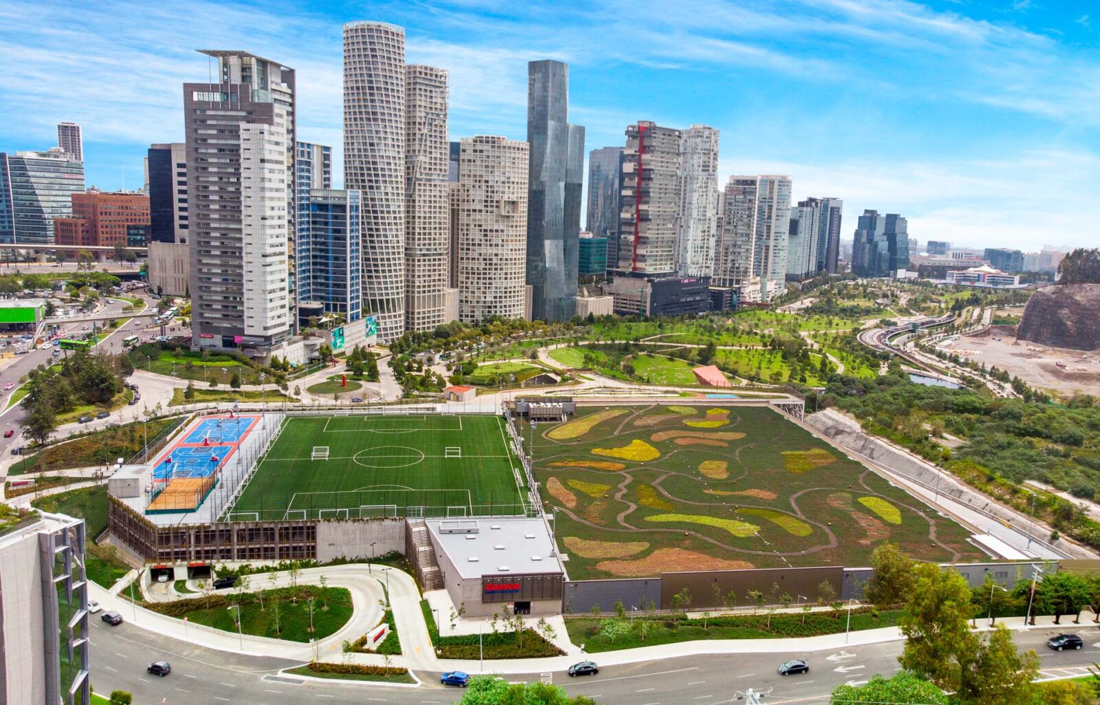
The wholesaler giant recently took an even more significant leap into the future of water conservation with its Costco Santa Fe store. Complete with a one-of-a-kind green roof that acts as a natural extension of Parque La Mexicana, the Santa Fe location was designed with numerous water-saving technologies,  including toilets and landscape irrigation that utilize recycled water and a stormwater collection system in the Parque lake. Restroom fixtures were also installed with 50% less water demand, according to baseline.

“Even when water conservation processes have been implemented for several years, I think it is still being a challenge for firms to sell this idea to some partners.” says Christian Razo, designer and co-lead of MG2’s water conservation goals, “Many do not realize how much water you can save, or even the consequences of not saving water. We do our best to educate every one of our clients on the rewards of implementing these processes, including the satisfaction of knowing that what you’re doing is helping future generations.”

Costco Santa Fe – Mexico

We’ve come a long way in our sustainable design practices and are immensely proud of the benchmarks many of our projects and partnerships have achieved. But the reality is, MG2 is just getting started. 

“When we set out to create MG2’s formal framework for sustainability, we knew it needed to resonate with all staff and be embedded in the culture of the firm.” says Mark Taylor, MG2’s Sustainability Lead, “Our data-driven approach speaks directly to the results-oriented nature of the firm and will be the backbone of our success as we continue on our journey.”

MG2’s Sustainability Action Plan

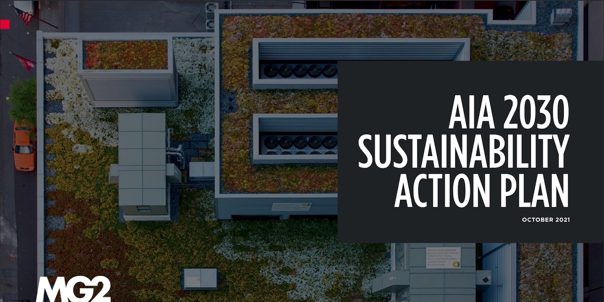
Learn more about our above-and-beyond commitment to the future of our planet in our AIA 2030 Commitment Sustainability Action Plan, or by reaching out to our sustainability team.

社区环境

6 Corners Lofts

Where Mixed-Use Innovation Meets Historic Revitalization

In an effort to revitalize a 1938 Sears building and reinvigorate a historic Chicago shopping district, Novak Development has partnered with MG2 as their design architect to bring to life an innovative mixed-use project complete with 200 residential units, over 50,000 s/f of retail, and 300 parking spaces.

MG2’s cross-market expertise spanning multi-family and mixed-use built environments grants our team the ability to create a holistic, inviting community experience. Simultaneously, our decades-long relationships with some of the world’s top retail brands and intimate knowledge of their programs and operations allow us to engage our portfolio of partners, bringing Target in on the ground floor—literally and figuratively— to create a truly unique experience for the residents of Chicago.

6 Corners Lofts mixed-use development provides the opportunity to create an architectural transformation that connects past and present and sets the tone for the future of the neighborhood.

“Six Corners was once the second-busiest shopping center aside from downtown area,” says Richard Fahy in a recent article by Block Club Chicago. He is a representative for Operating Engineers Local 150 and a longtime Northwest Side resident, “This site has the potential in playing a vital role in transforming our community and give our local economy a boost that is long overdue.”

The existing 1932 building serves as a historic backbone and foundation from which we can build a new and meaningful story for the neighborhood, residents, and visitors. The revitalization of 6 Corners Lofts is an opportunity to design a destination-worthy experience for the area. Our design—an iconic juxtaposition of Art Deco with cutting-edge technology—honors the historic nature of the site while simultaneously infusing new energy and life to the community it serves.


观点

The Future of Grocery Retail: Top Five Trends for 2021 & 2022

9 月 2021 / By The Future of Grocery Retail: Top Five Trends for 2021 & 2022, Melissa Gonzalez

Last week we had the pleasure of attending and speaking at Groceryshop 2021 in Las Vegas. One of our first live events in a while, the energy was palpable and the innovations were flowing. It was an absolute joy to connect with so many and share the results of our recent grocery industry survey. If you haven’t yet, you can get your copy of our 2021 Grocery Consumer Survey Insights here.

With so much changing for grocery over the past two years, it’s seemingly impossible to keep up with consumer expectations and demands. However, here are our top five takeaways from what’s important for experience designers to keep in mind as they continue to bring future generations of grocery retail to life:
Incorporating Surprise & Delight

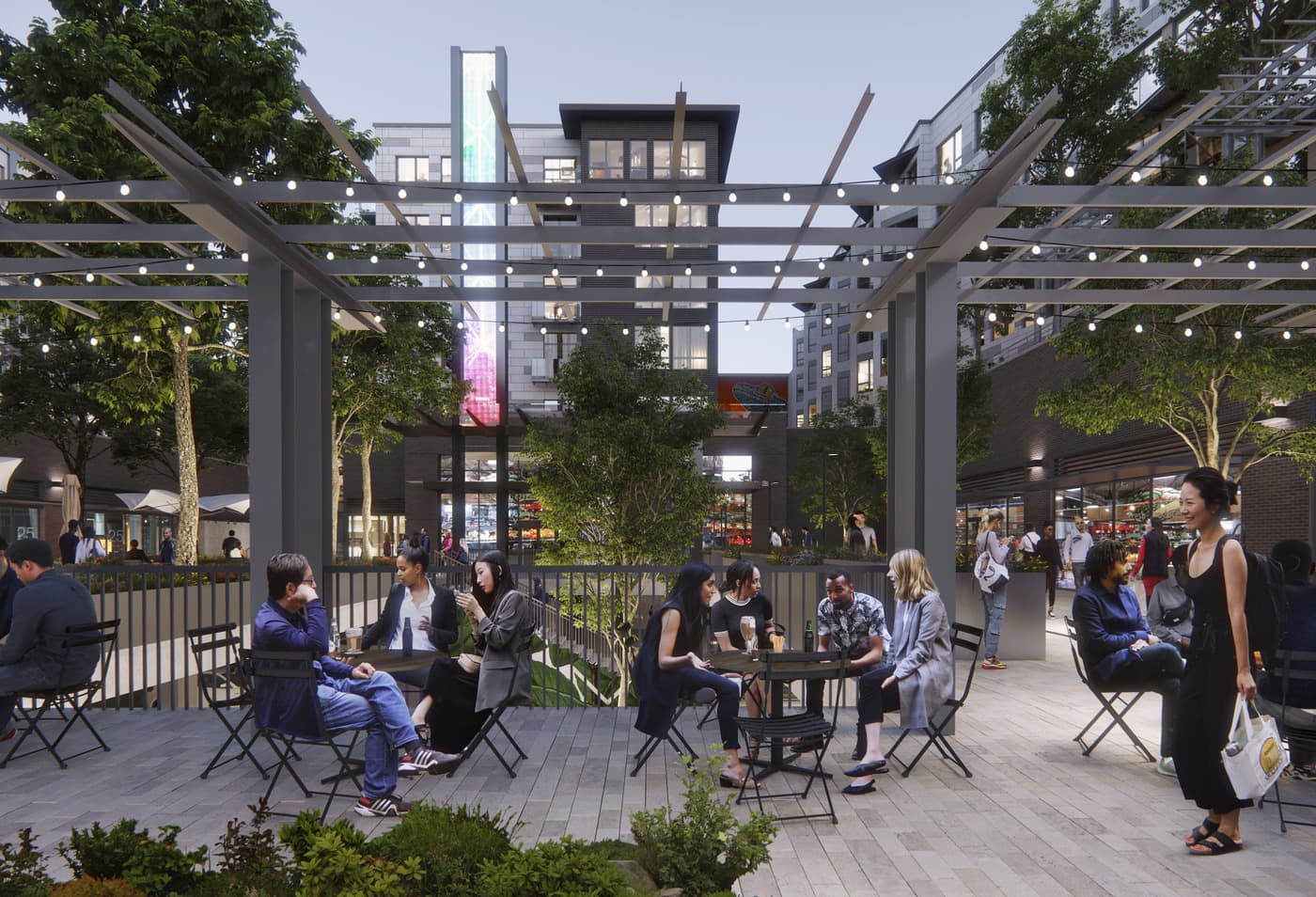
With such a significant shift to online and digital platforms, the in-store grocery experience has a bigger job to do in order to deliver upon surprise and delight. This ties into our survey results, which document consumer’s desire for discovery while in-store. 

Delight is the thoughtful touches and speed bumps along the way that foster education and discovery, and are embedded into environments designed to be “in service” of their customers. These could be temporary experiential moments—like what Lionesque Group CEO Melissa Gonzalez presented on stage about Jarlsberg or the Peanut Butter Association—or permanently designed experiences.
Innovative Retail Media

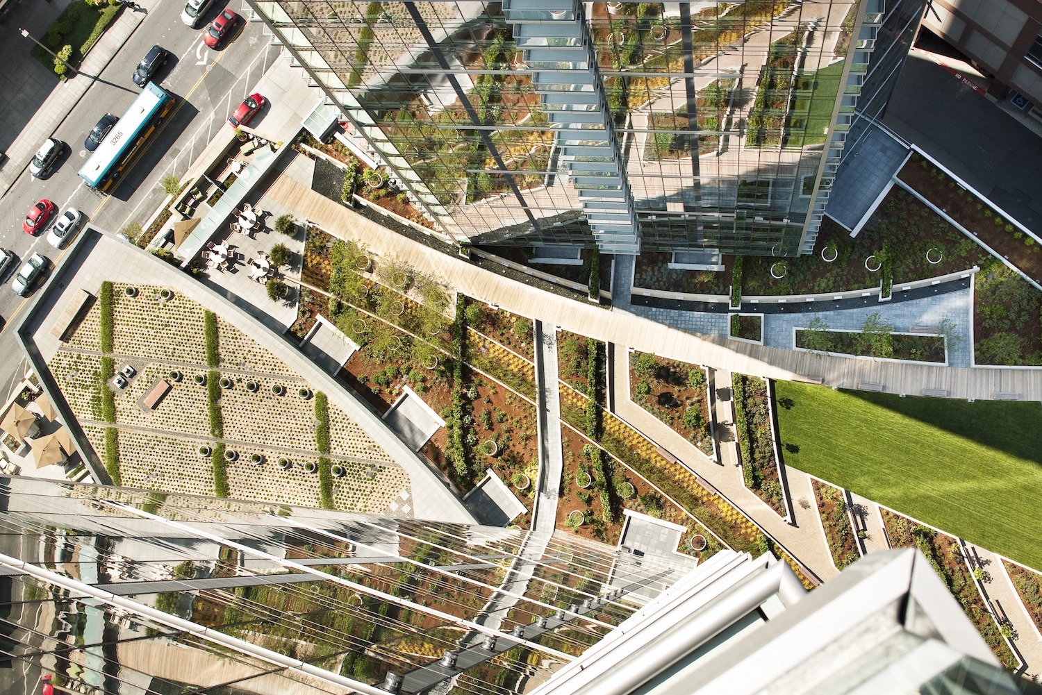
As digital and physical continue to merge, progressive grocers are seeing themselves as media platforms as much as grocers. In the name of inclusion and accessibility, it’s important for brands to make themselves available across all channels for all consumers. With online adoption, there is also a larger opportunity to leverage data and utilize the insights to deliver more personalized content to consumers.

For example, curated recipes, tailored nutrition plans, or even entire stores and brand philosophies dedicated to nutritional health and wellness, beyond what we typically see on a shelf. Raley’s O-N-E stores are a great example. Additionally, as we have seen in our work with Target, some are taking a more holistic approach to the curation of products around life occasions. This approach is also offering CPG brands the opportunity to gain mind share as well as increase their profitability.

Experiential Tech and Personalization

We all know consumer necessity fuels implementation as well as the adoption of technology. AI is seeing more prioritization to inform store teams on recommendations for merchandising, store layout, and more. Convenience and saving time are top priorities for consumers and they want tools that enable this. 

For example, Kroger and Instacart—which announced 30 minute delivery to your door—are utilizing AI to better understand demand and forecasting, as well as help with planning. They’re partnering with companies like Anuit.AI to help expand offerings, SKU count availability, and ensure the freshness of groceries. Order accuracy is also a huge focus for grocers, becoming both an issue and an opportunity for building customer satisfaction and confidence. Progressive retailers are looking at systems to improve upon predicting outages and substitutions to better improve this metric.

More unexpected partnerships that enable convenience are on the horizon well, such as what Albertson’s announced with DoubleDash in partnership with restaurants. The use of voice is also seen as an underutilized opportunity that is gaining consideration, and we see a rise in successful grocers that are empowering the in-store associate with data.

Proximity is still important (for numerous reasons)

In the argument to build more in-store experiences, proximity is still a motivator for consumers. Bloomberg cited that, as an established grocer, building more stores to increase consumer proximity is a tested and validated means to not only grow brick-and-mortar sales, but online sales as well. A store close to home is still seen as valuable even if the preferred channel is online delivery, and the cost of consumer preference is worth the price for multi-channel success.

Local is also important when it comes to products that are carried on shelves. Local, which is perceived as more sustainable than other products, including organic ones, offers the often true consumer perception that goods have not traveled as far, and therefore are both fresher and have a smaller carbon footprint. It’s a motivator for consumer decision-making and retailers are reviewing ways to surface suppliers, makers, and growers who are already in their supply chain.

Live Up To Your Brand Promise

It’s more important than ever that brands are standing behind a purpose, in addition to the products they sell. In order to garner customer loyalty, customers want to know you stand behind them, behind your staff, and behind your values. 

Giving back to the local community—another growing trend in grocer brand promises—is favored 42% by Gen Z and Millennial consumers. Only 38% of consumers polled thought their grocer was giving back to the community. 

A commitment to sustainability (action, not just words), a diverse selection of products, and inclusive accessibility are all at the top of the list when it comes to what consumers today are valuing from their grocers.

__________

Want to learn more? Find out what consumers expect from their grocers, both now and in the future, with our 2021 Grocery Consumer Insights Report.

社区环境

威尔伯顿村

策划城市中心的社区

为了将宜人的目的地带到Bellevue的市区走廊,MG2与该城市合作设计,建造并实现了Wilburton Village South。与“俄罗斯方块的城市规模”相比,该建筑群经过精心策划,每个零售商铺和店面都经过完全定制,可以满足该品牌的需求。 

与相邻的North项目一起,Wilburton Village South将为社区提供各种服务,包括医疗,餐馆,银行,杂货店,娱乐,休闲,体育用品和家居摆设。该广场设有充足的户外座位和喷泉,此外还提供动态照明,可适应不断变化的心情和季节。令人叹为观止的玻璃幕墙将顾客欢迎到中心,而雨棚覆盖的人行道可保护行人。  

项目团队能够巧妙地使用网站的版式来满足设计的要求,从而为该综合大楼创建了多个入口点(例如,在四楼),否则消费者可能不敢冒险。 

旨在同时保持品牌体验和卓越运营的设计,MG2能够掩盖客户从未见过的所有内部性能要求。从PCC装货场的杂货卡车到Target的数百辆汽车停车场,再到Virginia Mason的MRI机器的非凡要求,都可以满足所有细节。

通过对社区健康和未来发展的前瞻性和阶段性方法,未来的行人和自行车桥将与附近即将进行的轨道交通项目连接。该解决方案提供了前往Wilburton Village South和周围综合大楼的步行通道。 


  • Project Details

  • 地点 华盛顿州贝尔维尤
  • 客户 KG投资
  • 市场分类
  • 规模 160,000平方英尺
  • 设计服务
社区环境

芜湖苏宁广场

Adaptive reuse medical facilities for the post-COVID era

作为开拓性的国际零售中心,芜湖苏宁广场在支持该市快速发展的经济中发挥着重要作用。这座10层高的建筑被设计为一站式购物和娱乐场所,拥有众多国际品牌,室内溜冰场,IMAX电影院和适合各个年龄段的就餐场所。

玻璃幕墙构成了建筑物的外部框架,为H&M,优衣库和星巴克等国际零售商与当地市场建立联系提供了透明的窗口。到了晚上,霓虹灯将建筑物变成活动的灯塔。明亮,开放的内部平面图为顾客创造了一种欢迎且易于导航的体验,而拥有600个空间的停车库,室外凉亭和多个街道入口处则使人们可以轻松进入。


  • Project Details

  • 地点 中国芜湖
  • 客户 苏宁房地产有限公司
  • 市场分类
  • 规模 129万SF(119,844 SM)
  • 设计服务
社区环境

十字路口混合用途

Seeking to build density and add value to a property whose neighborhood was maturing around it, Crossroads in Bellevue, WA partnered with MG2 to evolve the urban-based shopping center into a sustainability-minded, multi-family community that leverages and seamlessly melds with nearby amenities.

Years of pedestrian studies, wayfinding strategy, and sophisticated design went into Crossroads’ U-shaped building and its positioning, ensuring the footprint lined up perfectly with surrounding environments and natural spaces. An approach that helps bolster multimodal exploration, walkability, and access to public transit, the campus seamlessly connects the public and private within its community.

Naturally, landscaping plays a significant role as well. Every edge of the complex is considered an urban trail, reinforcing the pedestrian-centric nature of the design. By converting an asphalt parking lot into green space, the team created an additional opportunity for the sustainable filtering of stormwater by implementing bioswales and rain gardens throughout. The effort resulted in 20% more community green space.

For its interiors, a thematic approach was taken to the design, embracing and enhancing the community and celebrating the diversity it fosters. Many units are two bedrooms, perfect for multi-generational families who work in the area. MG2 is working closely with the project’s interiors team to create a seamless, hybrid integration between internal and external experiences. With a color and design scheme that radiates the Pacific Northwest, there are endless opportunities for entertainment, including an activated public space and amenity-rich roof deck.

Designed as a community, not a commodity, Crossroads design incorporates a number of culturally-rich and thoughtful food options, as well as boutique retail space for brands to connect with residents and visitors alike in a highly socialized setting. The evolution of this predominantly retail environment into a sustainable, cultured, pedestrian paradise is slated for completion in 2024.


  • Project Details

  • 地点 华盛顿州贝尔维尤
  • 客户 投资回报率
  • 市场分类 , ,
  • 规模 388,380平方英尺; 244伙; 14,500平方英尺的零售/商业空间
  • 设计服务

社区环境

鹿脚美食小屋

餐饮成为新的商场主力

SHAPE与MG2合作在目的地:Deerfoot City设计了食宿概念。食堂将成为开发中的关键社交区,社区将在那里聚集,饮食和补给。

MG2的设计模糊了室内和室外空间之间的界线,其特色在于结合了程序设计,唤起了人们对通风的市场感觉,包括坐下咖啡厅,弹出式食品推车以及在线和独立式食品租户。炉膛是该空间的主要特征,提供了一系列私密区域,可邀请游客停留更长的时间。设计师强调了外部和内部社交区域之间的连通性,采用折叠玻璃墙和可卷起的车库门来融合空间。


社区环境

Brentwood购物中心

The Amazing Brentwood

神奇的布伦特伍德(Brentwood)位于温哥华的轻轨沿线,是一个面向交通的开发项目,涵盖零售,住宅和娱乐。 SHAPE是加拿大一家知名的开发商,与MG2合作,帮助完善了零售设计策略,并探索了该物业的未来设计阶段。

MG2寻求为来布伦特伍德(Brentwood)的人们创造一个独特而又高尚的体验,它采用了热情好客的零售设计理念。这种体验始于抵达之时,伴随着一系列不断扩大的客流吸引了购物者,让人联想起门廊式的感觉。

团队在整个设计概念中精心策划了零售经验,强调围绕舒适性,易用性和永恒美学的空间。


  • Project Details

  • 地点 加拿大不列颠哥伦比亚省,本拿比市
  • 客户 形状
  • 市场分类 ,
  • 规模 28英亩
  • 设计服务
社区环境

塔科马购物中心

塔科马购物中心(Tacoma Mall)最初于1965年开业,目前是低密度,郊区风格的开发项目。但是,随着市议会最近批准新的分区代码,密度要求和基础设施更新,塔科马市中心已准备就绪,可以演变为更具城市性,以行人为导向的景观。 

为了响应城市长期协调发展的需要,MG2与塔科马购物中心(Tacoma Mall)建立了合作关系,将其重新设计为综合用途的物业,融合了新的购物,餐饮和娱乐场所。 

该物业将进行重新配置,以容纳六个新建筑物,最多可容纳十二个租户,包括一个48,000平方英尺的电影院和多家餐厅。这些建筑中的三座将激活该站点的东北角,取代以前的百货公司的占地面积。


  • Project Details

  • 地点 华盛顿州塔科马
  • 客户 机密客户
  • 市场分类
  • 规模 保密
  • 设计服务
社区环境

汕头苏宁广场

不断发展的大都市的动态体现

汕头苏宁广场是一个充满活力的旗舰店,它激活了中国广东省的城市港口城市。该开发项目的高端零售中心以国内外知名品牌为特色,其外部环绕式LED屏幕和透明玻璃中庭吸引了人们的注意。

汕头苏宁广场位于城市商业区,拥有两座令人向往的A级办公大楼。该开发项目的时尚,简约设计与郁郁葱葱的屋顶花园和开放的中央法院并置,游客可以在此找到喘息的机会或参加社区聚会。目的地,信标和避风港都融入了一种集中式体验。


  • Project Details

  • 地点 中国汕头
  • 客户 苏宁房地产有限公司
  • 市场分类 ,
  • 规模 170万SF(157,935 SM)
  • 设计服务
社区环境

华盛顿广场

当西尔斯关门时,华盛顿广场购物中心(西北太平洋地区最大的购物中心)知道是时候采用创新方法了。该购物中心与MG2合作,寻求一种解决方案,以增加消费者流量,恢复主播位置并通过新鲜的零售,餐厅和娱乐场所吸引他们的客户群。难题的最后一部分将是酒店,以及围绕一个充满活力的公园的新建的住宅单元,从而完善社区并将其绑定在一起。

我们的团队立即接受了已经实施的计划,在保持项目进展的同时,创造了一个新颖的故事,使之成为我们自己的故事。 MG2的设计师采用了一种情境方法,在太平洋西北部散发着零星天气的情况下玩耍,我们自然回应了多层服装。最终的设计使用了美化环境,照明和新建的空间来诠释我们的建筑故事,为曾经的锚点带来新的活力。

Washington Square

通过从传统的购物中心到更加有机的开放空间的分层过渡,我们为购物中心产生了新的进入顺序。

现场酒店经过倾斜设计,可从道路上获得更多视野,同时还可以暴露自然环境。体验随着珠宝盒餐厅的建造,顾客的问候和竞购者的兴高采烈。

为客户提供无与伦比的全方位服务的建筑设计解决方案,MG2继续与华盛顿广场合作,进入建造阶段的最后阶段,一些高端娱乐,餐饮和零售品牌已经对这家充满活力的购物中心表示了兴趣。