Pathr.ai Announces Partnership with The Lionesque Group and MG2 to Deliver Pop-Up Shop Analytics for Retailers – Unveiling at National Retail Federation’s Big Show 2022

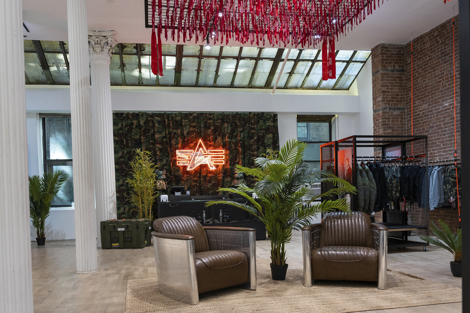
Pathr.ai, the industry’s first and only Artificial Intelligence (AI) powered Spatial Intelligence platform, announced today it has partnered with The Lionesque Group, an award-winning experiential retail strategy and design studio, and its parent company, MG2 Corporation, a global design and architecture firm, to bring real-time analytics to pop-up shops. Using Pathr.ai’s cutting-edge spatial intelligence technology, brands and retailers will now be empowered to utilize their pop-up store to gain actionable insights to drive business outcomes and deliver improved customer experiences.

Research & Insights

Designing Store Experiences for Today’s Consumer

January 2022 / By Melissa Gonzalez, Nick Caputo

In our constant curiosity and investigation of consumer behaviors and expectations, we utilize data insights to help uncover and validate where we can deliver true points of gratification within the customer journey. Here is a snapshot of key takeaways from our latest consumer survey. Our full deck with all our insights is available for download at the bottom of this preview.

How can we adapt “The role of the store” to reflect today’s consumer?

As consumers adjust to their hybrid worlds and the merging of digital and physical deepens, we take a look how consumer behaviors, needs, and expectations impact “the role of the store.” In this survey, we investigate the utility technology plays, the inherit value it brings us and how that can inform opportunities for physical retail environments.

Download – Advisory – 20220111 Store Experiences Report

Kathy Kuo Home

Curating immersive inspiration

Kathy Kuo Home is a boutique home furnishings brand that offers modern and classic home decor for all interior design needs. With a robust and loyal online following, Kathy Kuo Home sought to create its first permanent flagship location with the assistance of MG2 / The Lionesque Group. In addition to curating in an inviting, laid-back, dog-friendly space where customers can immerse themselves in possibilities, Kathy Kuo and her team also wanted to bring their online design center, full digital catalog, and tailored consultation offering to their clients in the heart of Southampton, New York.

The resulting experience is one that perfectly embodies the brand’s high-end offerings, seamlessly weaving together the delight of in-person discovery with the ease of digital retail technology and expert design consultation.

Within just 4,000 SF of retail space, the Kathy Kuo Home flagship uses vignette scenes to feature a hand-selected assortment of the brand’s best-selling products, including indoor and outdoor furniture, décor, and lighting in a range of styles. The store also houses a design resource center for KKH designers to work one-on-one with clients in-person to design their home, and will further serve as a destination for curated events hosted in-store.

Transcending an environment that feels like Kuo’s own Hampton home, it’s an experience that successfully welcomes everyone in the space, encouraging exploration and fueling inspiration.

“Interacting with our customers has always been a top priority for the brand, and there’s no better way to do this than in person.” said Kuo in an interview with Forbes just prior to the store’s grand opening, “We’ve seen continued success through investing in our relationships by providing our high-touch services online and now will have the opportunity for continued growth. Having a physical location will allow us to connect with and serve more customers and clients than ever before, aiding in our brand mission to help as many people as possible love where they live.”

Since opening doors, Kathy Kuo Home’s flagship store has been featured in Architectural Digest, Insider Trends, Modern Luxury, and Business of Home.

It was also awarded the honor of House Beautiful’s 2021 Best Home Stores in America Right Now.


  • Project Details

  • Location Southampton, New York, United States
  • Client Kathy Kuo Home
  • Market Sectors
  • Size 4,000 SF
  • Services

Packer x Asics

For US Open 2016, Packer x Asics opened up shop in Grand Central Station with a limited collection.

Goal

To generate awareness and sales for the first exclusive launch of Packer Shoes x Asics and Mitchell & Ness capsule collections.

MG2

Packer Shoes contracted MG2 for their 4th Pop-Up Store in NYC. With the goal of capturing U.S. Open-based media and foot traffic, MG2 secured Vanderbilt Hall at Grand Central Station and was the lead project management team for the #GAMESETMATCH activation.

Outcome

Located at the pinnacle of passerby traveling from NYC to Arthur Ashe stadium, the 3-day pop-up captured thousands of visitors daily and was featured in major industry publications including SneakerNewsHypeBeastSole Collector, and more.


Amazon Video

From November 29 through December 8, 2018, fans of the Amazon Prime Video original series The Marvelous Mrs. Maisel were able to experience a slice of 1958 New York through a pop-up Carnegie Deli replica restaurant in Lower Manhattan.

Goal

To promote the release of the second season of Prime Original show The Marvelous Mrs. Maisel, the iconic Carnegie Deli was brought back to life through a pop-up deli experience that transported visitors back to the era of the TV series, with everything from décor, to pricing, to the menu, reflecting 1950’s New York City as depicted in The Marvelous Mrs. Maisel, making it a fully immersive and highly photographable experience.

MG2

Tool of North America hired MG2 as their full-service partner to design and render, as well as source and manage, the production of the immersive environment for the pop-up, with a2zrestaurant as the operational partner.

Outcome

The pop-up deli experience was an extraordinary success, it served 11,000 people and had a waiting list of 8,000. The pop-up garnered 280 pieces of press coverage including BuzzfeedForbesVogueEaterUSA Today, and 10 broadcast segments, with a social media reach of 45 million.

2019 One Show Awards Finalist for Experiential Design and Indoor Spaces


Sally Hansen

Sally Hansen opened a pop-up nail bar during NYFW to debut their innovative new app that solves the trial-by-purchase nail polish problem.

Goal

Brand Awareness and education for ManiMatch the app that lets you virtually paint on nail polish. (Using augmented reality technology, the app allows you to digitally test drive over 200 different Sally Hansen shades!)

MG2

MG2 was tapped by Sally Hansen’s digital agency, CULT LDN, to be the partner production agency for the pop-up nail bar. We partnered to source the location, design 3D renderings, oversee production build, and source store staff.

Outcome

Over the 3-day pop-up had over 2,500 visitors, drove over 19 million social media impressions, and was cited as a “Genius App” by Teen Vogue and “Best Way to Shop” by Mashable.


Partnering with Steiner + Associates, MG2 was tasked to provide strategy services to analyze, evaluate, and solidify the pop-up retail incubator program. 

Goal

Evaluating and identifying the turnkey operational strategy in relation to data driven technology and brand curation while further solidifying goals of the overarching retail experience at the property.

MG2

MG2 worked closely with the Steiner + Associates team to ensure the turn-key program would be a success. MG2 provided guidance on needed IT infrastructure to support technology integration(s) and evaluated and ensured the design technology investments aligned with Easton Town Center customer DNA as well as met the needs of target brands and retailers. MG2 also strategized a comprehensive staffing and operational plan and consulted on the pricing structure and needed tenant amenities to establish a positive NOI.

Outcome

ShopLAB is a lower risk solution for the retailers, allowing them to test their performance at Easton Town Center while they measure customer capture potential and the online halo effect of the brick-and-mortar location. The program places a strong emphasis on local Ohio brands, unique gifts and concepts, experiential retailers looking to test out the Columbus market as a future long-term investment.


Curating immersive inspiration

When Tempo—an industry leader in the burgeoning world of home fitness—sought to expand its connection with consumers by branching out into the physical retail market, they partnered with MG2 / The Lionesque Group on a holistic approach toward the strategy, design, and build-out of new stand-alone stores.

Applying the data and learning from its partnership retail spaces, Tempo sought a retail offering that goes beyond demoing its products and services. A unique customer journey steeped in education and daily possibilities as part of the Tempo community was carefully curated, showcasing the potential for a healthier, fuller lifestyle, fueled by the strength derived from the brand’s offering. Featuring inspiration from coaches and the company’s founder himself, Tempo’s brick-and-mortar story helps consumers envision a marriage of activities in the real world—rock climbing, surfing, hiking, and more—and your wellness partner at home.

In addition to a comprehensive approach toward strategy, design, and build-out of stores, designers partnered with Tempo on an alignment of KPIs for its new retail spaces. A series of market studies helped the teams determine the right square footage and cities for pilot stores, while simultaneously partnering on and driving everything from concept development, retail strategy plan, and budget assessments, to design fit and project management.

With doors opening in Manhattan and Bellevue, Washington on time for the holiday season, Tempo is primed to properly analyze and optimize its brick-and-mortar retail strategies, while fully immersing home fitness enthusiasts in what’s possible as part of their unique community.


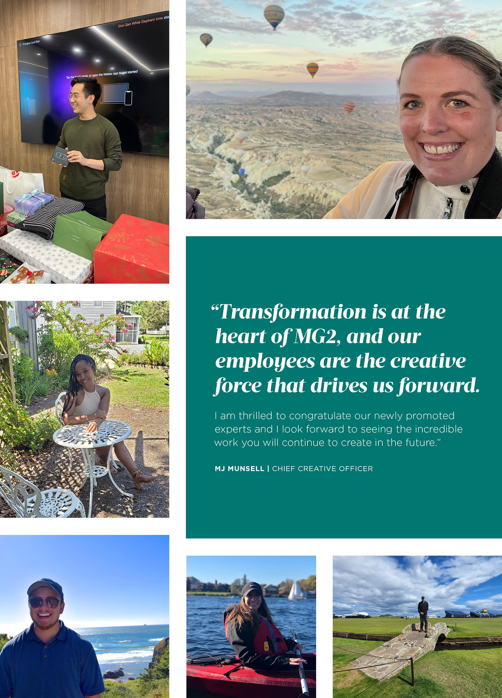
Ranked 5th in the top 100 best companies to work for in Washington state.

100 Best Companies To Work For in 2021- MG2 Ranks 5th!

MG2s mantra is people make place. The 50-year-old firm has a robust DEI initiative with a five-year timeline that involves all staffers. It emphasizes sustainable design practices and invests in staff development through leadership training, coaching programs and free LinkedIn Learning courses. Staff events include happy hours, movie nights, ping-pong tournaments and Mariners games.

Brick-And-Mortar Boom Comes As Retail E-Commerce Becomes More Reliant on Physical Stores

The U.S. has seen several retailers across the country forced to close their brick-and-mortar stores amid the rise of e-commerce over the past few years. However, we are in the midst of a brick-and-mortar boom, with retailers expected to open more stores this year than they close, for the first time since 2017, according to an analysis of more than 900 chains by IHL Group, a research and advisory company. At the same time, the e-commerce businesses of retailers have become more dependent on physical stores to fulfill orders, especially during the holiday shopping season. Lionesque Group CEO Melissa Gonzalez joins Cheddar News’ Closing Bell to discuss.

Perspectives

Above & Beyond: A Data-Driven Commitment to Sustainable Design

November 2021 / By Above & Beyond: A Data-Driven Commitment to Sustainable Design, Russ Hazzard

Architect and AIA 2030 Founder Edward Mazria once said, “We tend to rush toward the complex when trying to solve a daunting problem, but in this case, simplicity wins. Better buildings, responsible energy use, and renewable energy choices are all we need to tackle both energy independence and climate change.”

Straightforward, responsible design has long been at the core of MG2’s strategy and philosophy, with sustainable principles and applications woven into our projects at every opportunity. Our three sustainability values—Environmental Stewardship, Purposeful Efficiency, and Restorative Measures—are a simultaneous embodiment of where our firm was the year they were defined and reflect where we want to be in the years to come. MG2 has worked to raise the bar on our designs over time, evolving to match—and where we can, exceed—sustainable certifications and benchmarks.

“We had always reviewed our specifications for opportunities to suggest sustainable products and methodologies to our clients, which when we started were just better choices from a location and ‘better for the environment’ point of view,” says Russ Hazzard, President of MG2.

“Today, those sustainable vendor and materials recommendations aren’t just convenience, they’re a fundamental part of our DNA and design process. As a result, clients who once might not have been open to alternatives are looking to us as experts and advocates, armed with the right solution to set them on a path toward a more sustainable future.”

Costco Wholesale Headquarters Campus – Issaquah, WA

As architects and designers of built environments, the implications of everything we do, of every project we take on, are unmistakable. AIA’s 2030 Challenge outlines two specific goals that pledge firms must strive toward:

  1. A 90% reduction in built environment operating energy systems by 2025.
  2. A 45% reduction—a percentage imposed by our own team—in built environment embodied carbon by 2025.

“Greenhouse gas emissions reduction is the challenge of the century for the entire industry.” states Johnny Klemke, Building Performance Analyst at MG2, “How do we keep building more and more while producing less and less impact in the natural environment? That’s the question we’re taking on at MG2. By helping teams come up with more efficient, less carbon-intensive solutions for their designs, we’re also showing clients that sustainability doesn’t need to be a cost burden on the project.”

By helping teams come up with more efficient, less carbon-intensive solutions for their designs, we’re showing clients that sustainability doesn’t need to be a cost burden.

Johnny Klemke, Building Performance Analyst

“Our greatest hurdle is bringing the industry along with us,” says Jon Guerechit, a designer at MG2 helping to lead our operating energy initiative, “One benefit is that indisputable data makes it easier to convince clients that a cost-saving measure can also serve the environment. But the numbers aren’t always in our favor. Embracing the mindset of being a steward of the environment is harder because it forces stakeholders to think differently and invest in the distant future. It’s a mentality we’re pushing for across the board.”

Today, as we continue to evaluate and evolve our firm’s sustainability action plan, we’re committed to going above and beyond the goals outlined by AIA’s 2030 challenge by adding two more of our own

  1. A rigorous commitment to working with forward-thinking vendors and using sustainable materials that adhere to the highest standards possible.
  2. A reduction of water consumption—30% to 45% for indoor and 50% for potable outdoor—in all of our projects by 2030
PCC Community Markets – Seattle, WA

Adding materials to the mix.

From improving indoor air quality to reducing construction waste, the materials our architects and designers specify matter. Our choices represent an enormous opportunity to enhance the health of the planet and the people who live on it.

In addition to becoming proud signatories of the AIA Materials Pledge, MG2 has created our own rigorous Materials Evaluation System. Using a stoplight structure, our specialists analyze and rank every vendor, product, and material we use, to ensure that where and whenever possible, we’re adhering to the highest attainable sustainability standards for a better future.

PCC Community Markets—the largest grocery co-op in the United States—has partnered with MG2 for years on their journey to better their store’s materials and target LBC Petal Certification. In its Ballard location, the first grocery store in the world to be certified, over 40% of the materials—just shy of $1.4M—were sustainably sourced, with 9.2% of those derived from within 100 miles. Additionally, 100% of the store’s wood is FSC certified, with 10% of the elements reclaimed or reused.

“There is a misconception that we need to pursue green building certification to push for sustainable materials, or that we must only use sustainabile materials to make a difference in the world. Neither of these are true.”

Candon Michelle Murphy, Materials Specialist

With MG2’s data-driven materials system comes a deep reservoir of knowledge and insight, but continuous education to overcome misconceptions and help our clients and partners understand the financial and environmental investment is still critical.

“The largest challenge around the selection of sustainable materials is the misunderstanding of what costs are associated with it.” mentions Candon Michelle Murphy, MG2’s Materials Librarian, “It is true that there are specific material categories on the market that represent a high cost add if the sustainable selection is desired, but there are quite a few categories where there is no or nominal fee add to make a far more environmentally-sound final installation.

“There is also a misconception that we need to pursue a green building certification to push for sustainable and healthy materials, or that we must only put in sustainable materials to make a difference in the world. Neither of these is true, however: any selection that supplies a reduction of embodied carbon, lesser the amount of VOCs put into interior spaces, and provides for reclamation of materials or diversion from landfills still makes a difference.”

Fundamental impact through water reduction.

Water is one of the earth’s most precious resources. While many of us take fresh, clean water for granted in our day-to-day lives, architects who create built environments in areas where this resource is not so abundant continually have its preservation, reduction, and recyclability top-of-mind.

MG2’s water conservation goal—our fourth and possibly most ambitious sustainability initiative—is to reduce indoor water use in appliances such as toilets and faucets by 30% to 45% and to reduce potable outdoor water consumption in landscaping and irrigation by 50% in every single one of our projects by the end of 2030.

“Among dozens of reasons, a reduction of water in our projects is important because it can lower water withdrawals from local water sources,” states Maribel Barba, designer and co-lead of MG2’s water conservation goals, “allowing us to better harmonize with the local environment, increase water availability for all, and improve community relations.”

Costco Santa Fe – Mexico

While our water conservation goals may be new to many of MG2’s clients, some have been pioneering innovative technologies and water reduction tactics in their build environments for years. For example, longtime partner Costco has been working with MG2 on implementing water solutions programming into its warehouses throughout Mexico and the Southwest US for years, an initiative that awards them a 20% annual water savings.

The wholesaler giant recently took an even more significant leap into the future of water conservation with its Costco Santa Fe store. Complete with a one-of-a-kind green roof that acts as a natural extension of Parque La Mexicana, the Santa Fe location was designed with numerous water-saving technologies,  including toilets and landscape irrigation that utilize recycled water and a stormwater collection system in the Parque lake. Restroom fixtures were also installed with 50% less water demand, according to baseline.

“Even when water conservation processes have been implemented for several years, I think it is still being a challenge for firms to sell this idea to some partners.” says Christian Razo, designer and co-lead of MG2’s water conservation goals, “Many do not realize how much water you can save, or even the consequences of not saving water. We do our best to educate every one of our clients on the rewards of implementing these processes, including the satisfaction of knowing that what you’re doing is helping future generations.”

Costco Santa Fe – Mexico

We’ve come a long way in our sustainable design practices and are immensely proud of the benchmarks many of our projects and partnerships have achieved. But the reality is, MG2 is just getting started. 

“When we set out to create MG2’s formal framework for sustainability, we knew it needed to resonate with all staff and be embedded in the culture of the firm.” says Mark Taylor, MG2’s Sustainability Lead, “Our data-driven approach speaks directly to the results-oriented nature of the firm and will be the backbone of our success as we continue on our journey.”

MG2’s Sustainability Action Plan

Learn more about our above-and-beyond commitment to the future of our planet in our AIA 2030 Commitment Sustainability Action Plan, or by reaching out to our sustainability team.

Perspectives

What Designers Should Know About Antimicrobial Products

October 2021 / By Candon Michelle Murphy

This article was originally published on i+s on October 8, 2021.
__________

With the ongoing conversation around cleanliness in our built environments, there has been a large push to add anything available to inhibit the spread of viruses. “Antimicrobial” is seemingly a buzzword as of late, and you may have been questioned by your clients about what is available on the market that possesses these types of properties.  

Let’s break down what you should be looking out for and what you should be wary of when it comes to doing your part as a designer around health in the built environment

What Are Antimicrobial Products? 

There are two ways a product can be antimicrobial. First, we have products that are inherently antimicrobial, which means that their surface does not foster the growth of bacteria. You may have heard of copper having this property, which is unusual in this category due to the unique oxidizing process which actually kills bacteria. But for most products, this means that the surface of their product in so smooth and non-porous that there is no opportunity for the bacteria to grow.  

The second way a product can be defined as antimicrobial is with certain classes of chemicals integrated into the product or added on to a product as a coating. Although these products have been available on the market for many years, the advertising of them and the explosion of new products with these properties available has intensified over the pandemic. 

Why Scientists Are Concerned About Antimicrobials 

Despite the availability of these products, there has been much concern in the scientific community around these for nearly 20 years. After a study, the CDC said in 2003, “There is no evidence that antimicrobials in products prevent disease in hospital settings.”  Additionally, a study in 2016 noted the “FDA banned 19 antimicrobial ingredients, including triclosan and triclocarban, in over-the-counter consumer antiseptic wash products based on insufficient evidence demonstrating their safety for long-term daily use and that they reduce the spread of illness and infection.” Despite the ban on this particular product category, many of these chemicals are still overwhelmingly used with similar claims in other products.  

But there is a deeper concern here aside from the false advertising of these claims: there is quite a bit of proof available to show that antimicrobials are not only ineffective but the chemicals that are used in these products provide far more harm than good. 

[Related: How to Specify Cleanable Surfaces for Healthcare]

In December 2015, citing the concern for exposure to toxic chemicals and threat of drug-resistant bacteria, the health giant Kaiser Permanente banned the use of “15 specific antimicrobial chemicals to ban from its hospitals and other buildings because they can be toxic to both people and the environment.” Shortly after, a consortium of over 200 scientists and medical professionals released The Florence Statement, which details out a wide variety of concerns about these chemicals including but not limited to their properties of being toxic, bioaccumulation, and persistent. 

It has shown that specifically triclosan and triclocarban, which are the most common antimicrobial agents, are carcinogenic and endocrine disruptors in both human and animal tests. In addition, neither of these chemicals break down over time and have been detected in urine, breast milk, and sea life worldwide. Other commonly used antimicrobial chemicals contribute to microbial resistance, are known allergens and skin irritants, and provide adverse respiratory, nervous system, immunological, reproductive, and developmental effects. 

Many manufacturers of products will assure you that their additives of antimicrobial properties will not harm the environment or the humans occupying the space. But the truth is that coatings will eventually wear off, in the air or on someone’s skin; products will chip and turn into airborne pollutants; items will ultimately end their life in a landfill and leach into the surrounding ecosystem. 

5 Ways to Avoid Health Harm 

Despite all the evidence supporting the avoidance of these additives, we still have many clients and owners requesting these products. Because it is our role as designers to provide the best solutions possible, we should take responsibility for advocating against harm in the built environment while still supporting health. Here are some ways you can speak with your client about antimicrobials and alternate solutions. 

1. Educate yourself, your colleagues, and your clients on the harmful effects of antimicrobial chemicals. The Green Science Policy Institute has many resources to help you understand and provide information to others. Listen to the client’s preferences but offer them the information to make an informed decision. 

2. There are some antimicrobial products that do not contain chemicals of concern. Be sure to ask questions about what exactly the antimicrobial properties are and cross-reference with available information from verified sources. Create a list of these products to bring to your clients as alternate solutions. 

3. Understand the cleaning procedures of your clients and select finishes that support a high level of cleanability. Be ready with cutsheets to support how to clean the items. 

4. Think like a healthcare designer and implement highly cleanable design into every space. Consider detailing out inside corners that could be breeding grounds or incorporate bleach-cleanable textiles. Focus on making a space easy to clean rather than relying on something that may or may not work. 

5. Most importantly, build your knowledge of those inherently antimicrobial materials we touched on earlier. There are more available than you might realize, and here is a short but certainly not exhaustive list to get you started: 

  • PVD coatings: A far more sustainable way to finish metals than traditional electroplating, PVD is also inherently antimicrobial. This is available on a variety of hardware products and is also proven to outlast electrocoating. 
  • Linoleum: This all-around highly sustainable and healthy product is also a bacteria-killer. It is inherently antiallergenic, antibacterial and antistatic.  
  • Glass: The super smooth surface of glass shows to inhibit the growth of bacteria as well as being very highly cleanable while also having the ability to be super-heated for full disinfection. 
  • Some natural yarns like linen, merino wool and hemp: A wool rug is not only antimicrobial, but it also won’t stain either. 

Truthfully, the fact of this virus and others that we will face in our lifetime is that there is no magic solution to provide a bacteria and virus-free space. The most effective way to fight the spread of germs is through caution, mitigating exposure through all means available, and proper cleaning and disinfecting. 

Two More PCC Stores Meet Rigorous Green Building Standards

PCC Community Markets (PCC), the largest community-owned food market in the United States, has received Living Building Challenge (LBC) Petal Certification for its West Seattle and Bellevue, Wash., cooperative locations. The stores join PCC’s Ballard location, the first grocery store to receive this recognition, in meeting what are considered the world’s most rigorous green-building standards to earn the LBC Materials, Place and Beauty Petals from the International Living Future Institute (ILFI).

Perspectives

The Future of Grocery Retail: Top Five Trends for 2021 & 2022

September 2021 / By The Future of Grocery Retail: Top Five Trends for 2021 & 2022, Melissa Gonzalez

Last week we had the pleasure of attending and speaking at Groceryshop 2021 in Las Vegas. One of our first live events in a while, the energy was palpable and the innovations were flowing. It was an absolute joy to connect with so many and share the results of our recent grocery industry survey. If you haven’t yet, you can get your copy of our 2021 Grocery Consumer Survey Insights here.

With so much changing for grocery over the past two years, it’s seemingly impossible to keep up with consumer expectations and demands. However, here are our top five takeaways from what’s important for experience designers to keep in mind as they continue to bring future generations of grocery retail to life:

Incorporating Surprise & Delight

With such a significant shift to online and digital platforms, the in-store grocery experience has a bigger job to do in order to deliver upon surprise and delight. This ties into our survey results, which document consumer’s desire for discovery while in-store. 

Delight is the thoughtful touches and speed bumps along the way that foster education and discovery, and are embedded into environments designed to be “in service” of their customers. These could be temporary experiential moments—like what Lionesque Group CEO Melissa Gonzalez presented on stage about Jarlsberg or the Peanut Butter Association—or permanently designed experiences.

Innovative Retail Media

As digital and physical continue to merge, progressive grocers are seeing themselves as media platforms as much as grocers. In the name of inclusion and accessibility, it’s important for brands to make themselves available across all channels for all consumers. With online adoption, there is also a larger opportunity to leverage data and utilize the insights to deliver more personalized content to consumers.

For example, curated recipes, tailored nutrition plans, or even entire stores and brand philosophies dedicated to nutritional health and wellness, beyond what we typically see on a shelf. Raley’s O-N-E stores are a great example. Additionally, as we have seen in our work with Target, some are taking a more holistic approach to the curation of products around life occasions. This approach is also offering CPG brands the opportunity to gain mind share as well as increase their profitability.

Experiential Tech and Personalization

We all know consumer necessity fuels implementation as well as the adoption of technology. AI is seeing more prioritization to inform store teams on recommendations for merchandising, store layout, and more. Convenience and saving time are top priorities for consumers and they want tools that enable this. 

For example, Kroger and Instacart—which announced 30 minute delivery to your door—are utilizing AI to better understand demand and forecasting, as well as help with planning. They’re partnering with companies like Anuit.AI to help expand offerings, SKU count availability, and ensure the freshness of groceries. Order accuracy is also a huge focus for grocers, becoming both an issue and an opportunity for building customer satisfaction and confidence. Progressive retailers are looking at systems to improve upon predicting outages and substitutions to better improve this metric.

More unexpected partnerships that enable convenience are on the horizon well, such as what Albertson’s announced with DoubleDash in partnership with restaurants. The use of voice is also seen as an underutilized opportunity that is gaining consideration, and we see a rise in successful grocers that are empowering the in-store associate with data.

Proximity is still important (for numerous reasons)

In the argument to build more in-store experiences, proximity is still a motivator for consumers. Bloomberg cited that, as an established grocer, building more stores to increase consumer proximity is a tested and validated means to not only grow brick-and-mortar sales, but online sales as well. A store close to home is still seen as valuable even if the preferred channel is online delivery, and the cost of consumer preference is worth the price for multi-channel success.

Local is also important when it comes to products that are carried on shelves. Local, which is perceived as more sustainable than other products, including organic ones, offers the often true consumer perception that goods have not traveled as far, and therefore are both fresher and have a smaller carbon footprint. It’s a motivator for consumer decision-making and retailers are reviewing ways to surface suppliers, makers, and growers who are already in their supply chain.

Live Up To Your Brand Promise

It’s more important than ever that brands are standing behind a purpose, in addition to the products they sell. In order to garner customer loyalty, customers want to know you stand behind them, behind your staff, and behind your values. 

Giving back to the local community—another growing trend in grocer brand promises—is favored 42% by Gen Z and Millennial consumers. Only 38% of consumers polled thought their grocer was giving back to the community. 

A commitment to sustainability (action, not just words), a diverse selection of products, and inclusive accessibility are all at the top of the list when it comes to what consumers today are valuing from their grocers.

__________

Want to learn more? Find out what consumers expect from their grocers, both now and in the future, with our 2021 Grocery Consumer Insights Report.

Research & Insights

Understanding the Modern Grocery Shopper

September 2021 / By Melissa Gonzalez, Understanding the Modern Grocery Shopper
consumer experiences in grocery retail

In our constant curiosity and investigation of consumer behaviors and expectations, we utilize data insights to help uncover and validate where we can deliver true points of gratification within the customer journey. Here is a snapshot of key takeaways from our latest consumer survey. Our full deck with all our insights is available for download at the bottom of this preview.

HOW CAN WE ENHANCE THE GROCERY SHOPPING EXPERIENCE?

The dynamic of modern grocery is kaleidoscopic, with its definition and experience being driven by today’s consumers and our ever-changing world. How can we create a holistic and accessible experience?


READY TO LEARN MORE? GET THE FULL GROCERY CONSUMER INSIGHTS REPORT SENT RIGHT TO YOUR INBOX.

Brilliant Earth

jewelry-show-room-brilliant-earth-mg2-design

Approachable luxury

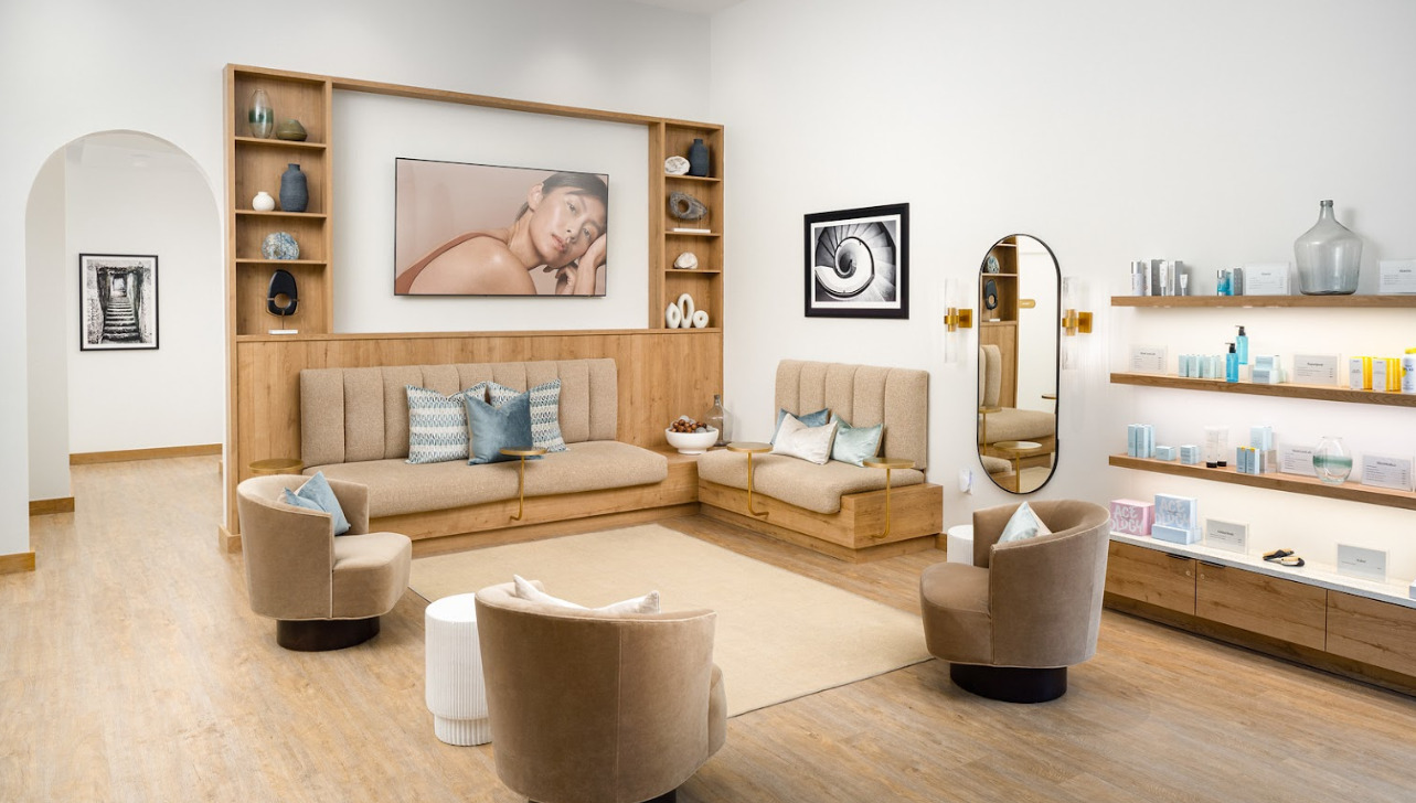
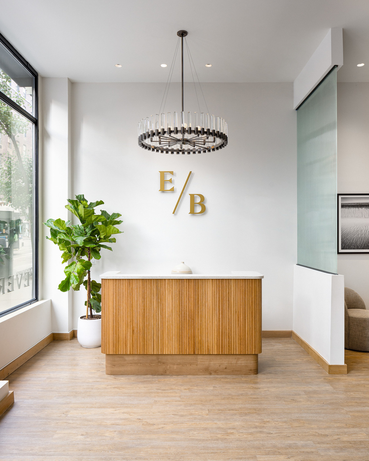
Since 2005, Brilliant Earth has offered the world ethically sourced, award-winning fine jewelry through its elevated web-based platform and personalized appointment-only showrooms. When the digitally-native company sought to expand its brick-and-mortar portfolio with open retail spaces, they partnered with MG2 to seamlessly translate the spirit of their digital brand and unique offerings into a real-world experience.

Like its jewelry, the retail design and rollout program for Brilliant Earth’s new showrooms was curated with thoughtful craftsmanship in every production phase. Previously, all the brand’s in-person experiences were appointment-only, with most of their spaces hidden away from window-shopping consumers on the upper floors of retail centers.

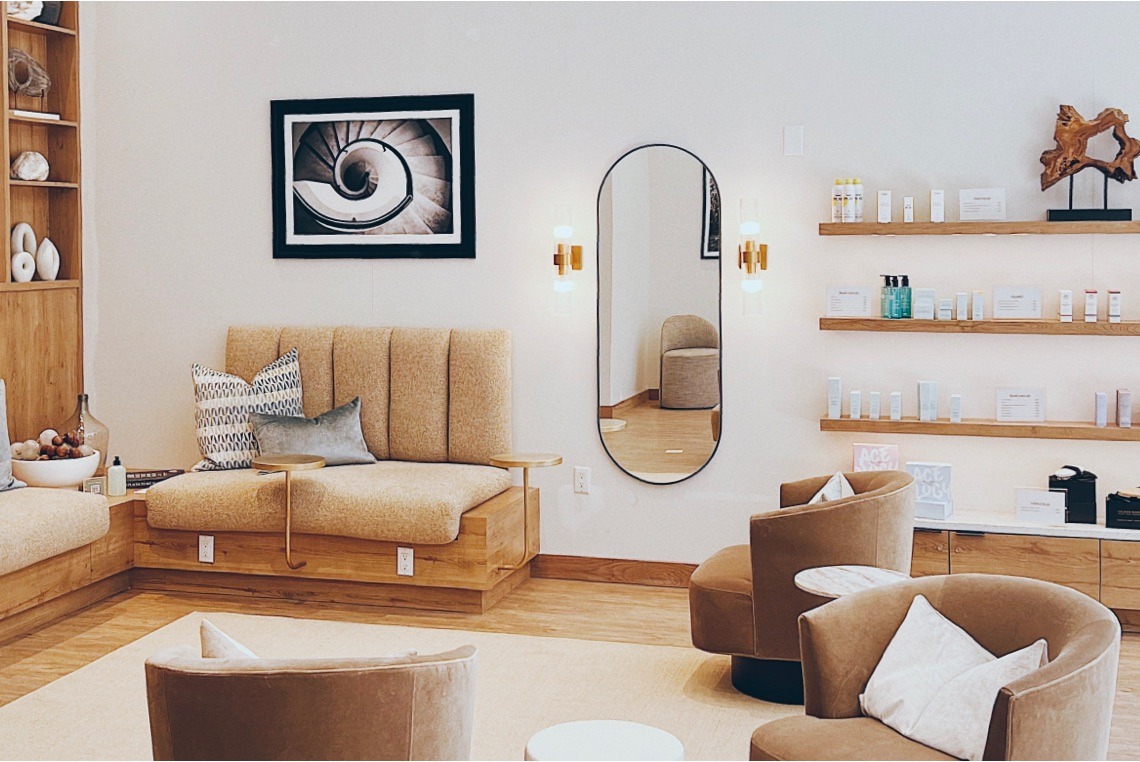
Utilizing a light, luminous, bright, and warm palette that reflected its online presence, MG2 designers brought an approachable luxury to Brilliant Earth’s new showroom experience. This new iteration of the store—the first of its kind for Brilliant Earth—brings an inviting, interactive, and educational retail experience into the brand’s program, diversifying its real estate potential with more premium, ground-level spaces, increasing awareness and engagement.

Brilliant Earth_Brooklyn

From planning to fixture design, the team boldly broke many industry barriers often seen in jewelry, such as the traditional horseshoe-shaped counters that often act as barriers.

Instead, in a direct reflection of the brand’s unique educational approach to the diamond shopping experience, MG2 designed a fixture package program that flexes and scales with each new space; a customizable kit-of-parts that can fit any format.

An entry kiosk once used to check customers in for their appointments evolved into a multi-functional digital tool. Now used to assist shoppers in industry and diamond education, the sizing of rings, and the check-out process, it’s a feature that further underlines the seamless integration of Brilliant Earth’s digital and physical offerings.

Caseline throughout the store is designed like furniture; display cases float lightly in the space, while round consultation tables equalize the service experience. This highly customized design and rollout program was achieved without raising the cost of construction for Brilliant Earth.

Brilliant Earth_Brooklyn

The Brooklyn location of Brilliant Earth represents a step forward for the brand while still adhering to the same kit of parts utilized in their other showrooms. Its unique building in Williamsburg features a vaulted ceiling and exposed brick, giving the space a larger and more roomy feel. This has granted merchandising room to grow, expanding the brand’s retail offering with six cases, an additional appointment station, and a more retail-focused reception area. With an emphasis on showcasing its fine jewelry products, this evolution in Brilliant Earth’s showroom design successfully balances its minimalist roots with an elevated, flexible retail agenda.

Similarly distinctive in its design hurdles and opportunities, Brilliant Earth’s King of Prussia showroom location—situated within a mall with limited egress and no natural light—presented unique challenges for the team to overcome. To bring the space to life, designers reprioritized the showroom’s configuration, eliminating the need for glazing, and added greater visual impact by utilizing large format graphics, wall casework, and incorporating merchandising above the cases. The warm and inviting retail story is solidified through the incorporation of recessed lighting, plush sofa seating, and education-centric pedestals at the front of the space.

The showroom’s private appointment stations were strategically relocated to the back of the space, providing guests with greater privacy while maximizing the overall flexibility of the design. By utilizing the same kit of parts as its other showrooms while adding new elements that reflect the brand, designers ensured that Brilliant Earth’s iconic bright and light personality prevailed within the confines of the darkened shopping center.

With each showroom brought to life across the country, this global leader in ethically sourced fine jewelry continues to seamlessly preserve its online identity while defining new retail experiences for its consumers, each with its own unique flair.


WaFd Bank Headquarters

Restoring and refreshing a community cornerstone

Community-Driven Design

Washington Federal, a cornerstone of the Pacific Northwest community, is one of the nation’s largest banking institutions with 235 branches across eight states. In conjunction with their brand refresh and transition to WaFd Bank, the business sought to reposition the interior and exterior of their flagship Seattle location, creating an experience and environment that resets the brand and its corporate headquarters. Design teams worked together to bring a modern, memorable destination to life, not just for banking clients but also for the entire Seattle community.

Illuminating a Landmark

Originally designed and built in the 1980s, the WaFd space located on the historical intersection of 5th and Pike in downtown Seattle was barely noticeable to passers-by as it faded behind the trees that stood outside. The teams sought to “empower the corner”, carefully curating an adaptive reuse effort while maintaining as much of the original 40-year-old stone exterior as possible.

MG2’s team achieved this feat through a series of design innovations: Shifting the entrance to a more visible, engaging location, we replaced the vacated spot with a vibrant, secure ATM experience. The reprogramming is complemented by a refreshed and illuminated external facade with the foundational design balancing bold, inviting digital signage and traditional architectural radiance. The canopy—now transparent—has been lightened and lifted, making the space more approachable to the community. Finally, new windows and glazing enhance visibility to the engaging branding within. These components harmoniously combine to pull the streetscape inward through a new entry vestibule, welcoming customers and passers-by alike.

Elevated Localization

Digital-first wayfinding and branding elements are custom-tailored to highlight WaFd’s new technology-forward strategy. It creates content zones that warmly celebrate everything from Seattle city culture to local sports teams, connect with the bank’s audience, and showcase their most essential services and features.

Complementing the technological approach are classic touches of an approachable, community-centered financial institution: gold and bronze elements combine with warm walnut, grass-green cloth coverings, and durable brand-centric finishes to breathe color and life into the otherwise neutral space. These features are easily changeable to evolve with WaFd’s newly implemented identity.

Programming, Harmonized

The concierge desk modernizes the space, bringing it into a new era while still embracing the building’s elegance and timeless permeance. It fosters a natural circulation and point of customer service throughout the lobby. Synchronized with the design of the space is an innovative user-centered banking process that creates new, flexible, friendly ways of connecting. WaFd’s hospitality-driven programming is strategically designed to allow for a symbiotic flow of bank staff and customers from teller interactions, loan appointments, and semi-private or private meetings.

The lobby further showcases deep shadows, dark wood walls, and stone finishes indicative of Washington’s natural hallmarks, which come together to draw your eyes to the elevator wall at the back of the space. Throughout are niches and subtle cabinetry that play host to storage for the concierge, coat closets, and the retractable bank grilles.

The Confluence of Compositions

Originally made up of four separate, closed-off areas—a bank branch, lobby, hallway, and retail shop—WaFd was redesigned to become one unified space. The experience offers an optimized traffic flow, allowing patrons to circulate naturally from the banking space into a new adjoining Starbucks. The internationally revered coffee brand, who struck up a rare collaboration with our designers, wove the bold themes of WaFd’s contemporary interiors into their retail motifs, extending to a tucked-away conference room space available to WaFd and their clients. These elements come together with commissioned local artwork, fixtures, and furnishings to seamlessly blend the juxtaposition of urban community and natural landscape.

With a refocus from simply a bank branch to a complex, design-forward program with multiple traffic patterns, vignette spaces, and memorable moments, the result is a modern, transparent, and welcoming experience that resides at the delicate intersection of gracious hospitality and progressive banking.


MG2 / The Lionesque Group partnered with GGP to create a place where digitally native brands could test physical retail in a complete turnkey solution. Technologically driven, the project included RFID “Wishlist” key with analytic tracking and enabled the education of customers about their brand story and unique product offerings.

The team fully developed the program and space from the ground up, including creating all branded aspects of the store, curating brands, developing a monthly membership program, design and production of the space, operational management, and ongoing marketing & in-store event strategies.

Offering an experience that garnered 4,156 shares and over 11M impressions, a total of 15 e-commerce brands were showcased in the first chapter of IRL, with 80% viable for long-term tenancy. The innovative concept drew attention from local and national media including articles in Chicago Tribune, Glossy, WWD, Design:Retail, among others.


  • Project Details

  • Location Chicago, IL
  • Client GGP Inc.
  • Market Sectors
  • Size 4,500 SF
  • Services
  • Certifications Design Retail Store of the Year 2018, Glossy 2018 Best New Concept Store Finalist

The Citizenry Bunkhouse is filled with handcrafted home goods from their various collections aimed at celebrating countries around the world. Located on Bleecker Street in the West Village, the pop-up gives customers the chance to shop the curated collection in person and meet the team.  The objectives were to grow overall brand awareness, learn about customers, and test the viability of a permanent retail store in NYC.

MG2 / The Lionesque Group worked in partnership with The Citizenry team to evaluate and concept the optimal flow and overall store layout. Deliverables included: inspiration for key in-store moments such as the Pampas window story, fireplace moment and patio scene, as well as budget assessment sourcing and oversight for store build-out production. 

After a successful 22 day pop-up with strong foot traffic, sales and growth in brand awareness in the New York market, The Citizenry extended their stay in the West Village. Over the duration of the pop-up, they garnered media coverage from major outlets including Architectural Digest and House Beautiful.


The RealReal

As a way to test the brick-and-mortar retail environment, The RealReal hired MG2 / The Lionesque Group as their pop-up design and strategy partner to launch a two-week holiday store in Soho, NYC. The objectives were to increase brand awareness, generate sales and test the viability of a permanent brick-and-mortar retail store.

The team provided location and design consultation for optimal layout in a retail environment and customer flow within the pop-up space. The deliverables included securing a location that best allowed TheRealReal to interact with their target demographic, sourcing of store fixtures, operational elements and back of house, and budget and production oversight from build-out to break-down.

After two successful weeks, with over 1,000 visitors
on a daily basis, The RealReal a year later opened up
a permanent location in Soho. Over the duration of
the pop-up, they garnered media coverage from
major outlets including BBC Radio, RackedNY,
HarperBazaar, Hollywood Reporter and more. 


  • Project Details

  • Location Multiple Locations, United States
  • Client The RealReal
  • Market Sectors
  • Size New York: 4,600 SF FOH + 2,500 SF BOH
    San Francisco: 4,500 SF FOH + 1,500 SF BOH
    Las Vegas: 4,500 SF
  • Services

Madison Reed

To help the brand build a solid, successful foundation for its long-term brick-and-mortar strategy, Madison Reed partnered with MG2 / The Lionesque Group to launch its first pop-up store in New York City.

With a six-month lease, the goals of the project were multi-faceted and included everything from introducing the Madison Reed brand to NYC and building awareness, to testing the viability of brick-and-mortar in order to acquire new customers and increase revenues of both one-time purchases and subscriptions. 

As a full-service partner, The Lionesque Group team provided a complete turn-key experience. Beginning by securing a retail space in Flatiron—a neighborhood with a high density of the brand’s target demographic—the team worked together with Madison Reed to conceptualize, design, source, budget, and bring to life the aesthetic and store flow for the first-ever Color Bar in just five weeks time.

Following a wildly successful launch—during which bookings increased daily—Madison Reed went on to open up a permanent location in Flatiron, with the design/build assistance of MG2 / The Lionesque Group, just a few months later, in addition to being named “Best in Beauty 2017” by NY Magazine.


With the objective of growing brand awareness and driving sales, Purple sought to tell an authentic, immersive direct-to-consumer story through a showroom and a series of pop-up experiences across the United States. Engaging MG2 / The Lionesque Group as their full-service partner, the D2C brand took a turn-key approach toward driving sales and educating potential customers. 

The design team visualized, crafted, ideated, and executed an innovative physical retail strategy, as well as sourced and managed the production of popup spaces across multiple cities. This multi-faceted program has empowered the brand to evolve and expand the program in the future, broadening its reach and allowing more customers to experience their Purple Grid technology first-hand.


Perspectives

We asked the community, “How do we want to live?”

November 2020 / By Abbie Drake

In 2017, MG2 explored the question, ‘How do YOU want to live?’ for our interactive Design in Public installation hosted by Seattle’s Design Festival. The data we collected was illuminating, however, the key messages focused on the individual rather than communities.

This year, we asked participants of the Seattle Design Festival, ‘How do WE want to live?’, which was driven by the dramatic social and economic changes happening in 2020.

The only way to get our questions answered was to ask real people.

Though this year has been challenging, it also gave MG2 a robust opportunity to collect insights from our national communities that inform future design decisions focused on physical spaces, cultural impact, and well-being of people.

We took a human-centered approach to formulating questions and sent out a survey to gather the data. The aim was to explore how we, as a collective society, want to move forward.

Periodic: A Popup Shop

A turnkey pop-up solution for innovative brands.

In today’s retail landscape, many companies find themselves hoping to test the waters of a brick-and-mortar investment before committing to a longer lease. Periodic—designed and implemented by MG2 / The Lionesque Group—is an award-winning, turn-key space located in the South Lake Union district of Seattle created for brands to activate pop-up experiences in a seamless way.

With the unique challenge of creating a full-service platform that offered both a B2B and B2C presence, the team worked with close attention to detail on everything from the Periodic name, font, and logo, to the modularity and functionality of design fixtures, to curating onboarding and offboarding programming offered to each business that inhabits their space.

From two weeks to two months at a time, Periodic gives brands an opportunity to have a presence in a fast-growing, highly trafficked neighborhood. The platform is designed to set them up for success, taking the jurisdictional weight off their shoulders and allowing them to test for viability, grow brand awareness, or trial a target demographic in a short amount of time with an efficient investment approach.

Along with a fixturing package designed to flex and modulate to accommodate individual merchandising and storytelling needs, each curated brand has access to a local marketing company and a best practices playbook. The space itself—a glass building on a corner lot—acts as a billboard, creating a truly unique, hyper-accessible, out-of-the-box pop-up solution that both brands and the community are already benefitting from.

For its unique consumer experiences and experimental turnkey platform that allows for brands of all sizes to test the brick-and-mortar waters in downtown Seattle, Periodic: A Popup Shop was honored as one of Fast Company’s Most Innovative Retail Designs of 2021.