Capitol Hill Food Hall

A true taste of Seattle

For travelers making their way through the Seattle-Tacoma International Airport, the corner-bound intermission in the center of Terminal A was, at best, unmemorable. Anchored with an aging bookstore and some sparse seating, the only true draw to the area was the sweeping view of the tarmac through its bank of windows. 

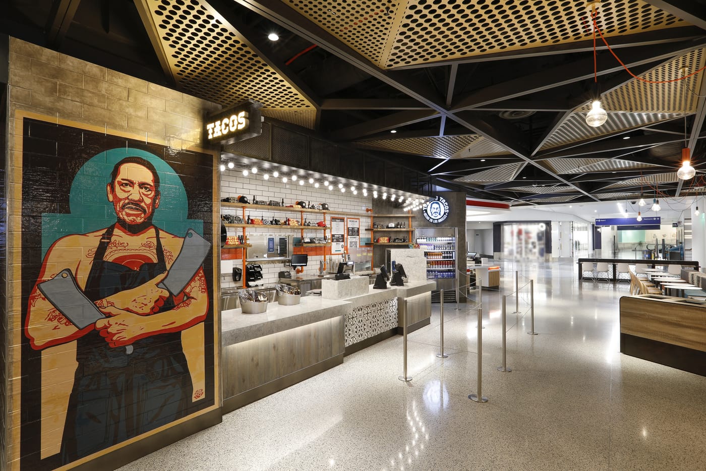
Partnering with MG2, SSP America transformed this nondescript section of the airport into the Capitol Hill Food Hall: a destination that passengers would remember and revisit for flights to come.

A remarkable one-stop terminus designed to embody the experience and authenticity of the city’s Capitol Hill neighborhood, the Capitol Hill Food Hall allows travelers to savor a true taste of what Seattle’s culinary scene has to offer without ever leaving the airport.

It offers a thoughtfully unique experience, bringing together a curated selection of popular vendors and reimagining and translating their curbside appeal within a terminal-bound venue. While other airports glean digitally-driven dining experiences whose technology integrations age poorly, Capitol Hill Food Hall relies on a more handmade, analog consistency throughout its branding, signage, and finishes, creating its own design language and immersing visitors in a genuine experience as they discover new favorites. 

Bringing Capitol Hill Food Hall to life was not without challenges. This section of the airport was one that had never been used as a food and beverage site before. The complexities of designing and constructing a building-within-a-building and housing numerous individual businesses—each with their own standards and requirements to uphold—created a vast landscape of moving pieces. 

An exceedingly complex program inside of a secured airport terminal, every detail that might otherwise be overarchingly accepted or otherwise overlooked; materials, fixtures, cases, and beyond were scrutinized and deeply reviewed by the Seattle Port Authority in the name of passenger health, safety, and security. Integrated and streamlined coordination was critical to stay on track and on budget in making SSP America’s original a reality. 
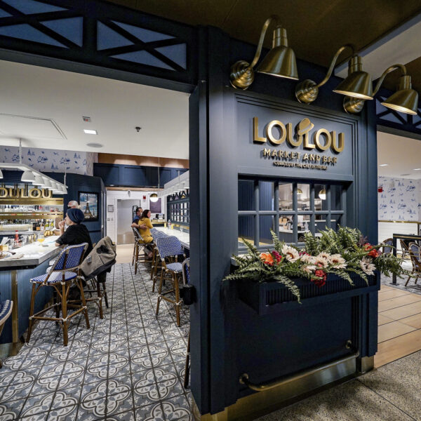
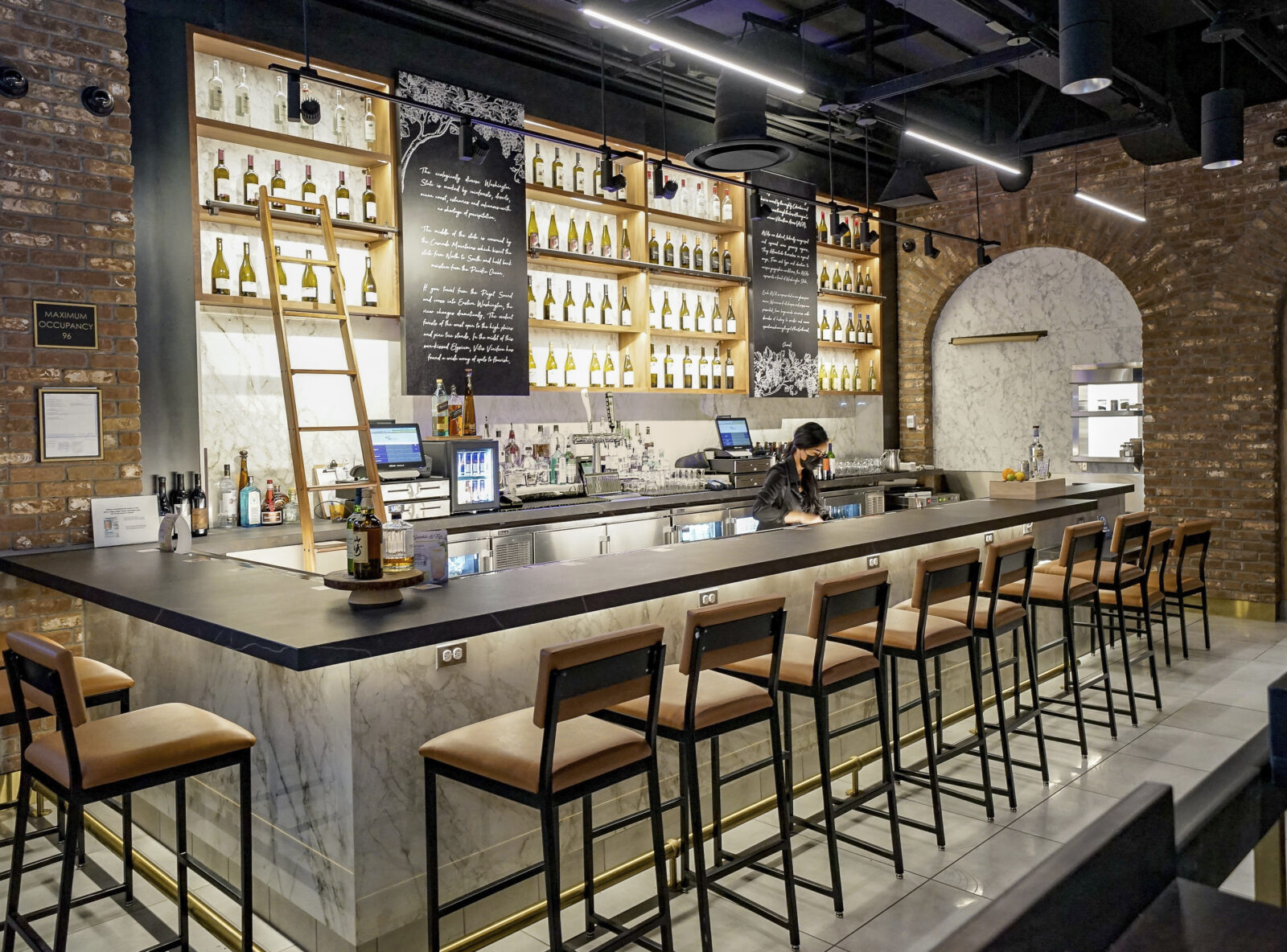
Today, the space offers much more than awe-inspiring views; Capitol Hill Food Hall offers food and beverage options from numerous local vendors, ranging from bahn mi and burgers to Seattle’s finest coffee and hoppiest brews. Each option is carefully curated, with each vendor taking their typical streetside branding and tailoring it to their terminal location, seamlessly blending all of the designs to create one encompassing language. Two unique areas are dedicated to live music, a scene that Seattle is known for the world over. In the spaces between, the experience is dotted with ample seating and outlets, encouraging weary travelers to sit back, relax, and experience the real Seattle without ever leaving the airport. 


Perspectives

Comes With A Side Of Vibe

October 2020 / By Comes With A Side Of Vibe
consumer experiences in specialty retail

How takeout can keep loyal consumers connected to the brand.

It is without shame or regret that I share just how old I am when I reference record albums, liner notes, and the occasional swag that came with them. Beyond the music, these were a way to connect with and be part of your favorite band. They were a peek into the process, the lifestyle, or simply the hype that brought them to your attention in the first place. 

I remember Joe Jackson’s Look Sharp record(s) came with a mini-pin, and the records themselves were smaller than the standard shape and size. I remember buying my sister the picture disc of Elvis Costello’s New Amsterdam when I was visiting a friend in Carbondale. The whole of the vinyl was tulips. Obviously, these details stood out, or I wouldn’t remember them decades later.

Nowadays, you can download your music, pull-up a YouTube video, and Google your favorite bands, but it’s tough to have something tactile to look at, to share with a friend. It’s easy to forget that discovery over time. It’s easy to forget the feeling you had when you first had an album on repeat for a week.

I feel the same way about bars and restaurants. Rich with emotion and inspiration, in 2020, they feel a lot like consuming music. It is collected but not tactile. It is memory-based. The feeling of walking into your favorite bar or restaurant is getting fainter by the month. The vibe—the people, the smells, the intent created, curated, cooked, and served up by your hosts—is being dulled by time and circumstances. 

Masked-up and keeping our distance to keep one another safe, it’s how we have to be right now. For restaurant owners and chefs, the takeout, to-go, and delivery methods have been a way to try and stay in business and make it through this pandemic. For bar owners, it is even more difficult in many states with safety restrictions limiting their ability to operate.

Arguably a bar and restaurant are more than its food and beverages. It is a highly emotional experience that is a collection of sensory elements all coming together to create delight in its many varied forms, which gets me to new packaging and connecting brand loyalists to what they love and remember from their favorite bars and restaurants.

I’m going to pick a local favorite as my muse for this example: Gainsbourg is a local French bistro in the Greenwood neighborhood of Seattle. It takes its name from Serge Gainsbourg, and though I’ve never interviewed the owners about the origin story of the brand, I have formed an opinion of what it’s about for myself – which is how consumers adopt brands and become loyal. “I like that; I’m like that…” 

So during the pandemic, you can order takeout, cocktail kits, or even bottles of wine to go from Gainsbourg. It’s a nice reminder of an evening there, but it doesn’t last. When the food’s gone and the bottle’s empty, the experience is over, and you are back to memory and recall to inspire your next order. 

It’s a small, cozy space that’s not perfect, but in a lovely way. The cookline just behind the bar. The cocktails are inventive, served in mismatched glassware. Music plays nonchalantly in the background, complementing a muted black-and-white film projected on the far wall. Surroundings and fellow patrons—always somehow so much cooler and more soulful than I’ve ever been—create an appeal that draws me in further with every visit.

All of these factors combine to form a rich sensory experience, seemingly impossible to replicate, particularly in one’s own home. So how, if you are Gainsbourg, do you package-up this experience and send it out the door when money is tight, and margins thin?

My answer is that it is the imperfection and patina of the space and the sensory cues of the music and film that could be added to the bag that you pick up on a Friday night. A second-hand 1960’s French postcard over-stamped with Gainsbourg’s phone and order info. A link to tonight’s playlist printed and enclosed in your bag. New-old-stock cocktail stirs.  Stickers, cut-out articles, little unexpected cultural surprises that become tactile reminders of how the brand makes you feel. Not expensive stuff. Thoughtful stuff. Imagining for your customer what they feel when they can have that on-site experience.

The same goes for bars. The Kraken Bar & Lounge in the University District of Seattle is a venue well-known for its punk rock shows and pub fare, but it will be ages before there can be live music again. What if the pulled pork sandwich to-go came with a flyer, a 45, stickers, swag, or an original drawing or photo collected over the years? A way to fill in the experience, the vibe that customers are missing in this pandemic.

Intentionally these suggestions and examples do not include items like serving ware, candles, or table linens, because who has the money to add those things to orders right now? And it’s kind of not the point. Those liner notes, photo jackets, and little bits that came in albums didn’t have any real shelf value. They had high emotional and recall value. They gave us evidence of our affiliation and participation in the music.

By including some of the “lifestyle” that goes along with memorable food and beverages, we make it easier for loyal consumers to remember the vibe and look forward to the day they can experience it on-site again.

—————

Interested in how you can keep your consumers connected to your brand? Reach out to Peter & his team at hello@mg2.com.

Vans Downtown LA

A heritage to call home

After 54 years of calling Southern California home, classic skateboard and surf icon Vans embarked on a journey to create their first community-driven retail and event space in Downtown Los Angeles. A longtime partner in Irvine, CA, and now primary firm in North America, MG2 worked closely with the Vans team on designing their newest and largest flagship, creating an elevated hybrid experience environment that goes above and beyond, signifying a new era for the brand.

Occupying three floors of the historic Singer Building, House of Vans needed to be meticulously designed with optimized vertical navigation and overlapping pathways to ensure a seamless customer experience. Also essential was the implementation of unique, above-and-beyond elements, such as a kitchen and mobile bar, that would require navigating the complexities of local permits and compliances to include in their hybrid retail space.

With the programming rotating daily between concerts, workshops, exhibitions, and more, the space required the ability to evolve for every function.

“Our Downtown LA store opening signifies a new Vans chapter as we continue our mission and commitment to being community and experience focused.”

Carly Gomez, VP of Marketing Americas, Vans

After working together for years, MG2 acted as the primary architecture partner for House of Vans DTLA: their largest and most ambitious flagship to date at 11,500 sq/ft. This intimate knowledge of and partnership with their brand allowed for seamless transparency, trust, and collaboration throughout the duration of the project.

The team acted as a sounding board, facilitator, and champion for structure functionality, materials, costs, and branding efforts throughout the space’s design. With the advantage of being local to the area, MG2 was deeply familiar with and able to traverse the intricacies of city permit and compliance logistics.

Holding true to their dedication to sustainability, and in direct reflection of Vans’ brand values, we utilized as many raw materials, elements of the original historic building, and sustainable energy fixtures throughout the space as possible.

Adorned in plywood, concrete, chain link, local art, and Van’s signature black and white checkerboard, the new environment holistically reflects their SoCal heritage and attitude, while allowing them space to broaden their demographic beyond skating and surfing and appeal to the next generation of consumers.

Over the course of the project, the team observed first-hand the excitement and enthusiasm from local government and consumers alike for Vans to revitalize this previously abandoned space and help reinfuse art, music, and culture back into the historic neighborhood.

Currently the largest Vans space in the world—and second largest experimental retail space in the neighborhood—House of Vans DTLA opened to the public in spring of 2020 and features fresh work from local artists, a dedicated community experience studio, and of course, a wide range of exclusive Vans footwear, apparel, and accessories.


Meet Our Team

Scott Owen, Jr.

Associate Principal

A passionate problem-solver and big picture liaison, Scott Owen has spent the past ten years helping mixed-use and large format retail partners such as Petco, Target, and Nordstrom go beyond simple integration of consumer trends. Hand-selecting perfectly calibrated teams for each project, he specializes in unpacking and analyzing difficult challenges, pushing comfort zones, and taking risks, ultimately breathing life into engaging and extraordinary environments.

Scott’s main prerogative as a designer is to preserve each client’s vision while continuously keeping functionality and user experience at the forefront. People-oriented and a persistent advocate for infusing personality into every venture, Scott is continually inspired by the young architects he mentors, gaining just as much wisdom and perspective as he imparts. When he’s not immersed in developing his teams or unraveling complex design problems, you’ll find Scott unwinding through music, be it listening or playing.

Meet Our Team

Mitch Pride, RA

Principal

As an award-winning retail and hospitality designer, Mitch Pride has always gravitated toward the creative aspects of architecture, resourcefully bringing together space, form, and volume to turn complex concepts into alluring yet functional realities. He is an expert at owning and facilitating the creative process, partnering with clients to realize their vision while never losing sight of the big picture.

With a remarkable ability to immediately bring ideas to life through sketch, Mitch synthesizes aspirations into tangible outcomes, resulting in truly novel retail solutions that set brands apart in the marketplace. Inspired by the flow of exteriors into equally compelling interiors, Mitch is a strategic romantic who specializes in helping clients see beyond their perceived limitations, translating aspirations into design solutions.

Meet Our Team

Janelle Schneider

Principal

Janelle operates at the forefront of client service. She has been leading high-performance teams for over 20 years, delivering state-of-the-art design concepts for leading brands. In her formative years, Janelle managed the interiors and casework teams for Nordstrom Store Design. An expert when it comes to programming, production, finishes, and fixtures, Janelle helps her teams translate spoken and unspoken consumer needs into cost-saving outcomes. Her passion for interiors only rivals her love for perfecting details. A natural connector, Janelle knows how to mobilize an effective team process that yields memorable experiences, authentic engagement, and consumer capture.

SSP America

Now Arriving: New Food Concepts at West Coast International Airports

Once a place for generic restaurants serving mediocre food, airports have come to realize investing in an array of quality F&B options can yield higher customer satisfaction and subsequent profits. As a result, multi-million-dollar renovation plans for the Los Angeles, Seattle and Portland international airports call for a number of new dining amenities.

After the government agencies that own and operate the airports announced redevelopment programs in 2017, MG2 worked with SSP America to develop a series of restaurant concepts to submit for leases. Concepts for multiple high-performing national brands and popular local brands were awarded contracts, as were one-of-kind brands crafted by MG2 exclusively for each airport. Six of the restaurants selected for the Seattle airport will be featured together as part of a food hall environment also designed by MG2.

LAX Photography: LAX Shop Dine

The work was developed and completed alongside SSP America and Unibail-Rodamco-Westfield Airports (URW Airports), the in-terminal commercial developer and manager of LAX Terminal 1.


Translating an iconic brand across borders

The Vans brand celebrates individuality and the culture of outdoor sports like skating, surfing, snowboarding, and BMX biking. In expanding in Mexico and other markets, VF Corporation needed to translate the Vans store concept into new store designs that reinforce the iconic brand with cultural sensitivity.

MG2 has collaborated with Vans to implement consistent architectural design and planning programs for more than 30 stores across North America.

In each location, the design concept is effectively tailored and efficiently implemented through MG2’s knowledge of cultural trends and the nuances of local developmental processes.


Transcending high standards for a luxury icon

Moncler sets the standard for luxury outdoor sportswear with a clientele that expects nothing but the best. With store locations around the world, Moncler was looking for a partner to bring the French-Italian lifestyle brand to life in new boutiques at The Shops at the Bravern in Bellevue, WA and the Forum Shops at Caesars in Las Vegas.

MG2’s expertise in specialty and luxury retail as well as retail center design created an effective bridge between Moncler and the retail center developers to achieve the objectives of everyone involved.

That process involved working on-site with Moncler’s installation teams to ensure unique materials, such as stonework from Italy and chêne fumé French wood paneling, were incorporated effectively. As a result of MG2’s work, the Las Vegas and Bellevue boutiques successfully uphold Moncler’s brand standards and the high expectations of the Moncler customer.


A tastefully designed shop for all seasons

Seattle Chocolate’s jcoco line brings together high-quality chocolate infused with global flavors with a high-fashion image and a strong commitment to community. MG2’s Peter Stocker worked closely with jcoco in the line’s early stages to develop its unique brand concept and packaging. Informed by this insight, Stocker and the MG2 team successfully brought the jcoco brand to life in their first standalone location.

MG2 designed the location to reflect the flexibility and interactivity of a pop-up shop, but with the high-end details of a permanent brick-and-mortar that is befitting of the stylish jcoco brand. MG2 designed the shop to undergo a series of three complete transformations during its seven-month run, with each design concept, in-store events, and merchandising drawing inspiration from a seasonally featured chocolate.

The jcoco pop-up is a clear representation of the impact of end-to-end brand storytelling and the type of immersive, interactive experience that can only happen in a brick-and-mortar store.


HomeStreet Bank

Banking on a more personal future

In the wake of the global financial crisis and widespread recession, HomeStreet Bank responded to the needs of its clients to expand the range of consumer services beyond lending. In order to accomplish that feat, HomeStreet Bank instituted a more personal brand philosophy focused on direct engagement and building trust with the consumer.

By understanding the personal nature of banking and HomeStreet Bank’s expansion aspirations, MG2 was able to reflect this heightened consumer engagement through architectural design. The process began with the design of a single lending center and then grew to include the design of a series of branches as HomeStreet Bank expands along the West Coast of the United States.

MG2 has designed a consumer-centric banking environment with modern, inviting exteriors that emphasize HomeStreet Bank’s community commitment in the way the branches blend with the local architecture. Taken together, these elements embody HomeStreet Bank’s refreshed brand.


First Tech Federal Credit Union

Creating the financial center of the future

First Tech Federal Credit Union’s dedication to serving its members comes through in everything from branch location to the design of those spaces. In developing its 40th branch, First Tech wanted to create an experience that fully aligned with the lifestyles and needs of their technology-oriented members. This required a more welcoming, relaxed, and contemporary atmosphere than traditional banking settings provide.

MG2 created a branch environment that places personal connections at the forefront. The typical row of bank tellers and cluster of account management desks were replaced with an open “relationship center” surrounded by member suites, offices, and a large meeting room to provide options for every type of financial discussion. The flexible layout, energetic color scheme, and incorporation of mobile technologies mirror First Tech members’ life and work styles, helping to integrate the experience seamlessly with their everyday lives.

Compared to more traditional First Tech locations, the new branch concept has led to enhanced member satisfaction and opportunities to provide more products and services to members.

Based on positive results and member feedback, First Tech has introduced several other locations based on this model and continues to see the concept resonate with members and employees.


  • Project Details

  • Location Multiple locations, U.S.
  • Client First Tech Federal Credit Union
  • Market Sectors ,
  • Size Approximately 3,000 SF
  • Services

Anthony’s Restaurants

Serving up a relaxed maritime atmosphere with waterfront views

For nearly two decades, MG2 has designed Anthony’s Restaurants, a family of locally owned restaurants in Washington. Dedicated to providing guests with a luxury dining experience, Anthony’s has earned the reputation for serving the finest in Pacific Northwest seafood. To complement the acclaimed cuisine, the majority of restaurants are built along rivers, lakes and the ocean. Oversized windows offer wide-sweeping views of these glistening bodies of water and create airy, light-filled dining environments.

As guests are led to their table by a host or hostess, they’re able to glimpse inside an open kitchen where chefs are expertly preparing fresh catches of the day. If they shift their gaze upward, they’ll notice exposed wood beams running across vaulted ceilings, an architectural detail intended to mimic the interior of a sailing ship’s hull.

MG2 recently helped Anthony’s introduce a new F&B concept, known as The Cabana. Located adjacent to the Anthony’s in Anacortes, The Cabana offers a more casual sit-down dining experience, as well as a classic fish and chips “to-go” bar and two sand bocce ball courts.


Corporate Campus Food Pods

A shipping container BBQ concept spices up employees’ work week

MG2 was tasked with transforming an underutilized outdoor common area into a food venue capable of serving hundreds of corporate campus employees daily. Designing the layout of the “kitchen container” and the placement of equipment within the space required working closely with the food service operator to understand the step-by-step preparation process for each menu item. With a limited footprint (20′ x 8′), the design team had to think linear. Everything needed to be streamlined and purpose-built.

Patrons are served their meal out of a carry-out window. From there, they can choose to either dine alfresco at a nearby patio table or step inside the “dining room” container, which features butcher block-style tables, plaid upholstered benches, neon blue wire chairs and Edison light bulbs dangling from upside-down refinished stock tanks.

Both shipping containers are adorned with custom graphics and signage designed by MG2’s brand development team.


A tailored approach to expressing a unique brand

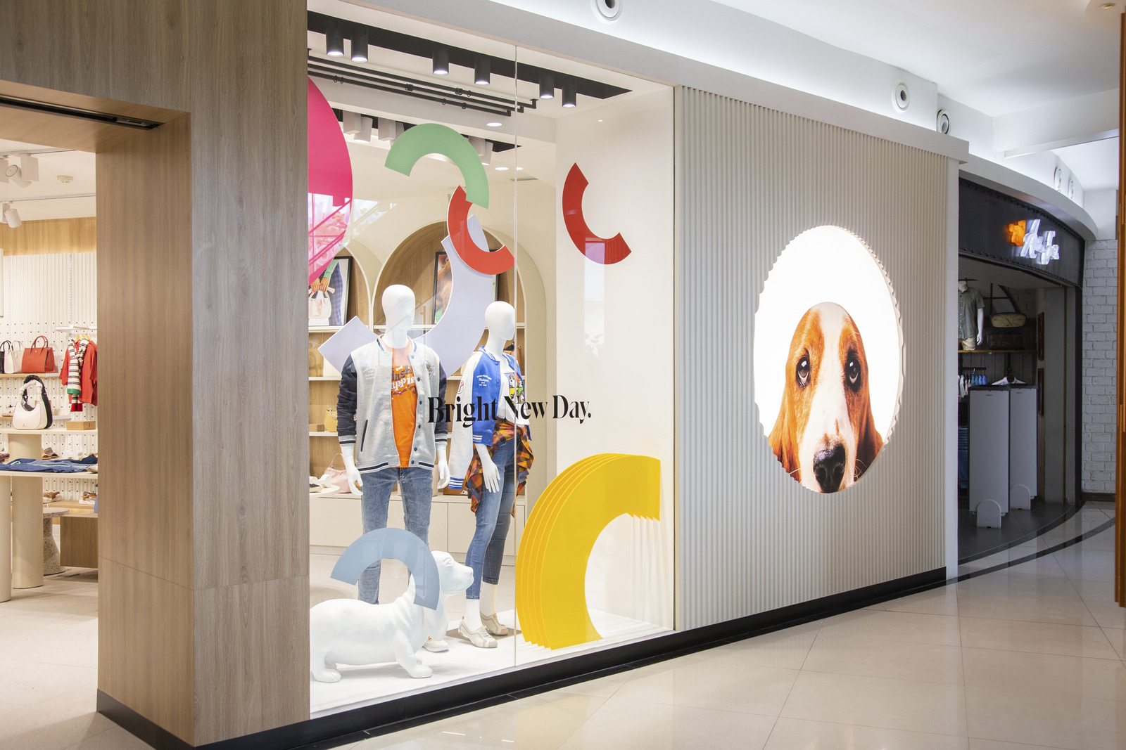
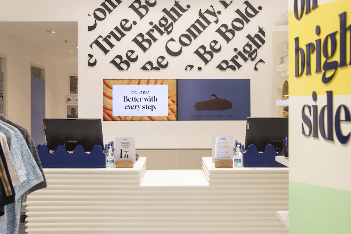
UNIQLO is the fourth-largest apparel retailer in the world with a growing network of more than 1,400 stores offering high-quality, casual apparel. As UNIQLO continues to expand, they work to integrate the cultural characteristics of each market into their retail stores while staying true to the brand’s core design.

When entering new markets, UNIQLO has strategically raised brand awareness by utilizing pop-up or temporary store locations. MG2 partnered with UNIQLO’s US and Japan teams on a series of such pop-ups as well as in-line mall stores and a flagship store. One particularly unique pop-up was located in Boston’s historic Faneuil Hall Marketplace and will be followed by a nearby flagship store reflecting a striking blend of UNIQLO’s modern aesthetic and the heritage of the nearly 200-year-old Quincy Marketplace building.

In each store location, MG2 interpreted the key UNIQLO brand and design values to fit the distinctive features of the market. UNIQLO’s signature design elements — from a precise approach to symmetry to a focus on strong visual impact upon entry — ensure that every store stays true to the UNIQLO brand while attracting a new set of loyal customers.


  • Project Details

  • Location Multiple locations, U.S.
  • Client Fast Retailing Co., Ltd.
  • Market Sectors
  • Size 2,500 - 15,000 SF
  • Services
Perspectives

The Future of Beauty

June 2020 / By Melissa Gonzalez

Just months ago, beauty relied on high-touch sensorial environments. With a raised awareness around high-touch environments, the beauty industry must appeal to customers that responsibly tackle the “touch and feel” interaction associated with product testing. Shop! Association asked our team how stores can create inviting and authentic experiences while balancing digitization and human interaction responsibly?

Melissa Gonzalez, Min Jae Kwon, and Lauren D’Archangelis explore design solutions in which The Future of Beauty can tackle this challenge through innovative gondolas, parallel play and mood lighting, interactive and shoppable store walls, and new checkout methods. Cleanliness and hygiene will be a key priority for both brands and consumers, but the emotional experience of discovery will still shine through.

Deschutes Brewery Public House

Nestled in Concourse D of the Portland International Airport (PDX), the Deschutes Brewery Public House provides a “taste of place” experience for travelers. One of two PDX brewery collaborations between MG2 and SSP America (the other being Hopworks Urban Brewery), Deschutes Brewery Public House is designed to provide a warm, inviting feel of an open-air restaurant while inside the airport. The interior pays homage to Deschutes’ history with custom artwork that demonstrates the brewing process, wall wraps made from used barrel staves, and a digital fireplace bookended with firewood and gallery walls showcasing photos from the brewery’s 30-year history.


  • Project Details

  • Location Portland International Airport (PDX), Portland, OR
  • Client SSP America
  • Market Sectors
  • Services
Perspectives

Rethinking the Fibers of Store Design

June 2020 / By Melissa Gonzalez

How Stores Will Be Reformatted to Flex for a More Connected Consumer

With consumers increasingly adopting technologies that enable self-guided exploration and check-out, store digitization has become more prevalent in the physical retail environment. Read about how modular design is the answer to our rapidly changing world.

Written by Melissa Gonzalez and Visuals by Mitch Pride and Alyssa Joy Taylor

Perspectives

Rethinking Play

May 2020 / By Melissa Gonzalez, Mitch Pride

How do we resurrect play in the new normal and give new life to brands focused on creating joy for kids and their families? As part of the #ExperienceGood campaign with The Vendry and global marketing firm CSM, Melissa Gonzalez and Mitch Pride provide insights on how sensory exploration can ignite a child’s creative spirit, building an emotional connection to a brand.

Hopworks Urban Brewery

Destination: Better brews

In an effort to satisfy the growing appetites of globetrotters for higher-quality food and beverage options, airports around the world are investing millions into both renovating and designing new dining amenities that excite and delight. 

One such experience is the new Hopworks Urban Brewery, located inside the Portland International Airport (PDX). The modern-day brewpub teamed with MG2 to design and build a natural extension of the brand into an airport setting, one that holistically captures their authentic character while weaving in fun, quirky, and socially responsible elements that reflect their ethos.

“As champions of sustainability, we couldn’t be more honored to become beer ambassadors”

As a family-owned business, Hopworks has a loyal following of locals, cyclists, and beer enthusiasts. As such, a bike-themed, family-friendly brewery was designed to highlight Hopworks’ vast portfolio of organic beers and extensive food menus, fit for both adults and kids alike. Maintaining the integrity of the yellow-and-black Hopworks brand motif to authentically mirror their Portland streetside locations, space seamlessly balances the brand’s cycling and street culture with PDX wayfinding, design aesthetics, and graphics. 

“As champions of sustainability, we couldn’t be more honored to become beer ambassadors for the best brewing city on earth in the best airport in the country,” remarks Christian Ettinger, Hopworks Urban Brewery Founder, of the space. “We are so excited to welcome travelers to Portland with a cold pint of organic beer in our new, beautifully designed pub!”


Smashburger

Smashing is fun and delicious

Across nine countries, thirty-seven states, and counting, the fast-casual restaurant Smashburger has served millions of their namesake-style burgers to hungry fans around the globe since 2007. Ready to elevate their consumer offering and continue differentiating themselves in an increasingly crowded market, they partnered with MG2 to refresh their dine-in experience and brand, emphasizing their unique process, encouraging community, and embracing their and embracing their heritage as a chef-designed product.

An open, comfortable layout that encourages diners to stay longer than just their meal. Each Smashburger space is outfitted to reflect a chef’s studio with the addition of USB chargers, free WIFI, and a variety of different seating options cater to all types of experiences—from one person grabbing a burger and a beer, to a big group of friends celebrating a sports win. Views into the kitchen were opened up to reveal the burger-smashing technique, complete with bleachers to properly observe the proverbial show. Meanwhile, elements of the equipment in use extend out to the service counter, truly enveloping customers in the cooking process.

The updated color palette pays subtle homage to the brand’s Colorado roots and acts as a key differentiator in an oversaturated market. MG2 designers utilized gray, dark gray, and yellow, fused with the subcategory of rust and blue—a nod to their Denver roots—creating a unique style and personality that simultaneously generates both visual recognition and distance from the typical red, white, and black color palette of your average burger joint.

Finally, and perhaps most pronounced, each Smashburger proudly showcases local pride through customized art installations and EGD in each new location.

Boston, for example, pays homage to its local architecture through a wall covering featuring the silhouette of Leonard P Zakim’s Bunk Hill Memorial Bridge, as well as interior touches that mirror the structure’s cable design.


Press Coverage

/ /

Costco Wholesale Headquarters Campus

Costco Wholesale first opened its global headquarters campus in the mid-1990s and has continued to expand as the company grows. Working closely with the City of Issaquah, MG2 has been partnering with Costco on developing a 30-year agreement to expand on the original master plan, which features up to 1.5 million additional square feet of office space. 

The design aims to evolve Costco’s corporate campus by reimagining working environments, enhancing connectivity to the surrounding natural environment and community, and integrating modern, efficient, and sustainable practices and materials. In its current phase, open, collaborative workspaces, multi-functional parking facilities, and high-efficiency sustainable materials and operations take center stage.

Flexible Workspaces for Wellness and Collaboration

MG2’s interior design programming for Costco’s new nine-story building serves as the standard and foundation for all office spaces across the company. Layouts and furnishings place a consistent emphasis on health and wellness, providing employees with open-concept workspaces and flexible meeting areas. To further promote collaboration and culture, three new food and beverage spaces, an auditorium, and an art-centric exhibit space contribute to the brand’s principles of “campus, connection, and community” that it has envisioned for its evolved headquarters.

The expanded fitness center, which now includes a gym in the parking garage, allows for more daylight and promotes overall employee well-being. The flexible exhibit area on the ground floor of the new parking garage provides a space for vendors to showcase their products to employees.

A Multi-Functional Parking Garage

In tandem with Costco Wholesale’s new nine-story office building, MG2 also designed a complimentary parking structure for employees, featuring 1,694 stalls and 712,000 square feet of space. Connected to the workspaces via a sky bridge, the first floor of the parking garage features a 13,130-square-foot staff wellness center—complete with a fitness gym, aerobics room, full-service locker rooms, and secure interior bicycle storage—a 14,500-square-foot exhibit hall—which provides a space for vendors to showcase their products to employees—and a catering kitchen.

Building a Greener Future Inside and Out

Costco and MG2 prioritized sustainability throughout the design, targeting sustainable certifications and sourcing local materials. Key sustainability features include:

  1. Triple-glazing: The building envelope utilizes triple-pane glazing and strategic positioning of north vs south facades to reduce energy demand and optimize natural daylighting.
  2. Daylighting: Daylight sensors, LEDs, narrow floor plans, and an intelligent interior layout maximize natural light and reduce the need for artificial lighting.
  3. DOAS System: The dedicated outdoor air system efficiently recovers energy and reduces heating demand by using interior building heat to warm up outside air, reducing fossil fuel usage.

Additionally, a 43.75 kW solar photovoltaic system on the roof trellises—equating to roughly 2,250 square feet of solar panels—is installed atop the parking garage, while the interior of the garage houses three large backup generators to support the adjacent offices.

Costco’s commitment to sustainability is further demonstrated by providing real-time feedback through a display in the Headquarters lobby, helping inform employees on how they can improve their energy and water consumption.

Setting a New Standard for Corporate Campuses

As the 30-year master plan continues to evolve and take shape, MG2’s forward-looking design approach for Costco’s Headquarters expansion creates a dynamic, interconnected, and sustainable work environment that fosters collaboration and well-being. 

The emphasis on a healthy interior design language, multi-functional environments such as its new parking garage, and sustainability features both inside and out showcase the brand’s dedication to its employees, the local community, and the environment.


Original flavors, optimized footprint

Challenged to create a seamless customer experience that reflects their passion for bringing healthy and delicious food to the masses, Evergreens partnered with MG2 to design their first Portland-area location in Hillsboro. Our design team focused on creating a more seamless experience within a reduced footprint, minimizing extra steps throughout the customer journey.

The resulting space features clean visual lines reflecting Evergreen’s passion for clean food, while smart, hidden storage provides ample space for supplies and ingredients. Beautiful colors and bold graphics instill brand confidence and authenticate pride for the region, while playful display boxes showcase products, mimicking a boutique dining experience. Modest materials and finishes were chosen to increase durability and delay renovations, reducing unnecessary waste over time.


  • Project Details

  • Location Multiple locations, Pacific Northwest
  • Client Evergreens
  • Market Sectors
  • Size 1,600 SF
  • Services

White Castle

The evolution of an American icon

White Castle—an iconic restaurant brand with a rich 100-year heritage and millions of loyal customers across the United States—was ready to raise the bar on their dining experience. Featuring a one-of-a-kind menu, they required a bold, innovative upgrade to their offering as they sought to introduce themselves to untapped demographics of consumers. 

Partnering with MG2, White Castle worked hand-in-hand with our design teams to prototype a more contemporary customer journey, one that includes both physical and technological upgrades. These enhancements incorporate flexible indoor-outdoor convertible dining areas, as well as brand new digital experiences including mobile POS ordering and an interactive drive-thru.